Upgrade Prompts: Converting Free Users Without Being Pushy

Upgrade prompts walk a fine line. Go too aggressive, and you annoy users into leaving. Too subtle, and users never discover premium value. The best upgrade prompts don't feel like sales pitches. They feel like helpful suggestions showing up at just the right moment.
This guide covers how to design upgrade prompts that actually convert free users without creating friction or resentment.
Users not understanding value?
Create step-by-step guides that help users discover premium features at the right moment with Glitter AI.
The Psychology of Upgrade Prompts
Why Timing Matters
When to show upgrade prompts might be the most important factor in whether they convert. Premature prompts (those shown before users have experienced real value) create immediate resistance. When a user sees an in-app upsell message within minutes of signing up, they feel pressured rather than helped. They don't have context for why they should pay, since they haven't experienced what makes your product valuable. This creates a negative association with your premium offering and can actually hurt long-term conversion rates. Research by Price Intelligently found that upgrade prompts highlighting realized value outperform generic upgrade messages by up to 350%.
Well-timed prompts, on the other hand, appear after users have experienced your product's core value and naturally hit a limitation. These prompts feel helpful rather than intrusive because users already understand what they'd be paying for. They've had the "aha moment" and can clearly see how premium features would improve their workflow. According to A/B testing by Mixpanel, timing upgrade prompts to match moments of high product value realization increased conversion rates by 32%. The prompt becomes a natural next step rather than an interruption.
Value Before Ask
The basic principle of freemium upsell is simple: users must get real value before being asked to pay. This isn't just good ethics. It's good business backed by conversion data. In practice, this means letting users reach their "aha moment" first, that critical point where they truly understand and appreciate what your product does for them. Mentioning premium features isn't enough. Users need to experience the value of your free tier before they can properly evaluate whether upgrading makes sense.
The most successful freemium products show premium value contextually rather than abstractly. Instead of listing premium features in a sidebar, they show users exactly what they're missing at the moment it would be useful. Slack, for example, lets users search recent messages but limits access to messages older than 90 days. When a user tries to search further back, they see a contextual prompt explaining how upgrading unlocks unlimited message history. The user has already experienced value from message search, so the upgrade proposition is immediately relevant. This approach ties every upgrade prompt to demonstrated need rather than hypothetical benefit.
The Right Mental State
User psychology plays a big role in whether upgrade prompts work. Users are most receptive when they've just accomplished something meaningful in your product. That moment of achievement creates positive emotion and openness to expanding their capabilities. Users actively experiencing product benefits naturally want more of those benefits. When someone has just created a beautiful design, analyzed compelling data, or finished a successful project, they're in a mental state that's open to considering how they could do even more with premium features.
Users who naturally need more capacity represent the ideal conversion opportunity. The person who has created five projects and wants a sixth doesn't need convincing that your product is useful. They already know it is. Your upgrade prompt simply provides the path to keep doing what they're already doing. Users exploring new capabilities signal curiosity and growth, which makes them receptive to discovering what else your product offers. These moments of openness create natural windows for upgrade prompts that feel helpful rather than sales-y.
On the flip side, certain mental states strongly predict prompt rejection. Users in the middle of completing a task view interruptions (any interruptions) as friction. An upgrade prompt at this moment, no matter how well-crafted, will generate frustration. Frustrated or confused users already have negative associations forming, and adding a sales pitch amplifies that negativity. Users who just started using your product haven't built the mental model needed to evaluate premium features. They need to understand basics before they can appreciate advanced capabilities. And users who recently dismissed a prompt have explicitly indicated "not now." Showing the same message again signals you're not listening, creating resentment instead of conversion.
Types of Upgrade Prompts
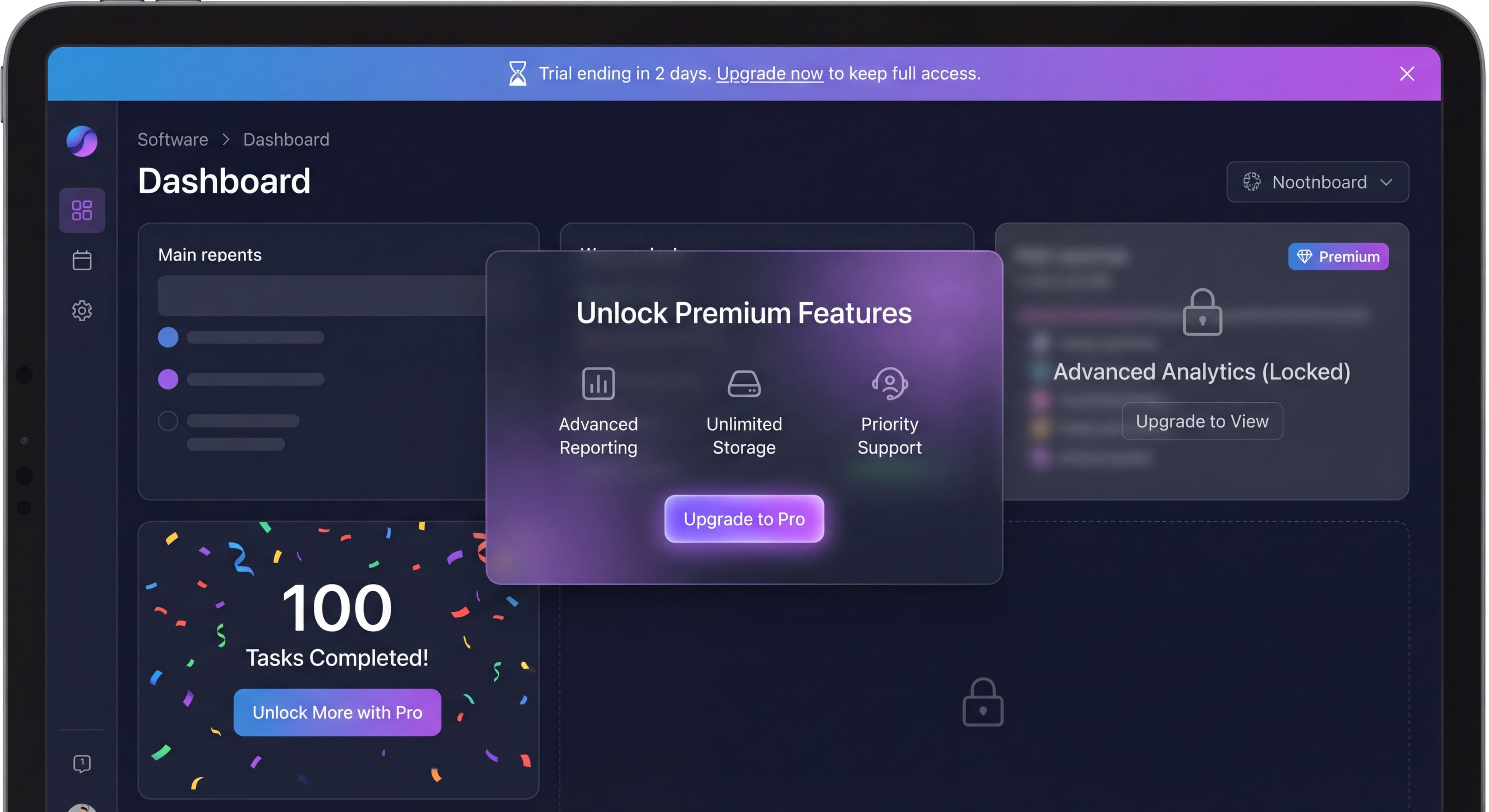
Hard Paywalls
Hard paywalls are the most direct approach to freemium conversion: a complete block that requires users to upgrade before continuing. When a user hits a predefined limit (five projects, three team members, 100 monthly tasks), they see a clear message: "You've reached your 5-project limit. Upgrade to create more projects." This approach creates immediate urgency and a clear decision point, forcing users to either commit to the paid plan or stop using the product at that capacity level.
Hard paywalls work best when clear value has already been delivered. If someone has created five projects, they've shown that your product solves a real problem for them. The limit should be reasonable and understood from the beginning. Surprising users with unexpected restrictions creates resentment rather than conversion. The upgrade path needs to be immediately clear and frictionless, letting users convert within seconds of deciding they want to continue. Companies like Trello successfully use hard paywalls on team size and board limits because users who hit these thresholds have already integrated the product into their workflow.
That said, hard paywalls should be avoided in several scenarios. Implementing them before value has been demonstrated (like limiting users to one project when they need several to understand the product's value) sabotages your own conversion funnel. Paywalling core functionality that defines your main value proposition prevents users from reaching the "aha moment" necessary for conversion. Using hard paywalls too early in the user journey, before habits have formed and value has been realized, just drives users to explore alternatives instead of upgrading.
Soft Paywalls
Soft paywalls take a more subtle approach by making premium features visible throughout the product but locked behind upgrade requirements. Users might see an "Advanced Analytics" section with a premium badge and text like "See deep insights with our Pro plan." This serves two purposes: it educates free users about what's available if they upgrade while creating aspiration for capabilities just beyond their current reach. Soft paywalls work particularly well for complex products where users gradually discover features over time.
The strength of soft paywalls lies in feature discovery moments and long-term conversion nurturing. When users naturally explore different sections of your product and encounter premium capabilities, they start building a mental model of what upgrading would unlock. This approach works because it doesn't interrupt workflow. Users can continue using free features while becoming increasingly aware of premium value. Grammarly does this well by highlighting premium grammar suggestions throughout the writing experience, showing users what they're missing without blocking their basic writing needs. Over time, this awareness builds FOMO that eventually drives conversion.
Soft paywalls lose effectiveness when overused or poorly implemented. Excessive frequency (showing premium badges on every screen and in every menu) creates visual noise that users learn to ignore. If soft paywalls block core workflows or create frustration by constantly reminding users of features they can't access, they generate negative sentiment rather than desire. The key is strategic placement that creates aspiration without annoyance, showing users what's possible while respecting their current tier choice.
Contextual Prompts
Contextual prompts are the gold standard of upgrade messaging because they're triggered by specific user behaviors that signal readiness to upgrade. Rather than appearing on a schedule, contextual prompts respond to what users actually do in your product. For example, when a user creates their tenth report in a week, they might see: "You've created 10 reports this week! With Pro, you can schedule automatic reports." This prompt works because it acknowledges behavior that demonstrates both product adoption and a clear use case for premium features.
These prompts excel when users demonstrate relevant needs through their actions. The user creating many reports has shown they value reporting functionality and would likely benefit from automation. The prompt feels like a natural extension of current usage rather than an arbitrary sales pitch. It provides a clear benefit tailored to that specific user's demonstrated workflow, making the value proposition immediately understandable and personally relevant. Research from Price Intelligently shows this contextual approach can improve conversion rates by highlighting exactly how premium features would improve the user's existing workflow.
Contextual prompts fail when they're irrelevant to the current task, interrupting users with suggestions unrelated to what they're trying to accomplish. If a user is deep in a design project and gets a prompt about reporting features they've never used, it feels like spam rather than help. Similarly, targeting the wrong segment (showing enterprise features to individual users or collaboration features to solo practitioners) wastes the opportunity for meaningful connection. The power of contextual prompts lies in their relevance. Without it, they're just another interruption.
Milestone Prompts
Milestone prompts celebrate user achievements while introducing upgrade opportunities at moments of high engagement. When a user reaches a significant accomplishment ("Congratulations! You've saved 20 hours this month. Power users like you love our time-tracking analytics on Pro."), they're experiencing positive emotions about your product. This psychological state creates openness to expanding their relationship with your tool. The prompt acknowledges their success, validates their usage level, and suggests that people like them (power users) benefit from additional capabilities.
These prompts work best after meaningful accomplishments that represent genuine value realization. Completing 100 tasks, reaching 1,000 visitors, or processing significant data volumes all indicate users have integrated your product into their workflow. Natural pause points (after completing a project, finishing a campaign, or reaching a round number) provide moments when users are reflective rather than task-focused. Celebrating success creates positive association with both the milestone and the upgrade suggestion, linking premium features with achievement rather than limitation.
Milestone prompts backfire when triggered by minor achievements that don't represent genuine value. Celebrating every small action dilutes the significance of milestones and trains users to ignore these messages. Interrupting workflow to announce milestones breaks concentration and creates frustration. Showing milestone prompts too frequently (multiple times per session or week) transforms celebration into annoyance. The key is selectivity: save milestone prompts for genuinely significant achievements that represent real success worth celebrating.
Time-Based Prompts
Time-based prompts use temporal urgency, most commonly related to trial expiration. A message like "Your trial ends in 3 days. Keep everything you've built" creates pressure to decide before losing access. These prompts work because they highlight potential loss. Behavioral economics research shows people are more motivated to avoid losses than to pursue equivalent gains. Showing users exactly what they'll lose (their projects, their data, their progress) if they don't upgrade creates stronger motivation than simply listing features they could gain.
Good time-based prompts appear as trials approach their end, giving users enough notice to make an informed decision without being pestered throughout their entire trial. They're particularly powerful when combined with evidence of value creation: "Your trial ends in 3 days. Keep your 12 projects, 4 active team members, and advanced integrations." This reminds users of the investment they've already made in your platform, increasing the perceived cost of churning. The prompt serves as a relevant reminder at time milestones that naturally matter to the user's access timeline.
Time-based prompts should be avoided too early in trials when users haven't experienced enough value to decide. Showing these prompts every session creates fatigue and diminishes urgency. If users see "trial ending soon" every day for two weeks, the message loses credibility. Continuing to show time-based prompts after users dismiss them signals you're not respecting their decision, potentially pushing them away rather than converting them. Stripe data indicates that each unnecessary prompt interaction can reduce conversion rates, making restraint as important as action.
Designing Effective Prompts
The Anatomy of a Good Prompt
Headline:
Clear, benefit-focused, specific.
Body:
Brief explanation of value.
CTA:
Action-oriented, specific.
Dismiss:
Easy, respected option.
Copy Guidelines
Leading with benefits rather than features is the core principle of effective upgrade copy. Users don't care about "advanced analytics" as an abstract feature. They care about discovering which campaigns drive results, understanding their best customers, or identifying growth opportunities. The difference seems subtle but has dramatic impact on conversion rates. When Spotify prompts users who've hit their skip limit, they don't say "Upgrade to Premium for unlimited skips." They say "Keep the music flowing with unlimited skips." The focus shifts from technical capability to user benefit: uninterrupted listening.
Specificity transforms vague promises into concrete value propositions that users can evaluate. "Get more features" provides no actionable information. Users can't assess whether those features matter to them. "Add unlimited team members" creates a clear picture of exactly what they're buying and how it solves a specific constraint they're experiencing. The more specific your copy, the easier it is for users to self-qualify whether the upgrade makes sense. Slack's "Your team is growing! With Team plan, you can manage permissions and see team analytics" works because it acknowledges a specific situation (team growth) and offers specific solutions (permissions management, team analytics).
Creating urgency must be authentic to maintain trust. Genuine time constraints ("Trial ends in 3 days") create appropriate urgency that helps users make timely decisions. False urgency tactics like "Limited time offer!" when there's no actual limitation damage credibility and can even trigger legal issues in some jurisdictions. Users have become sophisticated about these tactics, and fake urgency often backfires by making your entire brand feel manipulative. If urgency doesn't exist naturally, don't manufacture it. Focus on highlighting value and letting users convert when they're ready.
Acknowledging user context personalizes the message and shows your prompt responds to their specific situation. "You've invited 4 teammates. Add more with our Team plan" recognizes what the user has already done, making the upgrade suggestion feel relevant rather than random. This contextual awareness shows you're paying attention to how they use your product and offering upgrades that align with their demonstrated patterns. It transforms a generic sales pitch into a personalized suggestion based on observed behavior.
Visual Design
Non-Blocking:
Can be dismissed, doesn't prevent work.
Consistent:
Matches your product design.
Clear Hierarchy:
CTA prominent, dismiss available.
Contextual Placement:
Near relevant feature or action.
Examples
Limit Reached:
You've used all 5 projects

Your work is safe. Upgrade to Pro to create
unlimited projects and keep growing.

[Upgrade to Pro]    [Maybe Later]
Feature Discovery:
✨ Did you know?

Pro users can schedule automatic reports
to arrive in their inbox every Monday.

[See Pro Features]    [Dismiss]
Milestone Achievement:
🎉 Power User Status!

You've completed 100 tasks this month.
Unlock advanced productivity features
with Pro.

[Unlock Pro]    [Keep Going Free]
Trial Ending:
3 days left in your trial

Keep access to:
• All your projects (12 created)
• Team members (4 active)
• Advanced integrations

[Upgrade Now]    [Remind Me Tomorrow]
Timing and Triggering
Best Times to Prompt
After Value Delivered:
User just completed something successfully.
At Natural Limits:
User hits reasonable usage threshold.
During Feature Discovery:
User explores premium-relevant areas.
Near Decision Points:
Trial ending, usage increasing.
Frequency Guidelines
Modal Prompts:
Maximum once per session, ideally once per week.
Banner Prompts:
Can be more frequent, but respect dismissal.
Contextual Prompts:
When contextually relevant, not by schedule.
Suppression Rules
Don't Prompt When:
- User just dismissed a prompt
- User is mid-task
- User is new (first 1-3 sessions)
- User already upgraded
- User explicitly declined recently
Measuring Prompt Effectiveness
Same questions over and over?
Create self-serve documentation that empowers users to help themselves with Glitter AI.
Key Metrics
View Rate:
How many users see the prompt.
Engagement Rate:
Click on CTA (not dismiss).
Conversion Rate:
Actually upgrade after prompt.
Dismiss Rate:
Choose to close without action.
Annoyance Indicators:
Churn or negative feedback after prompts.
A/B Testing Prompts
What to Test:
- Copy variations
- Timing triggers
- Visual design
- CTA wording
- Placement
What to Measure:
- Immediate click rate
- Eventual conversion (attributed)
- User sentiment
- Downstream retention
Analysis Questions
For High Dismiss Rate:
- Wrong timing?
- Wrong value proposition?
- Too aggressive?
For Low View Rate:
- Trigger too restrictive?
- Placement too subtle?
- Missing opportunities?
For Low Conversion After Engagement:
- Pricing page issues?
- Checkout friction?
- Value not matching expectation?
Segment-Specific Approaches
Power Users
Power users represent your highest-engagement segment, typically hitting usage limits naturally through intensive product adoption. These users visit frequently, use features deeply, and often push your free tier to its maximum capacity. They've already demonstrated strong product-market fit and are prime conversion candidates. The challenge isn't convincing them your product is valuable (they already know it is) but showing them how premium features would amplify what they're already doing well.
When approaching power users, acknowledge their engagement explicitly. They've earned recognition, and calling out their status creates positive feelings that open pathways to conversion. Focus messaging on scale and efficiency improvements rather than basic capabilities. Power users don't need to be taught how to use your product. They need tools that let them do more, faster, and with less manual effort. Highlight team and advanced features that unlock new capabilities appropriate for their sophisticated usage. "You're one of our top users! Get the tools power users need with Pro" validates their status while creating aspiration to join an exclusive group with enhanced capabilities. Companies like Notion successfully convert free users who are power users by emphasizing collaboration features and unlimited blocks that remove constraints these users actively experience.
Casual Users
Casual users engage occasionally but haven't developed daily habits or deep feature adoption. They may not see a need for premium features because they're not using your product intensively enough to hit limitations. Attempting aggressive in-app upsell with this segment often backfires. They're not ready to pay for a tool they barely use. The strategy with casual users focuses on nurturing higher engagement first, gradually demonstrating value that encourages more frequent usage.
For casual users, show what's possible rather than pushing for immediate conversion. Educational prompts that highlight features they haven't discovered can increase engagement without feeling sales-driven. Use subtle awareness building that plants seeds about premium capabilities without demanding action. Messages like "Did you know you can also [premium feature]? See what else is possible" invite exploration rather than purchase. The goal is moving casual users toward power user status over time, at which point conversion conversations become natural. Many successful SaaS products implement drip campaigns and feature education specifically for casual users, gradually increasing their engagement until premium features become personally relevant.
Team Leads
Team leads exhibit distinctive behaviors that make them particularly valuable conversion targets: they invite other users to your platform, coordinate team activities, and need capabilities beyond what individual users require. When someone starts inviting colleagues or managing group workflows, they've signaled readiness for team-oriented premium features even if they haven't explicitly expressed interest in upgrading. These users experience collaboration friction that free tiers often can't adequately address.
Team-focused value propositions resonate strongest with this segment. Highlight collaboration features, admin capabilities, and team management tools that solve coordination problems they're actively experiencing. Permissions management, team analytics, centralized billing, and user administration all address pain points specific to people managing groups. A prompt like "Your team is growing! With Team plan, you can manage permissions and see team analytics" acknowledges their situation and offers concrete solutions to emerging challenges. Slack famously converts team leads by making certain team management features available only on paid plans, creating natural upgrade pressure as teams grow beyond individual use cases.
Enterprise Indicators
Users showing enterprise indicators (multiple users from the same domain, high engagement across teams, advanced security inquiries) signal potential for larger deals beyond standard self-serve pricing. These accounts often represent opportunities for custom contracts, dedicated support, and enterprise feature sets that justify significantly higher price points. When you identify enterprise patterns, the conversion approach shifts from self-serve prompts to sales-assisted outreach.
Enterprise-focused prompts should emphasize custom solutions, security and compliance capabilities, and dedicated support rather than feature counts or usage limits. Messages highlighting "SSO integration, advanced security controls, and dedicated customer success management" speak to concerns that matter at organizational purchasing levels. "Managing a larger team? Learn about our Enterprise features including SSO and dedicated support" opens a conversation rather than pushing for immediate self-serve conversion. Many companies transition these leads from product-led prompts to sales-led outreach, recognizing that enterprise deals require relationship building, security reviews, and custom negotiations that automated prompts can't provide.
Same questions over and over?
Create self-serve documentation that empowers users to help themselves with Glitter AI.
Common Upgrade Prompt Mistakes
Mistake 1: Too Early
Prompting users to upgrade before they've experienced meaningful value is one of the most common and damaging mistakes in freemium conversion. When users encounter upgrade prompts within their first session or before completing their first meaningful task, they lack context to evaluate whether your product is worth paying for. This creates immediate resistance and negative associations that can persist even after users do experience value. Instead of seeing your premium features as valuable enhancements, they remember feeling pressured before they understood what they were being pressured to buy.
The psychological impact of premature prompts extends beyond immediate rejection. Users who feel pushed too early often become defensive, actively resisting later prompts even when those prompts would be genuinely helpful and well-timed. This creates a lasting barrier that's hard to overcome. The fix requires patience: wait until users have definitively reached their "aha moment," that point where they truly understand and appreciate what your product does for them. Only after users have experienced tangible value can they make informed decisions about whether enhanced capabilities justify the investment. Data consistently shows users who reach activation milestones before seeing upgrade prompts convert at 3-5x higher rates than users prompted earlier.
Mistake 2: Too Frequent
Showing upgrade prompts every session (or worse, multiple times per session) creates prompt fatigue that trains users to automatically dismiss or ignore your conversion attempts. What might start as genuine consideration quickly becomes reflexive rejection. Users develop "banner blindness" for upgrade prompts, scrolling past without reading or processing the message. Even worse, frequent prompts create annoyance that can actively drive churn. Users who feel constantly pestered about upgrading often decide to leave entirely rather than continuing to be marketed to during every interaction with your product.
The psychological principle of habituation explains why frequent prompts lose effectiveness. When users encounter the same stimulus repeatedly, their response diminishes over time. The first upgrade prompt might get careful consideration. The fifth might be dismissed instantly. By the tenth, users have mentally categorized your prompts as noise to be ignored. The solution involves implementing strict frequency caps. Limit modal prompts to once per week maximum, and always respect dismissal actions. When a user explicitly closes a prompt, suppress similar messages for at least a week. Some successful products track prompt dismissals and progressively increase the interval between subsequent showings, recognizing that users who have declined multiple times are unlikely to convert through repeated asking.
Mistake 3: Feature-Focused
Listing features without explaining benefits leaves users unable to understand why they should care about your premium offering. When a prompt says "Upgrade for advanced analytics, custom reports, and API access," users must do the cognitive work of translating those features into personal value. Most won't bother. They'll dismiss the prompt without engaging because the value proposition remains abstract and disconnected from their actual needs. Features describe what you've built. Benefits describe what users can accomplish. The gap between these perspectives determines whether prompts convert or get ignored.
The fix requires reframing every feature as a user benefit. Instead of "advanced analytics," focus on "discover which campaigns drive results." Rather than "API access," emphasize "integrate with your existing tools." Transform "custom reports" into "share insights exactly how your team needs them." This benefit-focused approach does the interpretation work for users, making value immediately clear and personally relevant. When Dropbox prompts users about premium features, they don't lead with "2TB storage." They lead with "Never delete another file" or "All your photos, videos, and documents in one place." Storage capacity is the feature. The ability to keep everything without worrying about space is the benefit that drives conversion.
Mistake 4: No Context
Generic prompts that appear randomly rather than in response to specific user behaviors feel irrelevant and get ignored. When a user focused on design work receives a prompt about data export features they've never used, the message creates friction rather than value. The prompt interrupts their workflow without offering anything relevant to their current task or demonstrated usage patterns. This mismatch makes users less likely to engage with future prompts, having learned that your upgrade messages often don't apply to their specific needs.
Good prompts trigger based on specific user behaviors that signal readiness or relevance. If a user just created their fifth project, that's the moment to mention unlimited projects. When someone invites their fourth team member, that's when team management features become relevant. If a user accesses your product from three different devices in one week, that's when to highlight sync capabilities. The behavioral trigger ensures the prompt directly addresses something the user has demonstrably cared about through their actions. Contextual prompts can achieve 5-10x higher conversion rates than generic prompts because they appear when users actively need what you're offering.
Mistake 5: Blocking Core Value
Paywalling essential functionality that users need to reach their "aha moment" sabotages your own conversion funnel by preventing users from experiencing the value necessary to justify upgrading. If users can't accomplish meaningful tasks on your free tier, they'll never develop the attachment and understanding required for paid conversion. They'll simply leave and try a competitor whose free tier does let them experience value. Research from Price Intelligently suggests the optimal freemium strategy provides about 80% of product functionality to free users while reserving 20% of high-value features for paid plans.
Core value must be accessible on free tiers. Users need to complete the fundamental job-to-be-done that brought them to your product in the first place. Notion allows free users to create unlimited pages and use all basic functionality because the core value is organizing information. They paywall team features and version history, which are valuable enhancements but not the core value proposition. In contrast, products that limit free users to trivially small usage caps that prevent real work get abandoned before users ever experience enough value to consider paying. The fix requires ensuring your free tier genuinely delivers the "aha moment" while premium features enhance, accelerate, or scale that core value rather than gating it entirely.
Mistake 6: Aggressive Tactics
Using pressure tactics, false urgency, or manipulative messaging in upgrade prompts might generate a few short-term conversions but creates long-term damage to brand trust and customer relationships. When users feel manipulated into upgrading, they resent the tactic even if they end up paying. This resentment shows up in negative reviews, poor retention, and critical word-of-mouth that hurts acquisition. Modern users have developed sophisticated detection mechanisms for dark patterns and manipulative tactics. They recognize fake countdown timers, artificial scarcity, and pressure-based messaging, and they react negatively to all of them.
Honest, value-focused messaging builds sustainable conversion rates by creating genuine desire for premium features rather than coerced compliance. When users upgrade because they clearly understand and want what premium offers, they become satisfied paying customers with positive brand associations. When users upgrade because they felt pressured or manipulated, they look for opportunities to downgrade or switch to competitors. The fix involves auditing all upgrade messaging for authenticity: if urgency claims aren't real, remove them. If you're emphasizing what users will lose rather than what they'll gain, reframe the message. If you're using psychological pressure rather than clear value communication, redesign the prompt. Companies building long-term sustainable businesses prioritize trust over short-term conversion tricks, recognizing that customer lifetime value depends on relationships built on mutual value rather than manipulation.
Building Your Upgrade Strategy
Audit Current Prompts
- Where do prompts appear?
- How frequently?
- What triggers them?
- What's the messaging?
- What are the results?
Design Prompt System
- Define trigger conditions
- Set frequency rules
- Create suppression logic
- Design prompt variations
- Plan measurement
Implement and Test
- Start with highest-impact prompts
- A/B test variations
- Monitor user sentiment
- Iterate based on data
Optimize Continuously
- Regular performance review
- Test new triggers
- Update copy
- Adjust frequency
Training taking forever?
Create step-by-step guides that onboard users to premium features in minutes with Glitter AI.
The Bottom Line
The best upgrade prompts don't feel like sales. They feel like product. They appear when users naturally need more, offering exactly what would help them succeed. That alignment between user need and prompt timing is what creates conversion without friction.
Key Principles:
- Value before ask, always
- Timing based on context, not schedule
- Benefit-focused, not feature-focused
- Respect dismissal and fatigue
- Measure and optimize continuously
Upgrade prompts are part of your product experience. Treat them with the same care you'd give any other product feature.
Keep learning: Freemium Strategy and Free Trial Best Practices.
Frequently Asked Questions
When is the best time to show upgrade prompts?
The best time to show upgrade prompts is after users have experienced value and hit a natural limit. Prompt when users have just accomplished something, are experiencing product benefits, naturally need more capacity, or are exploring new capabilities. Avoid prompting mid-task, when frustrated, or immediately after signup.
How often should you show in-app upsell prompts?
Modal prompts should appear maximum once per session, ideally once per week. Banner prompts can be more frequent but must respect dismissal. Contextual prompts should trigger based on relevance, not schedule. Always suppress prompts when users have recently dismissed one or explicitly declined.
What makes an upgrade prompt effective at converting free users?
Good upgrade prompts lead with benefits rather than features, use specific concrete value propositions, acknowledge the user's context and current usage, and make dismissal easy. The best prompts feel like helpful suggestions at the right moment rather than sales pitches.
What are the different types of upgrade prompts for freemium products?
The main types are hard paywalls (complete blocks requiring upgrade), soft paywalls (premium features visible but locked), contextual prompts (based on user behavior), milestone prompts (triggered by achievements), and time-based prompts (related to trial timing).
How do you measure upgrade prompt effectiveness?
Track view rate (how many see the prompt), engagement rate (CTA clicks), conversion rate (actual upgrades), dismiss rate (closed without action), and annoyance indicators (churn or negative feedback after prompts). A/B test copy, timing, design, and placement to optimize performance.