Reducing Onboarding Friction: 15 Tactics That Actually Work

Friction kills conversion. Every extra form field, confusing step, or unnecessary hurdle pushes users toward the exit. Research shows each form field cuts completion by roughly 4-6%, and requiring a phone number alone drops signup by 6.8%. According to 2025 onboarding research (historical data), 81% of users abandon forms early, with nearly 30% citing security concerns alone. And 61% of users drop off during onboarding due to complexity or time constraints. Friction reduction is one of the highest-leverage optimization opportunities available to product teams.
These 15 tactics help you find and eliminate friction throughout your onboarding flow, backed by 2025 conversion research (historical data) and proven patterns that significantly improve signup and activation rates.
Users dropping off at signup?
Create step-by-step guides that eliminate friction and get users to value faster with Glitter AI.
Understanding Onboarding Friction
Friction is anything that slows users down, requires extra effort, or introduces uncertainty. It includes:
- Physical friction: Too many steps, complex forms
- Cognitive friction: Confusing choices, unclear instructions
- Emotional friction: Fear, uncertainty, lack of trust
Not all friction is bad. Some friction (like confirmation dialogs) prevents mistakes. The goal is eliminating unnecessary friction while preserving useful friction.
Tactic 1: Reduce Signup Fields to the Absolute Minimum
The Problem:
Every extra form field adds cognitive load, decision fatigue, and abandonment risk. These compound multiplicatively, not additively. Users hitting long signup forms make instant judgments about effort-to-value ratios, often leaving before entering a single character when forms look burdensome.
The Solution:
The best signup flow collects only the minimum information required for account creation and initial value delivery. Email-only signups are the gold standard for consumer and many B2B applications, allowing immediate account creation with zero additional fields. Password can be optional initially through magic link authentication that emails a login link instead of requiring password creation. Everything else, company size, role, use case, preferences, should be collected after signup through progressive profiling at contextually relevant moments when users understand the value exchange.
Impact:
According to 2025 conversion research (historical data), reducing signup fields from 6 to 2 typically improves conversion by 20-50%, with some teams reporting even higher gains. One to three fields, such as email plus optionally name and company, convert best across industries. The reduction compounds with other friction-reduction tactics, creating multiplicative conversion improvements.
Implementation:
Audit your current signup form systematically, questioning each field's necessity. For each field, ask: "Do we absolutely need this before the user can experience our product's value?" If no, remove it or move it to post-signup progressive profiling. If you need information for segmentation or personalization, collect it later through a welcome survey presented after the user has experienced initial value. Ausmed found that reducing required fields in their signup significantly improved engagement by streamlining the workflow and minimizing drop-offs.
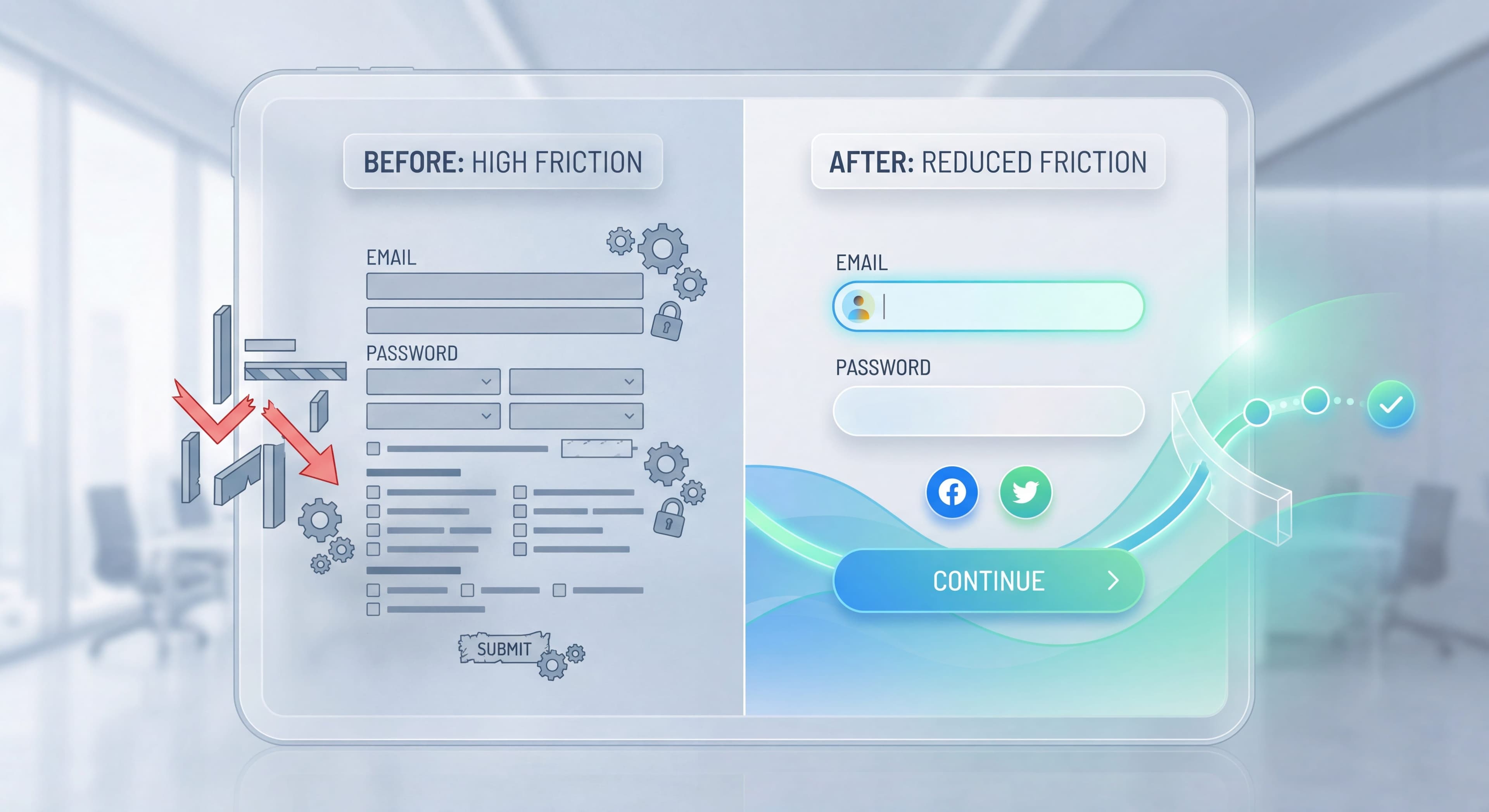
Tactic 2: Implement Social Login
The Problem:
Creating yet another password adds multiple friction layers that drag down conversion rates. Users must generate a password meeting complexity requirements, type it twice without errors, remember it for future logins, or manage it through password managers. This process interrupts flow, creates security anxiety, and triggers abandonment.
The Solution:
Social login eliminates password creation by using existing authenticated sessions with trusted providers. Google login sees the highest adoption across consumer and business contexts since most users have active Google accounts. Apple login appeals to iOS users who value Apple's privacy stance and seamless device integration. Microsoft login works well in enterprise contexts where users already authenticate daily to corporate accounts. LinkedIn targets B2B applications where professional identity adds trust. According to 2025 research (historical data), social logins reduce friction and improve conversions by 20-40%.
Impact:
Social login typically increases signup conversion by 15-30%, with the higher end achieved when multiple provider options accommodate different user preferences. The benefit extends to long-term retention since users who never created passwords never experience login friction on return visits.
Critical Considerations:
Some users strongly prefer email and password for privacy, security, or personal preference. Enterprise customers may require specific SSO providers like Okta, Azure AD, or custom SAML rather than consumer social logins. Always offer both social login and traditional email/password to accommodate all preferences without creating exclusionary friction.
Tactic 3: Use Smart Defaults
The Problem:
Every decision requires mental effort. Too many decisions cause abandonment.
The Solution:
Pre-fill with intelligent defaults:
- Workspace name: "[User's Name]'s Workspace"
- Timezone: Detected from browser
- Currency: Based on location
- Language: Browser language
Impact:
Reduces setup time by 30-50% and completion increases proportionally.
Implementation:
Review every configuration option. Can it be defaulted? Can it be changed later? Default it.
Tactic 4: Progressive Profiling
The Problem:
Product teams need user information for personalization, segmentation, and analytics, but demanding it all upfront during signup creates fatal friction that destroys conversion before users experience any value.
The Solution:
Progressive profiling spreads information collection across multiple touchpoints over time, presenting each request at a contextually relevant moment when users understand the value exchange and are more likely to provide accurate information. User willingness to share information correlates directly with their perceived product value and trust.
Implementation Timeline:
At signup, collect email only, the absolute minimum for account creation. During initial onboarding post-signup, ask "To personalize your experience, what's your role?" when users can see how role selection customizes their interface. At first use, when users create their first project, ask "What's this project for?" to gather use-case information. During Week 2, after users have experienced value, deploy an in-app survey asking "How are you using [Product]?" to collect detailed usage patterns.
According to 2025 conversion research, this progressive approach works dramatically better: Step 1 asks for email only, Step 2 collects company details during onboarding, Step 3 requests payment info near trial end. This can increase initial signups by 40-60% compared to collecting everything upfront.
Impact:
Progressive profiling lets teams gather the same user information with 40-60% less drop-off compared to upfront collection. Users provide more accurate information when they understand context and value, improving data quality alongside conversion. Some teams using progressive profiling through onboarding quizzes see completion rates exceeding traditional forms while also improving personalization accuracy.
Tactic 5: Clear Progress Indicators
The Problem:
Users in multi-step flows don't know how long it will take. Uncertainty creates abandonment.
The Solution:
- Step indicators: "Step 2 of 4"
- Progress bars: Visual completion representation
- Time estimates: "About 2 minutes"
Impact:
Progress indicators increase completion by 20-30%.
Best Practice:
Show progress only when there are 3+ steps. Single steps don't need indicators.
Tactic 6: Allow Skipping Non-Essential Steps
The Problem:
Users have different needs. Forcing everyone through identical steps frustrates those who don't need them.
The Solution:
Add "Skip" or "I'll do this later" to optional steps:
- Team invites
- Integration setup
- Profile completion
- Tutorial completion
Impact:
Skip options can increase overall completion by 15-25%.
Caution:
Don't make essential steps skippable. Some friction is necessary.
Tactic 7: Eliminate Account Verification Delays
The Problem:
The traditional "Check your email to verify your account before accessing anything" pattern creates a momentum break that devastates activation rates. Users completing signup expect immediate product access as their reward for the effort, but instead hit a dead-end message requiring email verification. They have to switch to their email client, find the verification message (often delayed or filtered to spam), click the link, and navigate back to your product. That's a multi-step journey where abandonment happens at every transition. Many users never return, forgetting about your product during the email detour.
The Solution:
Modern onboarding eliminates verification as a gate for initial product access, treating it as a background process that completes asynchronously. Let users access the product immediately after signup, experiencing value without interruption while the verification email sends in the background. Remind users about verification through non-blocking in-app notifications that don't prevent usage. Gate specific advanced features behind verification, like inviting team members, publishing content publicly, or integrating with external services, rather than blocking basic access. This balances security requirements with user experience.
Impact:
Immediate product access post-signup increases Day 1 activation by 30-50% according to multiple studies. Users who experience value right away show dramatically higher engagement and retention than those forced through verification delays. The improvement compounds through the entire funnel: higher activation leads to better retention, which drives improved lifetime value and referrals.
Tactic 8: Simplify Password Requirements
The Problem:
"Password must contain uppercase, lowercase, number, special character, and be 12+ characters" creates frustration.
The Solution:
- Minimum length only (8-10 characters)
- Show password strength meter
- Allow pasting passwords
- Support password managers
- Consider magic link alternative
Impact:
Simplified requirements improve signup completion by 10-20%.
Tactic 9: Pre-Populate with Example Data
The Problem:
Empty states require users to create content before seeing value. This is backward.
The Solution:
Pre-populate accounts with example content:
- Sample project with tasks
- Example dashboard with data
- Demo workspace to explore
- Template library
Impact:
Pre-populated accounts increase activation by 25-40%.
Implementation:
Create compelling, relevant example content. Make it easy to delete when users are ready for their own data.
Tactic 10: Optimize for Mobile
The Problem:
25-40% of signups happen on mobile. Desktop-designed onboarding fails on small screens.
The Solution:
- Large touch targets (44x44px minimum)
- Single-column layouts
- Keyboard-appropriate inputs
- Reduced content/shorter steps
- Swipe-friendly interactions
Impact:
Mobile optimization can double mobile conversion rates.
Tactic 11: Inline Validation
The Problem:
Users fill out a form, submit, and get errors. They must find and fix problems.
The Solution:
Validate in real-time:
- Email format checking as user types
- Password strength indicator
- Username availability
- Clear error messages at the field level
Impact:
Inline validation reduces form errors by 22% and improves completion by 10-15%.
Tactic 12: One Primary Action per Screen
The Problem:
Multiple calls-to-action create decision paralysis. Users don't know what to click.
The Solution:
Each screen should have:
- One primary action (prominent button)
- Secondary action (text link, optional)
- No competing CTAs
Impact:
Single CTA focus can improve click-through by 25-50%.
Tactic 13: Remove Distractions
The Problem:
Navigation, footers, and sidebar elements during onboarding compete for attention.
The Solution:
- Simplified header during onboarding
- Remove navigation until core flow complete
- Full-screen or modal onboarding
- Focus on the current step only
Impact:
Distraction removal improves completion by 15-25%.
Tactic 14: Fast Load Times
The Problem:
Every second of load time increases abandonment. After 3 seconds, 53% leave.
The Solution:
- Optimize page load speed
- Use skeleton states while loading
- Preload next step while current completes
- Progressive loading for heavy content
Impact:
Each second saved improves conversion by 7%.
Tactic 15: Smart Error Recovery
The Problem:
Errors happen. Poor error handling turns minor issues into major drop-offs.
The Solution:
- Clear, friendly error messages
- Specific guidance on how to fix
- Preserve entered data on error
- Easy retry without re-entering
- Help link for complex errors
Impact:
Good error handling recovers 30-50% of error cases.
Friction Audit Process
Use this process to identify friction in your onboarding:
Processes undocumented?
Create step-by-step SOPs that capture best practices in minutes with Glitter AI.
Step 1: Map the Flow
Document every screen and action from signup to activation:
- Landing page → Signup form → Email verification → Welcome → Setup → First action → Value
Step 2: Measure Drop-off
Add analytics to track:
- Completion rate at each step
- Time spent on each step
- Errors encountered
- Help doc access
- Rage clicks (heatmaps)
Step 3: Identify Friction Points
Look for:
- Steps with >20% drop-off
- Steps taking >30 seconds
- High error rates
- Help doc spikes
- User testing confusion
Step 4: Prioritize by Impact
Prioritize based on:
- Volume through step (higher = more impact)
- Drop-off rate (higher = more room for improvement)
- Effort to fix (lower = faster wins)
Step 5: Test Solutions
For each friction point:
- Hypothesize causes
- Design solutions
- A/B test changes
- Measure impact
- Iterate
Processes undocumented?
Create step-by-step SOPs that capture best practices in minutes with Glitter AI.
Common Friction Hidden in Plain Sight
"Just One More Question..."
Every additional question, even small ones, compounds friction. Audit ruthlessly.
Unclear Value Exchange
Asking for information without explaining why creates resistance. "We use this to personalize your experience" helps.
Inconsistent Design
Different visual patterns between steps create cognitive load. Maintain consistency.
Assumed Knowledge
Technical jargon, unexplained features, or references to things users don't know yet all create friction.
Unnecessary Choices
"Would you like to: A, B, C, D, or E?" when you could just default to the most common choice.
Measuring Friction Reduction Success
Track these metrics before and after friction reduction:
Primary:
- Signup completion rate
- Onboarding completion rate
- Time to first value
- Activation rate
Secondary:
- Support ticket volume
- Session duration (too short = friction, too long without activation = confusion)
- Drop-off by step
Qualitative:
- User feedback sentiment
- NPS during onboarding
- User testing observations
Too many steps slowing users?
Build streamlined SOPs that cut unnecessary friction and boost completion rates with Glitter AI.
The Friction-Free Mindset
Reducing friction isn't a one-time project. It's an ongoing discipline:
- Regularly audit your flows
- Watch user sessions
- Listen to support tickets
- Test every change
- Question every step
The goal isn't zero friction. Some friction is useful. The goal is friction that's justified, necessary, and as minimal as possible.
Continue optimizing: Product Tours Users Complete and Psychology of User Onboarding.
Frequently Asked Questions
What is onboarding friction and why does it matter?
Onboarding friction includes anything that slows users down, requires extra effort, or introduces uncertainty. This encompasses physical friction from too many steps, cognitive friction from confusing choices, and emotional friction from fear or lack of trust. Each form field reduces completion by approximately 4-6%, making friction reduction critical for conversion.
How many signup fields should you have to reduce friction?
Reduce signup fields to the absolute minimum, ideally email only or a single social login option. Reducing from 6 fields to 2 typically improves signup conversion by 20-50%. For each field, ask whether you absolutely need this information before the user can experience value. Collect everything else after signup through progressive profiling.
What is progressive profiling and how does it reduce user friction?
Progressive profiling collects user information over time at contextually relevant moments rather than all upfront. Ask only for email at signup, gather role information during onboarding, capture project purpose when creating their first project, and survey usage patterns after a week or two. This approach gets the same information with 40-60% less drop-off.
How do smart defaults reduce friction in onboarding?
Smart defaults eliminate decision-making effort by pre-filling options intelligently. Auto-populate workspace names, detect timezone from browser, set currency based on location, and use browser language settings. This reduces setup time by 30-50% and completion increases proportionally because users can accept defaults and move forward quickly.
How do you conduct a friction audit of your onboarding flow?
Map every screen and action from signup to activation, then add analytics to track completion rates, time spent, errors encountered, and rage clicks at each step. Identify friction points where drop-off exceeds 20% or steps take over 30 seconds. Prioritize fixes based on volume through the step, drop-off rate, and effort to fix.