How to Create Product Tours That Users Actually Complete

Product tours can be powerful onboarding tools or annoying interruptions users dismiss without reading. The difference comes down to design. Data from millions of product tour interactions shows 3-step tours achieve 72% completion while 7-step tours drop to just 16%. Length matters a lot, but so do relevance, timing, and copy. Industry benchmarks suggest well-designed tours should hit 60-70% completion rates, but many teams see much lower numbers because of common design mistakes.
The stakes are real: good onboarding can boost retention by up to 50%, while bad onboarding causes up to 80% of people to abandon an app before they even use it properly. Product tours sit right in the middle of this. They're either your chance to guide users toward activation or the thing that drives them away frustrated. Knowing what separates effective tours from ineffective ones matters for any team serious about user adoption.
This guide covers how to create product tours users actually complete, based on data and real-world testing across millions of interactions.
Tour design inconsistent?
Create step-by-step guides that standardize your product tour creation process with Glitter AI.
Understanding Product Tours
What Makes a Tour Effective
Effective tours share these characteristics:
- Focused: Teach one thing well, not everything poorly
- Relevant: Appear when users need the guidance
- Short: Respect user time and attention
- Actionable: Guide users to do, not just view
- Optional: Let users skip without penalty
Tour Types
Linear Tours: Step-by-step sequences through multiple features. Best for complex workflows.
Spotlight Tours: Single-step highlights of specific features. Best for announcements.
Interactive Walkthroughs: Users perform actions as part of the tour. Best for teaching.
Contextual Tips: Appear based on behavior, not sequence. Best for ongoing education.
When Tours Work (and Don't)
Tours Work Well For:
- First-time feature introduction
- Complex workflow guidance
- Post-signup orientation
- Feature announcements
- Behavior-triggered education
Tours Don't Work Well For:
- Teaching intuitive interfaces
- Covering every feature
- Replacing good UX
- Users who know what they're doing
- Features users don't need yet
The Core Principle
Tours should accelerate users toward value, not demonstrate product completeness. If users can figure something out on their own in 10 seconds, don't create a tour for it.
Optimal Tour Length
The Data on Length
Research analyzing 550 million data points shows clear patterns:
| Steps | Completion Rate | Key Insight |
|---|---|---|
| 1-3 | 70-80% | Optimal for most use cases; three-step tours hit 72% completion |
| 4-5 | 50-60% | Still acceptable; four-step tours around 74% in some studies |
| 6-7 | 30-40% | Significant drop-off; one extra step from four to five drops completion to 45% |
| 8+ | <20% | Failure territory; seven-step tours see only 16% completion |
The pattern holds across industries and use cases: keep tours to five steps or fewer, let users initiate, and use progress cues to maintain momentum. Every step beyond three causes a multiplicative drop in completion, not just an additive one.
Practical Guidelines
Ideal Length: 3-5 steps for most tours. Three is the sweet spot.
Exception: Complex workflows may need more steps, but break content into multiple shorter tours triggered at different moments rather than one long tour.
Rule of Thumb: If you can't explain why each step is essential and directly contributes to activation, cut it. Tours should accelerate users toward value, not demonstrate product completeness.
The difference between a three-step tour and a seven-step tour isn't just 56 percentage points in completion. It's the difference between most users learning what they need versus most users bouncing before gaining any value. That should inform every decision about what goes in your tours.
Breaking Long Tours
If you have 10 things to teach, don't create a 10-step tour. Instead:
Option 1: Multiple short tours
- Tour 1: Getting started (3 steps)
- Tour 2: Advanced features (triggered later)
- Tour 3: Power user tips (triggered by behavior)
Option 2: Progressive contextual guidance
- Show guidance for each feature when users reach it naturally
- No linear tour, just relevant help at relevant moments
Writing Tour Copy
The Structure for Each Step
Title (Optional): Brief, benefit-oriented
Body: 15-30 words explaining what and why
Action: Clear CTA or next step
Copy Principles
Be Concise: Every word must earn its place
Be Specific: "Click the blue 'Create' button" not "Create a new item"
Be Benefit-Oriented: "Save time with templates" not "This is the templates section"
Be Actionable: Tell users what to do, not what to observe
Good vs Bad Copy Examples
Bad:
"Welcome to the Dashboard! This is where you can see all your projects, tasks, team activity, reports, and more. The Dashboard is the central hub of your workspace."
Good:
"Your Dashboard shows project status at a glance. Create your first project to see it in action."
Bad:
"The sidebar contains navigation to different sections including Projects, Tasks, Calendar, Reports, Settings, and Help."
Good:
"Your projects live here. Click 'New Project' to get started."
Action-Oriented Language
Start steps with verbs:
- "Click..."
- "Enter..."
- "Select..."
- "Review..."
- "Save..."
Interactive vs Passive Tours
Passive Tours
Users read and click "Next" through each step. They view but don't act.
Pros:
- Faster to complete
- Less friction
- Works for simple explanations
Cons:
- Lower retention of information
- No practice with features
- Easier to dismiss mindlessly
Interactive Walkthroughs
Users perform actions as part of the tour. They learn by doing.
Pros:
- Higher retention
- Hands-on experience
- Confirms understanding
- Creates first-use data
Cons:
- Longer to complete
- Can feel forced
- May require sample data
- More complex to build
When to Use Each
Use Passive Tours For:
- Simple feature introductions
- Interface orientation
- Announcements
Use Interactive Tours For:
- Core workflow training
- Complex features
- Critical actions
- First value creation
Triggers and Targeting
Training taking too long?
Create step-by-step guides that get users productive faster with Glitter AI.
Trigger Strategies
Trigger type dramatically impacts completion rates. User control is the critical variable. Data shows that letting users start help when they need it improves trust and completion significantly.
Page Load (Immediate):
- Tour starts automatically when user reaches a page
- Good for: First-time access to key areas
- Risk: May interrupt user intent and feel pushy
- Completion rate: Around 31% for delay-triggered tours
- Best practice: Reserve for absolutely critical first-time experiences only
Delayed (Time-Based):
- Tour starts after X seconds on page
- Good for: Letting users orient themselves first
- Risk: May still interrupt at a bad moment
- Completion rate: Default time-based triggers perform poorly
- Improvement: Smart Delay tours (waiting for inactivity) outperform default triggers by 21%
Behavioral (Action-Based):
- Tour starts after specific action or demonstrated need
- Good for: Contextually relevant guidance
- Risk: May miss users who don't trigger the behavior
- Completion rate: Best-performing trigger type overall
- Key insight: Tours triggered by behavior feel helpful, not interruptive
Manual (User-Initiated):
- Tour available via help menu, button, or launcher
- Good for: Users who actively want guidance
- Risk: May not be discovered by users who need help
- Completion rate: Click-triggered tours hit 67% completion, the highest of any trigger type
- Bonus: Users who open a Launcher complete around 5 checklist items per session
Best Practice: Behavioral Triggers
The best tours appear when users need them, not when you think they should see them. User-triggered tours outperform delayed or blanket triggers by roughly 2-3x. Respecting user autonomy and timing makes a big difference.
- User hovers over unfamiliar feature: Tooltip appears
- User creates first project: Tour on project features
- User visits empty reports: Guide on generating reports
- User inactive for 7 days: Re-engagement tour on what's new
Targeting by Segment
Not all users need all tours:
By Role: Admins vs. Members see different tours
By Plan: Free vs. Paid have different feature access
By Use Case: Different workflows for different jobs
By Experience: New vs. returning users
Tour UI Design
Visual Design Best Practices
Highlight Clearly: The element being discussed should be unmistakable
Don't Cover Content: Position tooltips so users can see what you're teaching
Consistent Styling: Tours should feel native to your product
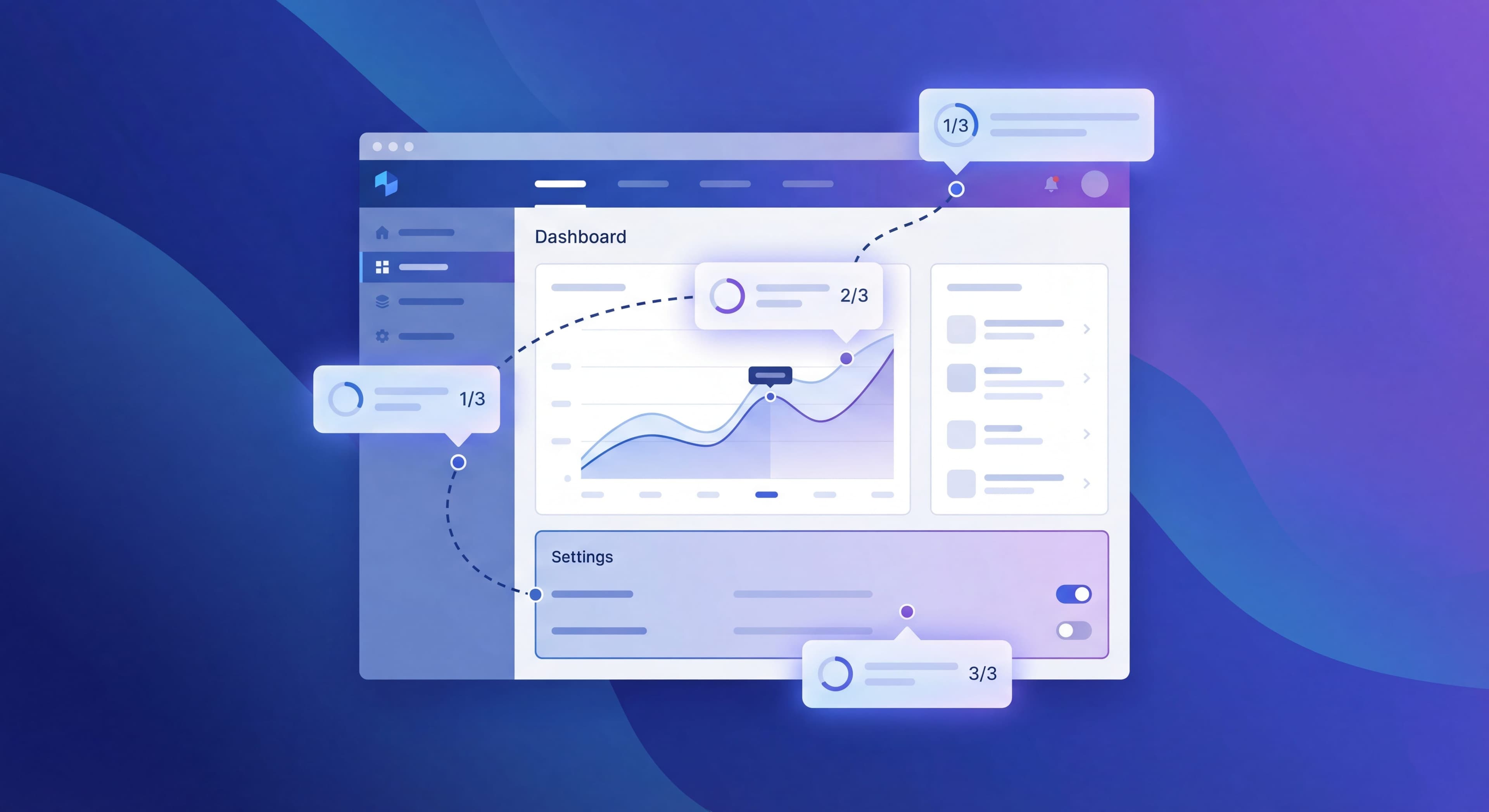
Progress Indication: Show step count (2/4)
Close Option: Always allow dismissal
Modal vs Tooltip Tours
Modal Tours:
- Center-screen explanations
- Good for: Welcome messages, overviews
- Risk: Feel interruptive
Tooltip Tours:
- Attached to specific elements
- Good for: Feature-specific guidance
- Risk: May obscure relevant UI
Animation and Attention
Subtle Pulsing: Draws attention to target element
Smooth Transitions: Between steps feels polished
Entry Animation: Establishes tour presence
Avoid: Aggressive flashing, multiple animated elements
Measuring Tour Success
Key Metrics
Start Rate: % of targeted users who begin tour
- Target: 70%+ if auto-triggered
- Low rate suggests bad timing or targeting
Completion Rate: % who finish all steps
- Target: 60%+ for 3-5 step tours
- Low rate suggests too long or not valuable
Step Drop-off: Which steps lose users
- High drop-off = problematic step
- Review copy, length, and relevance
Time per Step: How long users spend
- Very short = skimming
- Very long = confusion
Impact Metrics
Activation Rate: Do tour completers activate at higher rates?
Feature Adoption: Do tours increase usage of featured capabilities?
Support Tickets: Do tours reduce questions about toured features?
Retention: Do tour completers retain better?
A/B Testing Tours
Test Variables:
- Tour length (3 vs 5 steps)
- Copy variations
- Trigger timing
- Interactive vs passive
- With/without tour
Methodology:
- Run tour for 50% of new users
- Compare activation rates
- Ensure statistical significance
Training taking too long?
Create step-by-step guides that get users productive faster with Glitter AI.
Common Tour Mistakes
The Comprehensive Tour
Trying to show every feature creates a 15-step tour nobody finishes. Focus on what users need right now.
The Forced Tour
Blocking product access until tour completion breeds resentment. Let users skip.
The Timing-Blind Tour
Launching tours when users have clear intent interrupts their goals. Detect intent and respect it.
The Copy Novel
Three paragraphs per step gets skimmed or skipped. Write tight.
The Set-and-Forget Tour
Building a tour and never improving it. Tours need continuous optimization based on data.
Tour Implementation Checklist
Before Building
- Defined clear goal (what should users do after?)
- Identified target segment
- Determined optimal trigger
- Outlined 3-5 essential steps
- Justified why each step is necessary
During Building
- Written concise, action-oriented copy
- Created clear visual highlighting
- Added progress indicators
- Included skip/close option
- Made interactive elements functional
After Launch
- Set up analytics tracking
- Established baseline metrics
- Scheduled optimization review
- Planned A/B tests
- Created iteration timeline
Onboarding knowledge stuck in heads?
Turn your product tour expertise into shareable guides that scale your team's effectiveness with Glitter AI.
Building Your First Tour
Start simple:
- Identify one key action you want new users to take
- Create 3 steps guiding users to that action
- Trigger on first visit to relevant area
- Write minimal copy for each step
- Measure completion and impact
- Iterate based on data
One focused, effective tour beats five mediocre ones.
Continue learning: Psychology of User Onboarding and Tooltips and Hotspots Guide.
Frequently Asked Questions
How many steps should a product tour have?
The ideal product tour length is 3-5 steps. Data shows 3-step tours achieve 72% completion while 7-step tours drop to just 16%. If you have more to teach, break content into multiple shorter tours triggered at different moments.
What makes an interactive product tour effective?
Effective product tours are focused on one goal, relevant to user needs, short enough to respect attention spans, actionable with clear next steps, and optional so users can skip without penalty.
When should I trigger a product tour?
The best product tours use behavioral triggers, appearing when users need guidance rather than immediately on page load. Examples include showing a tour when users hover over unfamiliar features, create their first project, or visit empty report pages.
How do I write good product tour copy?
Keep copy concise (15-30 words per step), be specific with instructions like 'Click the blue Create button', focus on benefits rather than features, and start each step with action verbs like Click, Enter, or Select.
How do I measure product tour success?
Track start rate (target 70%+ for auto-triggered tours), completion rate (target 60%+ for 3-5 step tours), step drop-off to identify problematic steps, and impact metrics like activation rates and feature adoption among tour completers.