First-Time User Experience (FTUE): A Product Manager's Guide

The first five minutes with your product decide whether users stick around or join the 40-60% who never come back after their initial session. First-time user experience (FTUE) is about making those early moments count, turning curious signups into engaged users who see value and want to return. Research shows 21% of users abandon an app after one use, and 80% say they'll delete an app if it's hard to use. A smooth first-time experience can boost retention by up to 50%. FTUE deserves focused attention because it's not just about first impressions. It's about converting initial interest into activation and long-term engagement.
This guide covers what product managers and designers need to know about FTUE that converts, from the first 30 seconds through the path to first value, with specific tactics, examples, and measurement approaches you can start using right away.
Users leaving after signup?
Create step-by-step guides that walk new users through their first five minutes and reduce drop-off with Glitter AI.
What is First-Time User Experience?
FTUE covers everything from signup completion to accomplishing the first meaningful task. It's the bridge between acquisition and activation, and it's where most products lose their users.
Unlike ongoing onboarding, FTUE focuses specifically on:
- First impressions and welcome moments
- Initial configuration and setup
- Empty state handling
- The path to first success
Why the First Five Minutes Matter
User attention and intent hit their peak right at signup. They've just made a decision, taken action, and arrived expecting something. This is your highest-leverage moment.
The decay curve is brutal:
- 10% of users drop off within 60 seconds if confused
- 40-60% never return after first session
- Users form opinions about products in under 30 seconds
Every moment of friction in FTUE compounds into lost users.
The Critical First Five Minutes
Seconds 0-30: First Impression
Users make snap judgments about:
- Is this product professional?
- Does it match my expectations?
- Do I understand what to do?
- Is this for people like me?
Design implications:
- Welcome screen should acknowledge their goal
- Visual design should match their sophistication level
- Clear primary action should be obvious
- Branding should feel appropriate
Seconds 30-60: Orientation
Users are asking:
- Where am I?
- What can I do here?
- What should I do first?
- How do I get started?
Design implications:
- Clear visual hierarchy
- Obvious starting point
- Reduced cognitive load
- Helpful empty states
Minutes 1-3: First Action
Users attempt their first meaningful action:
- Can I accomplish something quickly?
- Does this work as expected?
- Am I making progress?
- Is this going to solve my problem?
Design implications:
- Low-friction first task
- Immediate feedback on actions
- Visible results
- Error prevention and recovery
Minutes 3-5: Value Assessment
Users evaluate the experience:
- Was this worth my time?
- Will this solve my problem?
- Do I want to continue?
- Should I come back?
Design implications:
- Clear demonstration of value
- Reason to return
- Save progress
- Next step clarity
Welcome Screens That Convert
Elements of Effective Welcome Screens
Personalization: Use their name if captured. Acknowledge what brought them.
Value Reminder: Briefly reinforce why they signed up.
Clear CTA: One obvious next action. Not three options.
Progress Context: If there's a setup process, show where this fits.
Skip Option: Let users who know what they want jump ahead.
Welcome Screen Patterns
The Warm Greeting:
"Welcome, Sarah! Let's get your first project organized. This takes about 2 minutes."
The Goal Acknowledgment:
"Ready to stop losing track of customer conversations? Let's connect your inbox."
The Quick Win Promise:
"In the next 3 minutes, you'll send your first automated message."
Anti-Patterns to Avoid
The Feature Dump:
"Welcome! ProjectApp includes tasks, calendars, gantt charts, time tracking, resource planning, reports, and integrations!"
The Tutorial Request:
"Before you start, let's take a 10-minute tour of all our features."
The Survey First:
"Before we begin, tell us about your company, team size, industry, role..."
Setup Wizards That Don't Kill Conversion
Setup is often unavoidable. You need integrations, preferences, team structure. But bad setup flows kill conversion.
Setup Wizard Best Practices
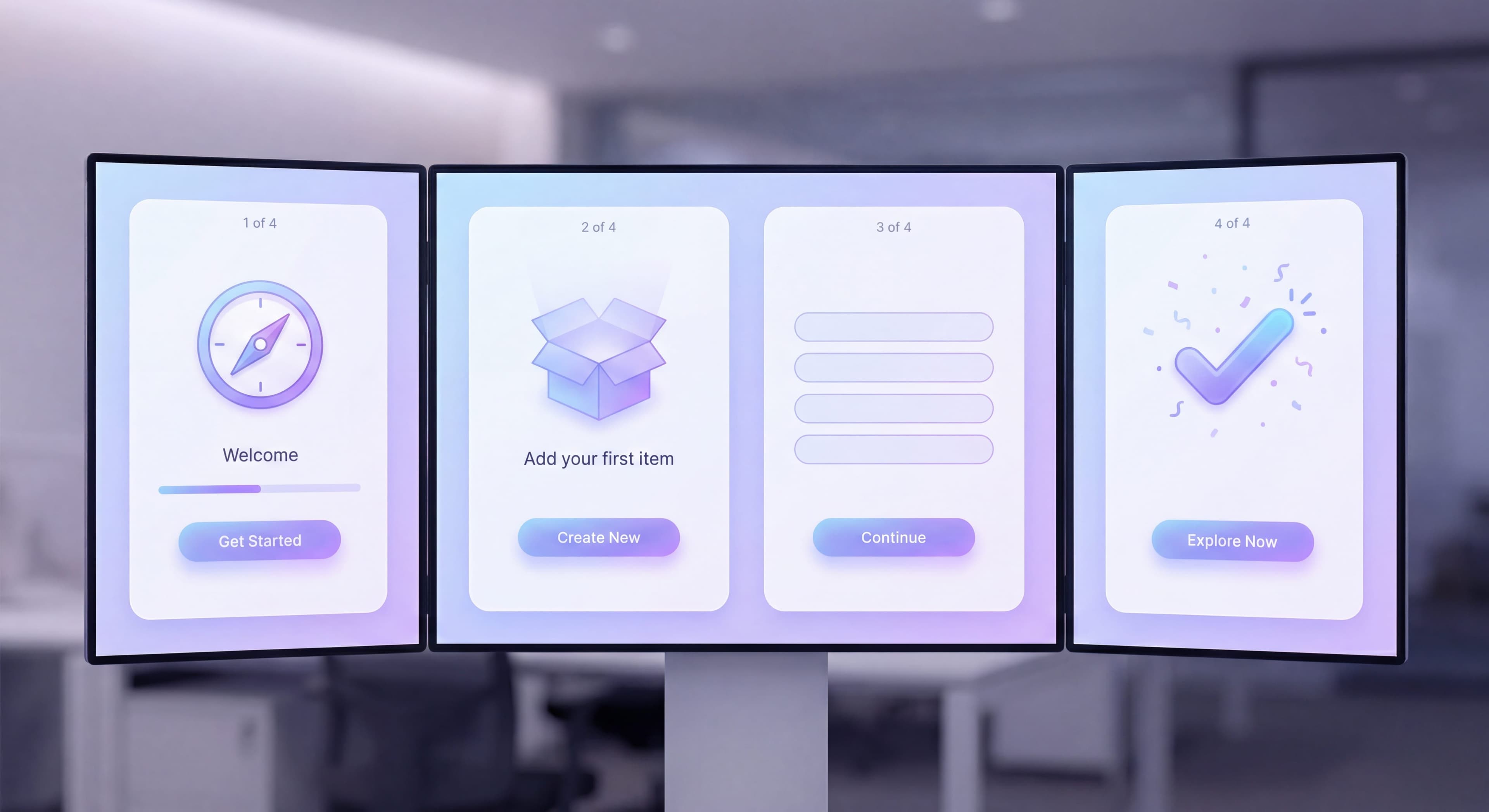
Show Progress: "Step 2 of 4" reduces anxiety about length.
Explain Why: "We're asking this to personalize your experience."
Enable Skipping: "Skip for now (you can do this later)" on non-essential steps.
Smart Defaults: Pre-fill what you can. Reduce decisions.
Celebrate Milestones: Small wins between steps maintain momentum.
What to Ask When
During Signup (absolute minimum):
- Password (or social auth)
Setup Wizard (essential configuration):
- Primary use case or role
- Team size (if relevant)
- Workspace name or project name
- Critical integration (if required for value)
Later (progressive profiling):
- Detailed preferences
- Secondary integrations
- Team invites
- Advanced configuration
Setup Flow Example
Step 1: Name Your Workspace
"What should we call your team's space?"
[Default: Sarah's Team] [Skip - I'll do this later]
Step 2: Your Role
"What best describes you? This helps us customize your experience."
○ Project Manager ○ Designer ○ Developer ○ Executive ○ Other
Step 3: Quick Win
"Create your first project to see how [Product] works."
[+ Create Project] [Skip - explore first]
Done: You're all set!
"Your workspace is ready. Start by adding your first task."
Empty States That Drive Action
Empty states are some of your most viewed screens. New users encounter them constantly. Design them with intention.
Empty State Components
Explanation: What this area is for
Why Empty: Briefly acknowledge the blank state
Primary Action: Clear CTA to populate the area
Visual Support: Illustration or example
Help Option: Link to learn more (optional)
Empty State Examples
Bad Empty State:
No tasks found.
Good Empty State:
[Illustration of organized tasks]

No tasks yet

Tasks help you track what needs to get done.
Add your first task to get started.

[+ Add Task]

Need help? Learn about tasks →
Empty State Patterns by Type
Dashboard Empty:
Focus on the primary action that will populate the dashboard.
"Your dashboard shows project progress at a glance. Create your first project to see it in action."
List Empty:
Guide to adding the first item.
"Contacts you add will appear here. Import from a spreadsheet or add manually."
Search Empty:
Acknowledge no results, suggest alternatives.
"No results for 'quarterly review.' Try different keywords or create a new item."
Quick Wins: The Key to FTUE Success
Quick wins are low-effort actions with immediate visible results. They build confidence and get momentum going.
Characteristics of Good Quick Wins
- Completable in under 60 seconds
- Obviously valuable result
- Minimal decisions required
- Low stakes (mistakes are reversible)
- Representative of core value
Quick Win Examples by Product Type
Project Management:
Create a task → See it in your list → Check it off → Feel accomplished
Email Marketing:
Select a template → Customize one field → Preview the result → Feel professional
Analytics:
Connect data source → See first chart appear → Understand the insight → Feel informed
CRM:
Add a contact → See timeline appear → Log an activity → Feel organized
Designing Quick Wins
- Identify your product's core action
- Reduce it to absolute minimum
- Pre-populate with example data
- Provide clear next step
- Celebrate completion
FTUE Audit Checklist
Use this checklist to audit your FTUE:
Same questions over and over?
Create self-serve documentation that empowers users to help themselves with Glitter AI.
Welcome Experience
- Does welcome screen acknowledge user's goal?
- Is there a single, clear primary action?
- Can users skip to product if they prefer?
- Does it feel personal, not generic?
Setup Flow
- Is each step clearly necessary?
- Do users understand why we're asking?
- Can non-essential steps be skipped?
- Is progress visible?
- Are smart defaults provided?
Empty States
- Do all empty states have clear CTAs?
- Is there helpful context, not just "no data"?
- Do empty states guide users toward value?
First Actions
- Is there an obvious first action?
- Can it be completed in under 60 seconds?
- Is the result immediately visible?
- Is it representative of core value?
Error Handling
- Are errors friendly and actionable?
- Can users easily recover from mistakes?
- Do we prevent errors before they happen?
Orientation
- Is the interface self-explanatory?
- Is the first screen focused, not overwhelming?
- Is navigation clear?
Same questions over and over?
Create self-serve documentation that empowers users to help themselves with Glitter AI.
Measuring FTUE Success
Key Metrics
Time to First Action: How long until users do something meaningful?
- Target: Under 2 minutes
First Action Completion Rate: What % complete the intended first action?
- Target: 60%+
Session Duration: How long do first sessions last?
- Too short (< 1 min) indicates confusion
- Very long without activation indicates struggle
Return Rate: What % come back within 24/48/72 hours?
- Day 1 return target: 30%+
Qualitative Signals
User Testing: Watch users complete FTUE. Note confusion, hesitation, questions.
Support Tickets: First-day tickets indicate FTUE failures.
Rage Clicks/Exits: Heat mapping shows frustration points.
FTUE Across Product Types
Complex B2B Products
Challenge: Users need education before value
Solution: Guided setup with explanation, sample data
Simple Consumer Apps
Challenge: Users expect immediate value
Solution: Minimal setup, quick win in seconds
Collaborative Tools
Challenge: Solo value is limited
Solution: Show value of collaboration, prompt invites early
Data-Dependent Products
Challenge: Empty states dominate without data
Solution: Sample data, easy import, immediate insight
Common FTUE Mistakes
The Information Dump
Showing users everything upfront creates overwhelm. Reveal things gradually instead.
The Forced Tour
Mandatory tours before users can explore create resentment. Give users a choice.
The Complex First Action
If the first thing users need to do is complicated, they'll leave. Keep it simple.
The Forgettable Experience
Generic "Welcome to AppName" doesn't create connection. Be memorable. Be specific.
The Abandoned Setup
Starting setup but not finishing leaves users stranded. Either require completion or handle partial setup gracefully.
Empty states confusing users?
Create step-by-step guides that turn blank screens into clear paths to first value with Glitter AI.
Building Great FTUE
Great FTUE starts with empathy. What do users want to accomplish? What are they worried about? What would make them happy?
It requires restraint. Show less, not more. Guide gently. Enable success instead of demonstrating features.
And it demands iteration. Measure everything, watch users, ask questions, and keep refining.
Products that win respect users' time and intelligence while guiding them to success. That's what great FTUE delivers.
Continue learning: Self-Serve vs High-Touch Onboarding and Reducing Onboarding Friction.
Frequently Asked Questions
What is first-time user experience (FTUE)?
FTUE encompasses everything a user experiences from completing signup until accomplishing their first meaningful task. It includes first impressions, welcome screens, initial configuration, empty state handling, and the path to first success. FTUE is where most products lose users.
Why do the first five minutes matter so much for new users?
User attention and intent peak at signup. The decay curve is brutal: 10% drop off within 60 seconds if confused, 40-60% never return after first session, and users form opinions in under 30 seconds. Every moment of friction in FTUE compounds into lost users.
How should I design effective welcome screens?
Include personalization using their name, a value reminder of why they signed up, one clear CTA for the next action, progress context for setup processes, and a skip option for users who want to explore. Avoid feature dumps, mandatory tutorials, or surveys before showing value.
What makes a good quick win in FTUE design?
Good quick wins are completable in under 60 seconds, produce obviously valuable results, require minimal decisions, have low stakes with reversible mistakes, and represent core product value. They build user confidence and momentum toward activation.
How do I design empty states that drive action?
Include an explanation of what the area is for, briefly acknowledge it's empty, provide a primary CTA to populate the area, add visual support like illustrations, and optionally link to help content. Never just show 'No data found' without guiding users forward.