Tooltips and Hotspots: When and How to Use In-App Guidance
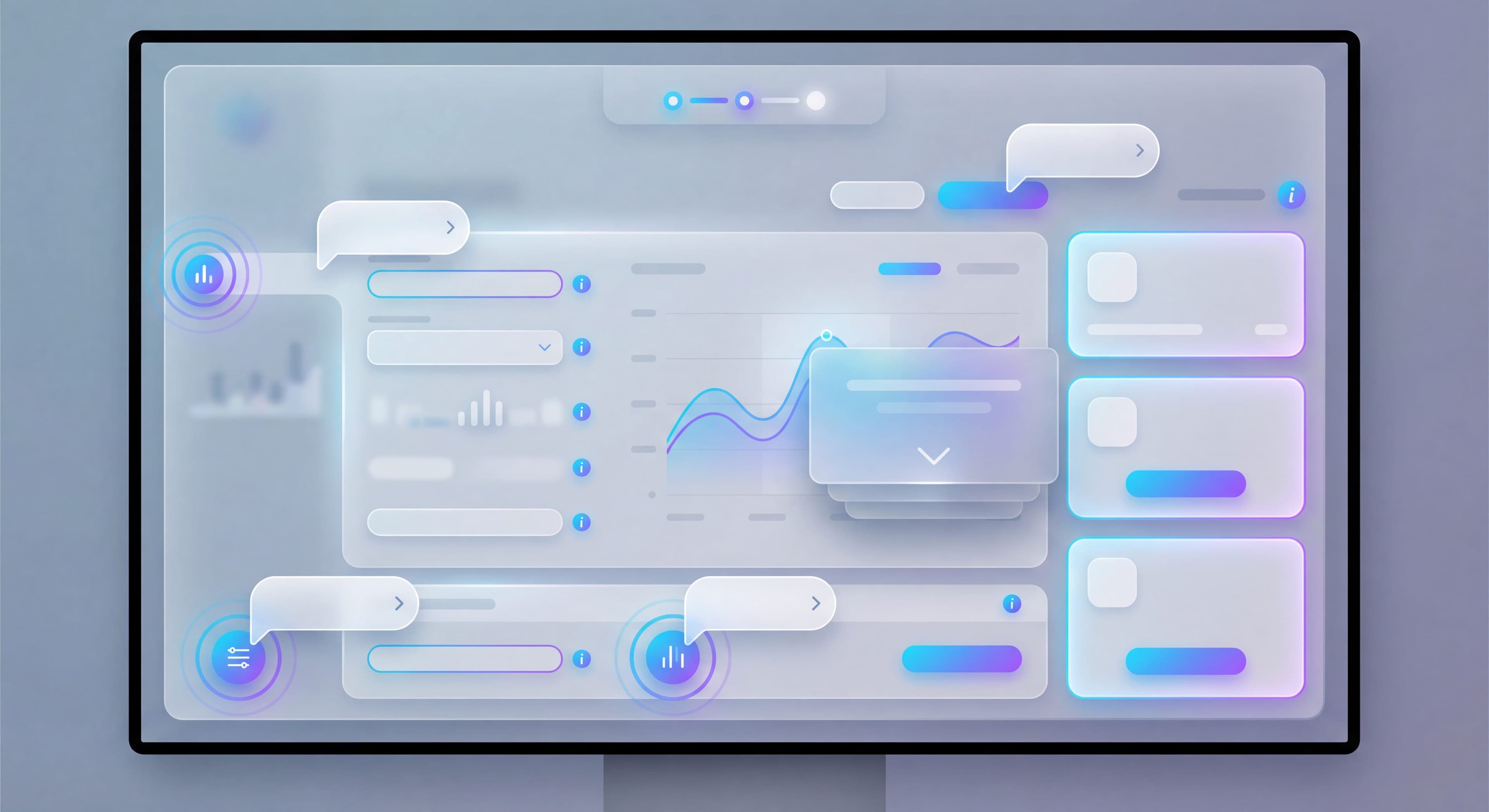

In-app tooltips and hotspots do the heavy lifting of user guidance. Unlike full product tours, they deliver bite-sized, contextual help exactly when users need it. Done well, they feel like invisible assistants guiding users to success without breaking their flow. Done poorly? They're just annoying pop-ups that users dismiss without reading, creating negative associations and missing the chance to drive feature adoption.
The way tooltips and hotspots work has evolved quite a bit. Rather than showing the same generic messages to everyone, better implementations now trigger based on user behavior, target specific segments, and personalize content based on roles. According to UserGuiding's website tooltip guide, tooltips work best for directed sequences and walkthroughs, while hotspots provide passive feature discovery. Research shows that contextual triggering dramatically increases engagement. In-app tooltips triggered by user actions see much higher interaction rates than those shown on page load.
Knowing when to use tooltips versus hotspots versus beacons, how to write good copy, and how to avoid tooltip fatigue makes the difference between helpful guidance and user annoyance. Chameleon's tooltip research points out that while tooltips can be overused, when implemented with the right triggers and concise messaging, they become powerful tools for contextual education. This guide covers how to use these tools without creating fatigue.
Training taking forever?
Create step-by-step guides that walk users through your product features in minutes with Glitter AI.
Types of In-App Guidance
Tooltips
Tooltips are small text boxes attached to specific UI elements, providing brief explanations or guidance in context. According to Userpilot's tooltip best practices guide, a good tooltip is short and snappy. Space is limited, so messaging should be minimal. Tooltips respect user agency by providing information without forcing interaction, which makes them ideal for users who need help but don't want mandatory training sequences.
These contextual helpers work best for explaining non-obvious features, providing context about why a feature exists, and showing users exactly what to do next. The key to effective tooltips is restraint. They should enhance understanding without overwhelming users.
Hotspots
Product hotspots are pulsing indicators, usually subtle dots or circles, that draw attention to features without immediately explaining them. As noted in Whatfix's hotspot guide, hotspots are minimalist UX elements designed to capture attention without being intrusive. They provide contextual information like explaining how a feature works or highlighting an essential part of your UI.
These attention-grabbing elements work best for drawing attention to undiscovered features, indicating that elements are interactable when it's not obvious, and appealing to curious users who prefer to explore rather than being told what to do. Hotspots shine in their passive approach. They invite interaction without demanding it, respecting users who may not need guidance at that moment.
Beacons
Beacons work similarly to hotspots but are larger and more prominent, reserved for important discoveries that warrant stronger visual emphasis. According to Chameleon's hotspot tooltip template, beacon tooltips combine a visual indicator with informational content, using pulsing dots or rings positioned near target elements. The visual cue needs balance: noticeable enough to catch attention but not so prominent that it disrupts the current task.
Beacons work best for major new feature announcements, critical actions users should take to avoid problems, and time-sensitive information like limited-time offers. The increased prominence means they should be used sparingly. If everything is marked as important, nothing is.
Coach Marks
Coach marks are full-screen or overlay guides that dim the background and highlight specific areas, creating focused attention on particular elements. These more intrusive elements work best for first-time experiences where users need orientation, complex UIs that require step-by-step explanation, and multi-step processes that benefit from isolated focus on each component. They're more disruptive than tooltips or hotspots, but sometimes users genuinely need that level of guidance before they can proceed.
Tooltips vs Hotspots vs Beacons
| Type | Visibility | Information Density | Best Use |
|---|---|---|---|
| Tooltip | Medium | High | Explanation needed |
| Hotspot | Low | Low | Discovery encouraged |
| Beacon | High | Medium | Attention required |
Trigger Strategies
The most important decision in in-app guidance isn't what to show. It's when to show it. Contextual triggering dramatically increases engagement compared to page-load triggers. Timing determines whether your tooltip feels helpful or intrusive, whether users engage or dismiss, and whether your guidance actually drives behavior change or just creates fatigue.
Page Load Triggers
Page load triggers display contextual help tooltips when users reach a specific page, making them immediately visible. This works well for first-time visits where orientation is valuable, critical information users must understand before proceeding, and new feature announcements that warrant immediate attention. But page load triggers carry risks. They may interrupt user intent when someone arrives with a specific goal. They can feel intrusive if users see the same tooltip repeatedly. And users often reflexively close anything that appears automatically.
Research on in-app tooltip best practices emphasizes behavioral triggers over page load whenever possible. They're more contextual and less likely to interrupt focused work. Reserve page load triggers for genuinely critical information.
Hover Triggers
Hover triggers reveal content when users move their cursor over an element, providing information on demand without cluttering the interface. This pattern works well for additional context when users are already examining an element, help for confusing interface elements, and details about options in dropdowns or configuration panels. The limitations matter though: hover interactions don't work on mobile devices at all. Users may never hover if the affordance isn't obvious. And tooltips must appear quickly enough to feel responsive but not so fast they appear accidentally during cursor movement.
Despite limitations, hover triggers respect user agency more than page load triggers. Users explicitly request the information through their behavior rather than having it forced on them.
Click Triggers (Help Icons)
Click triggers require users to actively click a "?" or "i" icon to reveal guidance, making them the most user-initiated form of tooltip interaction. These icons work well for reference information users might need occasionally, complex features requiring detailed explanation, and users actively looking for help. The risks: low discovery since users must notice the help icon, users may not know they should click if the icon blends in, and help icons add visual clutter when overused.
According to Chameleon's SaaS tooltip design research, tooltips become powerful tools when implemented with appropriate triggers. Click-triggered help is the least intrusive approach but requires the most user initiative.
Behavioral Triggers
Behavioral triggers display in-app guidance based on specific user actions or patterns. This is the most sophisticated approach to tooltip timing. These triggers work best for contextual help when users are struggling, feature suggestions based on actual actions showing interest or need, and progressive disclosure where guidance appears as users demonstrate readiness.
Effective examples: show an explanation when users hover over a feature three times (curiosity without understanding), redirect with guidance when users click the wrong button (intent but confusion), suggest related features when users complete an action (ready for next steps), display help when users spend 30+ seconds without action (probably stuck), and offer advanced features only after users have mastered basic ones.
Time-Based Triggers
Time-based triggers display guidance after users spend a certain amount of time in an area, balancing page load immediacy with behavioral awareness. These patterns work well for ensuring users have oriented before showing guidance, catching stuck users who haven't explicitly requested help, and not interrupting confident users who know exactly what they're doing.
The key is calibrating the delay. Too short and you interrupt confident users. Too long and struggling users suffer before receiving help.
First-Time Triggers
First-time triggers show guidance only on users' first encounter with an element, preventing the fatigue that comes from seeing the same messages repeatedly. This approach works for new feature education (users need orientation once, not ongoing reminders), first-use orientation to interface elements, and avoiding the cardinal sin of annoying repeat visitors with redundant information.
Implementation requires tracking which tooltips each user has seen, typically in user profiles or browser local storage, and respecting dismissals. Combining first-time triggers with behavioral signals creates optimal timing: show advanced feature tooltips on first encounter, but only after users have demonstrated basic proficiency.
Writing Effective Tooltip Copy
The Formula
What + Why + How (optional)
What: What is this thing?
Why: Why would I use it?
How: How do I use it? (if not obvious)
Character Limits
Title (optional): Under 5 words
Body: Under 30 words
CTA (optional): 2-4 words
Good vs. Bad Examples
Bad:
"This is the export button. Clicking this button will allow you to export your data in various formats including CSV, Excel, and PDF. You can also schedule automated exports by configuring the settings in the export preferences panel."
Good:
"Export your data as CSV, Excel, or PDF.
[Export Now]"
Bad:
"Settings"
Good:
"Customize notifications, integrations, and team access.
[Open Settings]"
Action-Oriented Copy
Lead with what users can do:
- "Filter results by date, status, or assignee"
- "Invite teammates to collaborate in real-time"
- "Track changes with version history"
Not what the feature is:
- "This is the filter feature"
- "The team invitation area"
- "Version history section"
Placement Best Practices
Position Relative to Element
Above: Default for bottom-of-screen elements
Below: Default for top-of-screen elements
Left/Right: When vertical space is limited
Rule: Don't cover what you're explaining
Pointer/Arrow
Always point directly to the relevant element. Users should know exactly what you're referencing.
Z-Index and Layering
Tooltips should appear above other elements but not break the page layout.
Responsive Considerations
- Reposition on small screens
- Ensure touch-friendly dismissal
- May need to simplify or relocate on mobile
Avoiding Tooltip Fatigue
The Problem
Too many tooltips → Users dismiss without reading → Guidance becomes invisible → Missed opportunities
Tired of repeating yourself?
Create step-by-step SOPs once and share them with your entire team using Glitter AI.
Signs of Fatigue
- Low engagement rates (< 10% interaction)
- Fast dismissals (< 2 seconds view time)
- Complaints about pop-ups
- Users disabling guidance
Prevention Strategies
Limit Quantity:
- Maximum 2-3 new tooltips per session
- Prioritize most important guidance
- Remove low-value tooltips
Use Smart Timing:
- Not on every page load
- Respect user intent
- Delay until users orient
Make Dismissal Easy:
- Clear close buttons
- Click outside to dismiss
- "Don't show again" options
Personalize:
- Don't show guidance users don't need
- Track what users have seen
- Adapt to user expertise
Ensure Value:
- Every tooltip must help
- Remove explanations for obvious things
- Test if tooltips improve outcomes
Hotspot Design
Visual Design
Pulsing Animation:
Draws attention without being aggressive. Gentle pulse every 2-3 seconds.
Color:
Match brand but ensure visibility. Often use accent color.
Size:
12-20px diameter. Large enough to notice, small enough to not obstruct.
Behavior
On Hover: Expand or show preview
On Click: Open full tooltip or feature
After View: Stop pulsing (user has noticed)
Placement
- Don't cover important UI
- Place near but not on the element
- Consider scrolling behavior
Beacon Strategies
When to Use Beacons
- Major new feature launches
- Critical one-time announcements
- Important actions users might miss
- Time-sensitive information
Beacon Design
More Prominent Than Hotspots:
- Larger animation
- Brighter colors
- May include text preview
Urgency Signals:
- "New" badge
- Countdown timers
- Pulsing intensification
Frequency
Beacons should be rare. If everything is a beacon, nothing is.
Rules:
- Maximum 1 beacon at a time
- Not on every page
- Clear dismissal path
- Don't return after dismissal
Measuring Guidance Effectiveness
Engagement Metrics
View Rate: % of eligible users who see the tooltip
Interaction Rate: % who interact (click CTA, hover, etc.)
Dismissal Time: How quickly users dismiss
Follow-Through: % who take the suggested action
Impact Metrics
Feature Adoption: Does tooltip increase feature use?
Support Tickets: Does guidance reduce questions?
User Sentiment: NPS/CSAT for users who see vs. don't see
A/B Testing
Test variations:
- Tooltip vs. no tooltip
- Different copy versions
- Different trigger timings
- Different placements
Same questions over and over?
Create self-serve documentation that empowers users to help themselves with Glitter AI.
Implementation with Tools
Most Digital Adoption Platforms Include:
- Tooltip creation
- Hotspot placement
- Trigger configuration
- Targeting by segment
- Analytics tracking
Common Tools
- Appcues
- Userpilot
- UserGuiding
- Chameleon
- Pendo
- WalkMe
Implementation Checklist
- Define trigger condition
- Write concise copy
- Place tooltip appropriately
- Set targeting rules (who sees this?)
- Configure frequency (how often?)
- Add analytics tracking
- Test on multiple screen sizes
- Set review date
Contextual Guidance Patterns
New Feature Discovery
Pattern: Beacon on new feature → Click reveals tooltip → CTA to try feature
Trigger: First visit after feature launch
Frequency: Until interacted or dismissed
Target: Users who would benefit
Stuck User Help
Pattern: Tooltip appears when user seems stuck
Trigger: User on page > 30 seconds without action
Content: Help for common blockers
CTA: Link to help or simpler path
Progressive Disclosure
Pattern: Basic feature tooltip → After mastery, advanced tip
Trigger: Usage threshold reached
Content: "Now that you've mastered X, try Y"
Target: Engaged users ready for more
Error Prevention
Pattern: Warning before common mistakes
Trigger: User approaches risky action
Content: Confirmation or alternative suggestion
CTA: Proceed or safer alternative
Same questions over and over?
Create self-serve documentation that empowers users to help themselves with Glitter AI.
Best Practices Summary
Do:
- Keep copy under 30 words
- Use behavioral triggers over page load
- Limit to 2-3 new tooltips per session
- Make dismissal easy
- Measure impact
Don't:
- Explain obvious things
- Show tooltips on every page
- Stack multiple tooltips
- Make dismissal hard
- Ignore fatigue signals
Contextual guidance should feel like a helpful friend, not an annoying pop-up. The best in-app tooltips make users grateful. The worst ones make them hunt for the close button.
Continue learning: In-App Announcements and Resource Centers.
Frequently Asked Questions
What is the difference between tooltips, hotspots, and beacons?
Tooltips are text boxes attached to UI elements providing explanations. Hotspots are pulsing indicators that draw attention without explaining. Beacons are larger, more prominent animations for important discoveries. Use tooltips when explanation is needed, hotspots for discovery, and beacons for critical attention.
How do I avoid tooltip fatigue in my product?
Limit to 2-3 new tooltips per session, use behavioral triggers over page load, make dismissal easy with clear close buttons, personalize based on user expertise, and ensure every tooltip provides genuine value. Watch for warning signs like fast dismissals and low engagement rates.
What are the best trigger strategies for in-app guidance?
Behavioral triggers based on user actions are most effective. Show guidance when users seem stuck (30+ seconds without action), hover repeatedly over elements, or reach usage thresholds. First-time triggers for new features and time-based delays prevent interrupting user intent.
How should I write effective tooltip copy?
Keep body text under 30 words. Lead with what users can do (action-oriented), not what the feature is. Use the formula: What is it + Why use it + How (if not obvious). Include a clear CTA. Avoid explaining obvious UI elements.
How do I measure whether in-app tooltips are working?
Track view rate, interaction rate, dismissal time, and follow-through on suggested actions. Measure impact on feature adoption and support ticket reduction. A/B test tooltip vs no tooltip, different copy versions, trigger timings, and placements to optimize effectiveness.