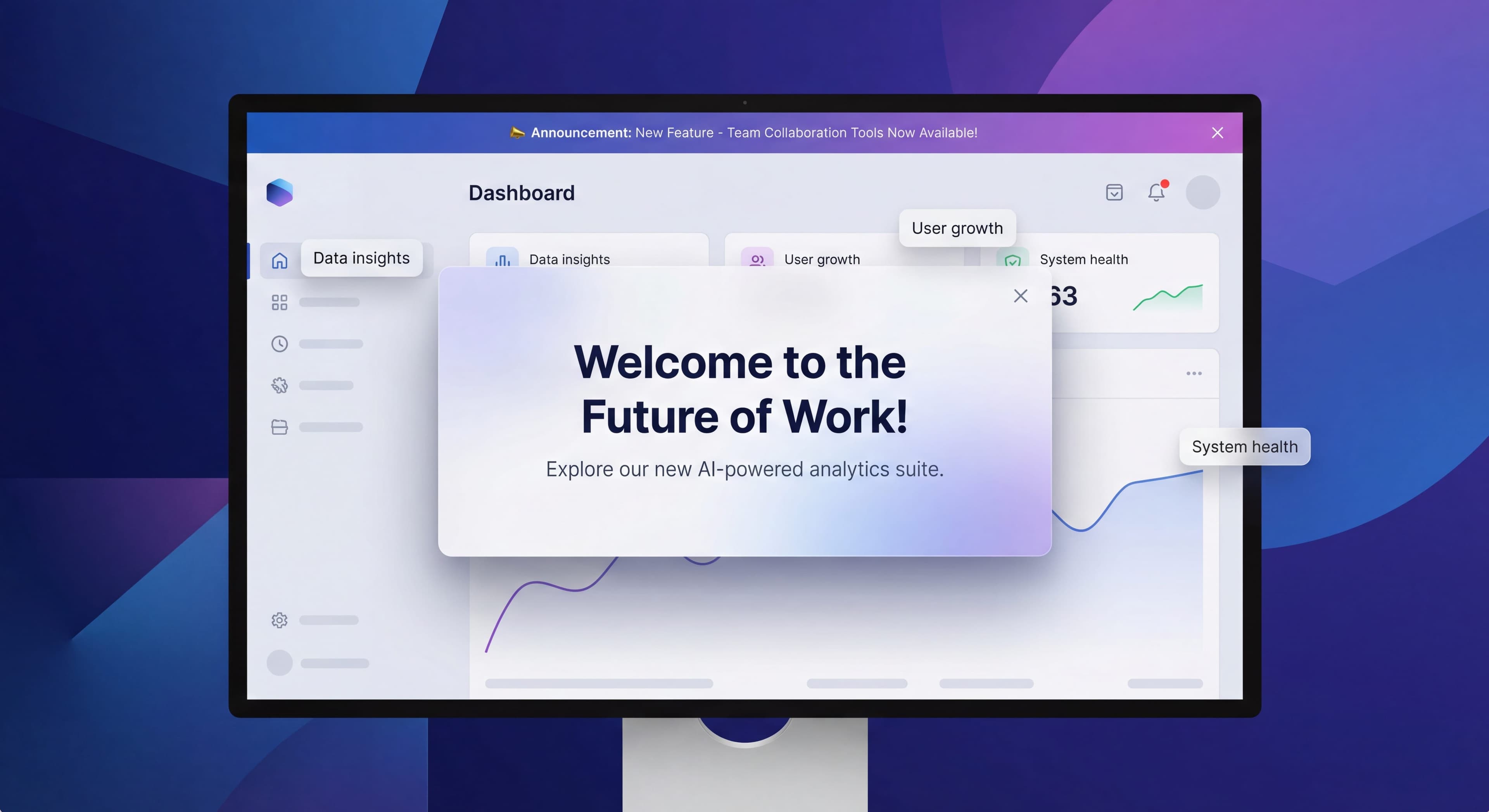
Announcement Modals and Banners: Driving Feature Awareness

You spent months building a great new feature. It launches. And... nothing. Users don't notice. Adoption flatlines. Sound familiar?
In-app announcements are supposed to bridge the gap between shipping features and users actually finding them. But get them wrong and they become popup ads that people reflexively dismiss and resent.
This guide covers how to announce things in ways that people actually pay attention to, without annoying everyone in the process.
Announcement process inconsistent?
Create step-by-step guides that standardize your feature announcement workflow and improve adoption rates with Glitter AI.
Types of In-App Announcements
Modal Announcements
Full-screen or centered overlays that demand attention.
Characteristics:
- High visibility, high interruption
- Blocks user action until acknowledged
- Best for major announcements
- Risk of frustration if overused
Best For:
- Major feature launches
- Critical product updates
- Breaking changes users must know
- Onboarding milestones
Avoid For:
- Minor updates
- Frequent communications
- Non-essential information
Banner Announcements
Persistent or dismissible strips at top/bottom of interface.
Characteristics:
- Visible but non-blocking
- Can persist or be dismissible
- Lower interruption cost
- Often ignored if overused
Best For:
- System status updates
- Promotional announcements
- Time-sensitive information
- Gentle feature nudges
Avoid For:
- Complex explanations
- Required actions
- Information needing acknowledgment
Slideout Announcements
Panels that slide in from edge of screen.
Characteristics:
- Medium visibility and interruption
- More space than banners
- Less intrusive than modals
- Good for detailed information
Best For:
- Feature tours and explanations
- Contextual tips
- Multi-step announcements
- Rich media content
Tooltip Announcements
Small contextual bubbles near interface elements.
Characteristics:
- Highly contextual
- Minimal interruption
- Specific to element
- Easy to miss if poorly timed
Best For:
- New feature indicators
- UI changes
- Contextual tips
- Quick explanations
Choosing the Right Format
Decision Framework
| Factor | Modal | Banner | Slideout | Tooltip |
|---|---|---|---|---|
| Urgency | High | Medium | Medium | Low |
| Content Length | Medium | Short | Long | Very Short |
| User Action Required | Yes | Optional | Optional | No |
| Interruption Cost | High | Low | Medium | Very Low |
| Visibility | Very High | High | Medium | Low |
Match Format to Message
Critical Updates:
Use modals when users must be aware
- Security changes
- Breaking feature changes
- Required action needed
New Features:
Use slideouts or contextual tooltips
- Rich explanation space
- Show feature in context
- Allow immediate trial
Ongoing Promotions:
Use banners
- Persistent visibility
- Non-blocking
- Easy to dismiss when ready
UI Changes:
Use tooltips
- Point to what changed
- Contextual explanation
- Minimal disruption
Writing Announcement Copy
Modal Copy Structure
Headline (5-7 words):
Clear, benefit-focused statement
- "Track Time Without Leaving Projects"
- "New: Export Reports to PDF"
- "Your Dashboard Just Got Smarter"
Body (2-3 sentences):
What it is + why it matters
- Focus on user benefit
- Specific, not vague
- Actionable next step
CTA Button:
Action-oriented, specific
- "Try Time Tracking"
- "Explore New Dashboard"
- "See What's New"
Secondary Action:
Option to dismiss or learn more
- "Maybe Later"
- "Learn More"
- "Dismiss"
Banner Copy Guidelines
Keep it short: 10-15 words maximum
Lead with benefit: What do they gain?
Include clear CTA: What should they do?
Examples:
- "New: Schedule reports to arrive in your inbox. Set up now →"
- "Pro tip: Use keyboard shortcuts to work 2x faster. Learn them →"
- "Limited time: 20% off annual plans. Upgrade today →"
Avoid These Copy Mistakes
Vague Headlines:
Bad: "We've Made Some Updates"
Better: "New: Bulk Edit Multiple Tasks at Once"
Feature-Focused vs Benefit-Focused:
Bad: "We added Zapier integration"
Better: "Connect to 3,000+ apps with Zapier"
Passive Language:
Bad: "A new feature has been added"
Better: "You can now export data to Excel"
Too Much Information:
Bad: Three paragraphs explaining every detail
Better: One sentence + link to learn more
Timing Your Announcements
When to Show
Timing affects engagement more than most people realize. According to feature announcement research, well-timed versus poorly-timed can mean a 3-5x difference in engagement and adoption. Getting this right requires understanding the trade-offs.
Session start catches users when they have fresh attention and haven't gotten absorbed in their tasks yet. It's a natural pause when people are deciding what to do next. Downside: if someone logs in to finish something specific, a modal appearing immediately feels like an obstacle. Even a great feature announcement frustrates someone who just wants to do their thing.
After completing something works differently. When users finish a project, send a report, or hit a goal, they're feeling good. They're receptive to learning what else is possible. Research from TimeSolv's feature announcement case shows that triggering announcements in related areas works well, like showing payment features when someone visits the payment dashboard. The risk is interrupting power users who have their routines dialed in.
Detecting natural pauses sounds smart but proves tricky in practice. What looks like a pause might be someone thinking carefully about their next step. Interrupting "idle" users can feel intrusive when they're actually planning their approach.
Contextual relevance is the gold standard. Showing announcements exactly when users would benefit from the feature, right when they hit the problem it solves. According to mobile feature announcement UX research, these contextual moments create "aha" experiences that drive immediate adoption. The hard part is detecting relevant contexts accurately without false positives that make people distrust your announcements.
Frequency Considerations
Modal Fatigue:
- Maximum 1 modal per session
- Ideally 1-2 per week maximum
- Space out major announcements
Banner Tolerance:
- Can show more frequently
- Rotate different messages
- Allow permanent dismissal
Tooltip Tolerance:
- Can show contextually
- Once per feature per user
- Don't stack multiple tooltips
Avoiding Announcement Fatigue
Symptoms of Fatigue:
- Immediate dismissal
- Low engagement rates
- User complaints
- Negative feedback
Prevention Strategies:
- Quality over quantity
- Respect dismissals
- Frequency caps
- Priority systems
Targeting and Segmentation
Who Should See What
New Users:
- Welcome messages
- Onboarding prompts
- Getting started tips
- Feature discovery
Power Users:
- Advanced feature announcements
- Pro tips
- Beta feature invites
- Efficiency shortcuts
Returning Users:
- What's new since last visit
- Features they haven't tried
- Usage milestones
At-Risk Users:
- Re-engagement prompts
- Help resources
- Success stories
Targeting Criteria
By Usage:
- Active vs inactive
- Feature usage patterns
- Session frequency
By Account:
- Plan type
- Account age
- Team size
By Behavior:
- Recent actions
- Feature exploration
- Help seeking
By Attribute:
- Role
- Use case
- Industry
Exclusion Logic
Don't show announcements when:
- User already saw it
- User already uses feature
- User dismissed similar content
- User is mid-critical-task
Measuring Announcement Success
Key Metrics
View Rate:
Percentage of targeted users who saw announcement
Engagement Rate:
Percentage who clicked CTA (not dismiss)
Feature Adoption:
Users who try announced feature after viewing
Time to Dismiss:
How quickly users close without engaging
Downstream Conversion:
Impact on activation, conversion, or retention
Benchmarks
Modal Engagement:
- Good: 15-25% CTA click
- Average: 10-15%
- Poor: Below 10%
Banner Engagement:
- Good: 2-5% CTA click
- Average: 1-2%
- Poor: Below 1%
Feature Adoption Post-Announcement:
- Good: 20-30% try feature
- Average: 10-20%
- Poor: Below 10%
Analysis Approach
For Each Announcement:
- How many saw it?
- How many engaged?
- How many adopted the feature?
- What was the dismiss pattern?
Over Time:
- Are engagement rates declining?
- Which formats perform best?
- Which segments respond?
- What timing works?
Design Best Practices
Processes undocumented?
Create step-by-step SOPs that capture best practices in minutes with Glitter AI.
Visual Design
Modal Design:
- Clear visual hierarchy
- Prominent CTA button
- Image or illustration helps
- Easy dismiss option
- Mobile-responsive
Banner Design:
- High contrast for visibility
- Concise text
- Clear CTA button
- Obvious dismiss option
- Doesn't shift page content
Slideout Design:
- Smooth animation
- Clear close option
- Scrollable if needed
- Focused content
Accessibility
- Screen reader compatible
- Keyboard navigable
- Sufficient color contrast
- Clear focus states
- Dismissible via keyboard
Mobile Considerations
- Touch-friendly targets
- Full-width modals
- Bottom-aligned banners
- Larger text
- Easy dismissal
Common Announcement Mistakes
Mistake 1: Announcing Everything
Problem: Every feature gets a modal announcement
Result: Users tune out, dismiss without reading
Fix: Reserve modals for major announcements, use lighter formats for minor updates
Mistake 2: Poor Timing
Problem: Interrupting users during critical tasks
Result: Frustration, negative association
Fix: Detect appropriate moments, respect user context
Mistake 3: No Targeting
Problem: Same announcement to everyone
Result: Irrelevant messages, wasted attention
Fix: Segment by user type, behavior, and needs
Mistake 4: Feature Focus vs User Focus
Problem: "We built this cool thing!"
Result: Users don't care about your roadmap
Fix: Lead with user benefit, not feature specs
Mistake 5: No Follow-Up
Problem: Announce and forget
Result: Announcement doesn't drive adoption
Fix: Multiple touchpoints, contextual reminders
Mistake 6: Ignoring Dismissals
Problem: Showing same announcement repeatedly
Result: User frustration, banner blindness
Fix: Respect dismissals, don't resurrect closed announcements
Announcement Strategy
Creating an Announcement Calendar
Plan Ahead:
- Map upcoming releases
- Schedule announcements
- Avoid clustering
- Coordinate across teams
Prioritize:
- Rank by user impact
- Allocate modal budget
- Balance urgency levels
Multi-Channel Coordination
Announcements work best as part of larger communication:
Pre-Launch:
- Email teaser
- Blog post announcement
- Social media
Launch:
- In-app announcement
- Help documentation
- Support training
Post-Launch:
- Follow-up emails
- Contextual reminders
- Success stories
Testing and Iteration
What to Test:
- Headline variations
- CTA copy
- Visual design
- Timing
- Format (modal vs slideout)
How to Test:
- A/B test variants
- Measure engagement
- Track downstream adoption
- Gather qualitative feedback
Processes undocumented?
Create step-by-step SOPs that capture best practices in minutes with Glitter AI.
Real-World Examples
Feature Launch Modal
Headline: "Track Time Without Switching Tools"

Body: "New time tracking is here. Start a timer
directly from any task and see exactly where
your hours go."

CTA: "Try Time Tracking"
Secondary: "Learn More" | "Not Now"
System Update Banner
"We're upgrading our infrastructure tonight at
2am EST. Expect 10 minutes of downtime.
Learn more →"

[Dismiss X]
New Feature Tooltip
[Pointing to new button]

"New! Bulk actions"

"Select multiple items to edit,
delete, or move all at once."

[Got it]
Re-engagement Slideout
"We've added 5 features since your last visit"

- Bulk editing (save hours)
- Dark mode (easier on eyes)
- Keyboard shortcuts (work faster)
- API access (build integrations)
- Team permissions (control access)

[Explore What's New]
Building an Announcement System
Essential Capabilities
Targeting:
- User attributes
- Behavioral triggers
- Segment inclusion/exclusion
Scheduling:
- Start/end dates
- Frequency caps
- Priority ordering
Analytics:
- View tracking
- Engagement tracking
- Dismiss tracking
- Downstream attribution
Management:
- Easy creation
- A/B testing
- Archive/history
Tool Options
Built into DAPs:
Appcues, Userpilot, Pendo, UserGuiding all offer announcement features as part of their platforms.
Dedicated Tools:
Intercom, Chameleon for sophisticated targeting and design.
Custom Build:
Consider if you have very specific requirements or high volume needs.
Processes undocumented?
Create step-by-step SOPs that capture best practices in minutes with Glitter AI.
The Bottom Line
In-app announcements give you direct access to users, so be careful how you spend that privilege. Every announcement costs something: user attention and patience. Every irrelevant, badly-timed, or low-value announcement drains your credibility with users.
Key Principles:
- Match format to message importance
- Lead with user benefit
- Target precisely
- Time thoughtfully
- Measure and optimize
- Respect user attention
The best announcements don't feel like interruptions. They feel like useful information that arrived at exactly the right moment. That's the difference between driving awareness and driving users crazy.
Continue learning: Feature Adoption Strategies and Tooltips and Hotspots Guide.
Frequently Asked Questions
When should I use a modal vs banner for in-app announcements?
Use modals for major feature launches, critical updates, and breaking changes that users must acknowledge. Use banners for system status updates, promotions, and gentle feature nudges where you want visibility without blocking user actions.
How often can I show in-app announcement modals without causing fatigue?
Limit modals to maximum one per session and ideally 1-2 per week. Space out major announcements and watch for symptoms of fatigue like immediate dismissals, low engagement rates, and user complaints. Quality over quantity is essential.
What makes a good feature announcement modal?
Use a clear, benefit-focused headline of 5-7 words, a body of 2-3 sentences explaining what it is and why it matters, an action-oriented CTA button, and always include a secondary dismiss option. Lead with user benefit, not feature specs.
How do I measure if my in-app announcements are working?
Track view rate, engagement rate (CTA clicks vs dismissals), feature adoption after viewing, time to dismiss, and downstream conversion impact. Good modal engagement is 15-25% CTA click rate; for banners aim for 2-5%.
How should I target in-app announcements to different user segments?
Segment by usage (active vs inactive), account type (plan, age, team size), behavior (recent actions, feature exploration), and attributes (role, use case). Exclude users who already saw the announcement, already use the feature, or are mid-critical-task.