Pricing Page to Activation: Optimizing the Conversion Path

Getting someone from your pricing page to actually using your product is harder than it looks. People drop off at every step: the pricing page itself, signup, the welcome experience, and that first moment of value.
Here's the good news: small improvements add up fast. A 10% boost at each of four stages means 46% more activated users from the same traffic.
Let's walk through how to optimize each step.
Users dropping off?
Create step-by-step guides that help users reach value faster and boost activation rates with Glitter AI.
The Conversion Funnel
The Full Journey
Pricing Page Visit → Signup Started → Signup Completed →
Welcome Experience → First Action → Activation

Each transition is a conversion point.
Typical Drop-Offs
| Stage | Typical Conversion | Drop-Off |
|---|---|---|
| Pricing → Signup Start | 30-50% | 50-70% |
| Signup Start → Complete | 70-85% | 15-30% |
| Signup → First Action | 60-80% | 20-40% |
| First Action → Activation | 50-70% | 30-50% |
| Overall | 10-25% | 75-90% |
The Compounding Effect
Before Optimization:
100 visitors → 40 signup starts → 32 completes → 22 first action → 15 activated
After 15% improvement per stage:
100 visitors → 46 signup starts → 40 completes → 30 first action → 23 activated
Result: 53% more activated users from same traffic.
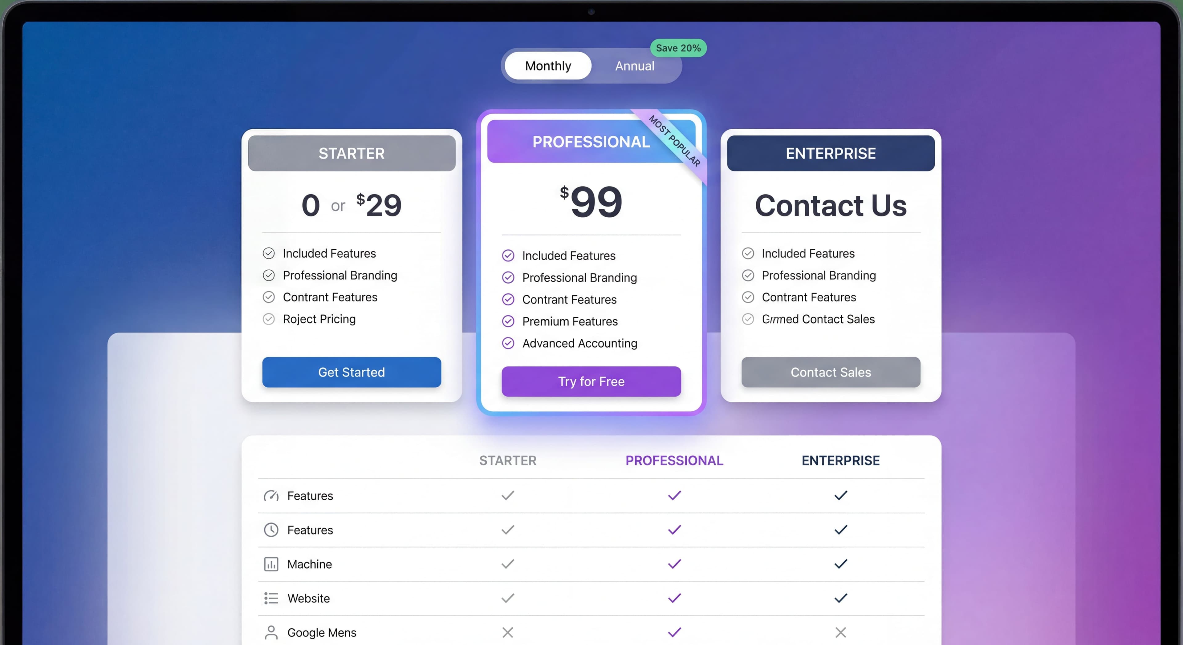
Pricing Page Optimization
Your pricing page is where interest turns into action. Good pricing pages can boost conversion by 20-30%, but hardly anyone tests theirs regularly. The best ones balance transparency with psychology.
Core Elements
Start with a clear value proposition. Visitors need to know not just what they're buying, but why it helps them specifically. Don't just list features. Show outcomes. Answer the question everyone's thinking: "How will this actually solve my problem?"
Keep your tier structure simple. Three to four options works best. More than that and people freeze up, unable to decide. Fewer than that and you're leaving money on the table. Make each tier obviously different, not just in price, but in who it's for. Someone should be able to look at your page and know immediately which tier fits them.
Every tier needs a clear call-to-action. Specific language like "Choose Starter" or "Choose Pro" beats generic "Sign Up" buttons. People like feeling they're making a choice, not filling out a form. Make sure CTAs appear above the fold and use colors that stand out without looking desperate.
Sprinkle trust signals throughout the page. Security badges, testimonials, stats like "50,000+ teams" all help reduce the anxiety that kills conversions. Put testimonials near pricing tiers. Put security badges near payment buttons where people worry most about security.
Pricing Display Best Practices
Highlight your recommended tier. Use "Most Popular" badges, different background colors, or subtle shadows to make it stand out. This helps uncertain visitors make a decision and tends to increase average deal size. When you anchor on a mid-tier option, higher tiers look more reasonable and lower tiers feel limiting.
Show annual savings prominently. "Save 20% with annual billing" or "Two months free" works because people hate missing out on savings more than they love monthly flexibility. Show both the monthly equivalent and the total annual cost so different buyers can find the numbers they need.
Use feature comparison tables, but keep them focused. Don't list every minor feature. Highlight what actually matters: integrations, usage limits, support levels, and advanced functionality. Hide the rest in expandable sections.
Add an FAQ section directly on your pricing page. Answer the questions that stop people from converting: billing cycles, cancellation policies, security, feature limitations. If someone can get their questions answered without leaving the page, they're more likely to convert right then instead of "thinking about it" and never coming back.
CTA Optimization
Button copy matters more than you'd think. "Start Free Trial" beats "Submit" because it describes what happens next. "Get Started Free" addresses two objections at once: it's easy and it's free. Tier-specific CTAs like "Choose Starter" make people feel like they're making a decision, not filling out a form.
Make your buttons visually obvious without being obnoxious. High contrast, generous sizing, and above-the-fold placement all help. On longer pages, repeat CTAs after comparison tables and testimonials so visitors can convert whenever they're ready.
Social Proof
Put social proof where people feel nervous about committing. Near CTAs works well. Within tier descriptions helps visitors see others like them made this choice. Footer testimonials give one last nudge to people who read the whole page before deciding.
What you use for social proof matters too. Customer logos from recognizable brands build instant credibility. Usage numbers like "50,000+ teams" make people think "if that many people use it, it must be good." Specific testimonials beat vague ones. "Increased our conversion rate by 34%" lands way harder than "Great product!" Link to case studies for prospects who need more convincing before committing to bigger plans.
Common Pricing Page Mistakes
Too many tiers. More than four options and people freeze up. They can't compare all the nuances, worry about making the wrong choice, and end up "thinking about it" instead of buying. Consolidate around distinct customer types: individual, team, enterprise.
Unclear differentiation. If "Professional" and "Business" sound the same, visitors won't know which to pick. Use names that signal who each tier is for: "Startup," "Growth," "Enterprise." Add subtitles like "For individuals just getting started" to make it obvious.
Hidden pricing. "Contact us for pricing" kills self-serve conversion. People bounce instead of engaging with a sales process they didn't ask for. Even if pricing is complex, give ranges or minimums so prospects know if they're in the ballpark.
Feature overload. Listing fifty features makes people's eyes glaze over. Focus on the ten to fifteen that actually matter: storage limits, user seats, integrations, support level. Hide everything else in expandable sections.
No free option. Today's buyers want to try before they buy. Without a free trial or freemium tier, you lose the entire evaluation opportunity. Free trials reduce friction. Freemium builds volume and can drive viral growth.
Signup Flow Optimization
This is the moment of highest intent in your whole funnel. Someone has decided to try your product and is actively trying to sign up. Yet so many companies blow it here with unnecessary friction. Every extra field, every extra click, every confusing moment increases abandonment.
Minimize Friction
Ask for the bare minimum. Email is genuinely required since it's how you identify users and follow up. Password too, so they can come back. But names? Company info? Those can wait until after someone has experienced value. Every additional field is another chance for someone to abandon.
Offer social login. Google, Microsoft, or Apple sign-in turns signup from a minute-long form into a single click. People already have dozens of passwords to remember. Don't make them create another one. This matters even more on mobile where typing passwords on tiny keyboards is painful.
Use progressive profiling. Collect information over time instead of all at once. Once someone's experienced value and committed to your product, they're much more willing to tell you their job title or company size. The data you get later is usually higher quality too, since engaged users give thoughtful answers instead of rushing through forms.
Signup Flow Structure
Single Page:
All fields visible, simple products.
Multi-Step:
Break into logical steps, complex signups.
Best Practice:
- Step 1: Account (email, password)
- Step 2: Profile (name, role—can be skipped)
- Step 3: Workspace/Company (if needed)
Copy and Messaging
Headline:
Reinforce value, not just "Sign Up"
- "Start your free trial"
- "Create your workspace"
- "Get started in 2 minutes"
Microcopy:
- "No credit card required"
- "14-day free trial"
- "Cancel anytime"
Error Messages:
Helpful, specific, human.
- "That email's already registered. [Sign in instead?]"
- "Password needs 8+ characters with a number"
Email Verification
When Required:
- Before accessing product (more secure)
- After accessing product (less friction)
Best Practice:
Let users into product immediately, verify for specific actions (team invites, integrations).
Mobile Optimization
Essential:
Significant traffic is mobile.
Considerations:
- Touch-friendly fields
- Appropriate keyboard types
- Simplified flow
- Easy social login
Welcome Experience
The Critical First Screen
Someone just finished signing up. They're landing in your product with a mix of excitement, uncertainty, and impatience. This moment is make-or-break. Users form impressions within seconds, and if they feel lost or overwhelmed, they often never come back.
Your welcome screen needs to answer three questions immediately: "What do I do now?" "How does this work?" and "Can I get started quickly?" Products that answer these questions well convert way more signups into activated users than those that dump people into empty interfaces.
Welcome Screen Elements
Start with a personal greeting. Something simple like "Welcome, Sarah!" creates an immediate connection. It doesn't need to be fancy. Even basic personalization beats generic "Welcome to Product X" messages.
Show one obvious action. Don't display your entire product interface with dozens of possible starting points. Identify the single most valuable first action and make it unmissable. New users can't know which option matters most. Guide them.
Explain what they'll accomplish. Instead of "Create your first project," say "Create your first project to see how our templates accelerate your workflow." People are motivated by outcomes, not tasks.
Include a skip option. Some users have experience with similar products and want to explore on their own. Forcing everyone through guided paths creates frustration. Let power users skip while keeping guidance available for those who need it.
Welcome Patterns
Setup Wizard:
Guided configuration for complex products.
- Step-by-step setup
- Progress indicator
- Can be paused/resumed
Quick Start:
Fast path to first value.
- Minimal setup
- Template/example data
- Immediate action
Personalization:
Customize based on signup data.
- Role-based starting point
- Use case-specific guidance
- Relevant features highlighted
Avoiding Welcome Mistakes
Too Much Information:
Overwhelming new users with everything.
No Clear Action:
User doesn't know what to do.
Long Setup Before Value:
Too much configuration before any benefit.
Generic Experience:
Same for everyone, relevant to no one.
First Action Optimization
Knowledge stuck in silos?
Create step-by-step guides that share expertise across your entire team with Glitter AI.
Defining First Action
The Goal:
Smallest meaningful action that delivers value.
Examples:
- Create first project (project tool)
- Send first message (communication tool)
- Import first data (analytics tool)
- Complete first task (productivity tool)
Designing for First Action
Low Barrier:
Make it easy to complete.
Clear Benefit:
User sees value immediately after.
Guided Path:
Obvious how to take the action.
Quick Completion:
Under 2-5 minutes.
Supporting First Action
Templates:
Pre-built starting points.
Sample Data:
See what populated state looks like.
Contextual Guidance:
Help where users need it.
Progress Indication:
Show advancement toward goal.
Measuring First Action
Time to First Action:
How long from signup to first action?
First Action Completion Rate:
What percentage complete first action?
Actions to Activation:
How many actions until activation?
Full Funnel Optimization
Cross-Stage Consistency
Messaging:
Same value proposition throughout.
Visual Design:
Consistent branding and UI.
Expectations:
What's promised is delivered.
Handoff Points
Pricing → Signup:
Carry context (selected tier, source).
Signup → Welcome:
Personalize based on signup info.
Welcome → First Action:
Guide directly to next step.
Multi-Device Journeys
Reality:
Users may research on phone, sign up on desktop.
Optimization:
- Consistent experience across devices
- Session continuity where possible
- Mobile-optimized throughout
Testing and Optimization
What to Test
Pricing Page:
- Tier names and prices
- Feature presentation
- CTA copy and design
- Social proof placement
Signup Flow:
- Number of fields
- Step sequence
- Social login prominence
- Microcopy
Welcome Experience:
- First screen content
- Quick start options
- Onboarding flow
Testing Methodology
A/B Testing:
One change at a time, measure impact.
Sample Size:
Ensure statistical significance.
Duration:
Full business cycle (minimum 1-2 weeks).
Metrics:
Track full funnel, not just immediate conversion.
Prioritization
High Impact + Easy = Do First:
- CTA copy changes
- Field removal
- Social login addition
High Impact + Hard = Plan:
- Complete flow redesign
- New welcome experience
- Personalization systems
Knowledge stuck in silos?
Create step-by-step guides that share expertise across your entire team with Glitter AI.
Measurement Framework
Key Metrics by Stage
Pricing Page:
- Page to signup start rate
- Tier selection distribution
- Time on page
Signup:
- Start to complete rate
- Drop-off by field
- Time to complete
Welcome:
- Welcome to first action rate
- Flow completion
- Time to first action
Activation:
- First action to activation rate
- Time to activation
- Activation by path
Dashboard Elements
Funnel Visualization:
Full path with conversion rates.
Trend Charts:
Conversion over time.
Segment Analysis:
By source, device, plan.
Drop-Off Analysis:
Where users leave.
Common Full-Funnel Mistakes
Mistake 1: Optimizing in Isolation
Problem: Improve signup, ignore welcome.
Result: More signups, same activations.
Fix: Optimize entire funnel together.
Mistake 2: Local Maximum
Problem: Small tweaks hit ceiling.
Result: Diminishing returns.
Fix: Sometimes need bigger changes.
Mistake 3: Ignoring Segments
Problem: Optimize for average user.
Result: Hurt some segments.
Fix: Segment analysis, personalization.
Mistake 4: No Full-Funnel View
Problem: Only measure immediate conversion.
Result: Miss downstream effects.
Fix: Track to activation, retention.
Trial users getting stuck?
Create step-by-step guides that walk users to their first win and increase conversion rates with Glitter AI.
The Bottom Line
Your conversion path is only as strong as its weakest link. Optimizing the whole funnel from pricing page to activation creates compounding returns.
Key Principles:
- Audit the complete journey
- Find the biggest drop-offs
- Optimize for full funnel, not just signup
- Test systematically
- Measure to activation, not just conversion
Every percentage point improvement compounds through the funnel. Small wins add up fast.
Continue learning: Free Trial Best Practices and Reducing Onboarding Friction.
Frequently Asked Questions
What is the typical conversion rate from pricing page to activated user?
The overall conversion rate from pricing page visitor to activated user typically ranges from 10-25%, with 75-90% of visitors dropping off at various stages of the funnel including signup, welcome experience, and first action.
How can I improve my SaaS pricing page conversion rate?
Optimize your pricing page with a clear value proposition, simple 2-4 tier structure, prominent CTAs with action-oriented language like 'Start Free Trial', social proof near conversion points, and an FAQ section to address common objections.
What is the best signup flow for SaaS conversion?
The best signup flows minimize friction by requiring only essential fields (email and password), offering social login options, using progressive profiling to collect additional information later, and letting users into the product before requiring email verification.
How does full-funnel optimization compound conversion improvements?
A 10-15% improvement at each of the four main stages (pricing page, signup, welcome, first action) compounds to result in 46-53% more activated users from the same traffic, making full-funnel optimization one of the highest-leverage activities for growth.
What are the most common pricing page mistakes that hurt conversion?
Common mistakes include offering too many pricing tiers (more than 4 creates choice paralysis), unclear differentiation between tiers, hidden pricing requiring contact, feature overload making comparison difficult, and missing free trial or freemium options.