The Complete Onboarding Checklist Template for SaaS Products

Onboarding checklists are one of the highest-impact features you can add to your product. They give new users structure, create a sense of progress, and dramatically improve completion rates. When done well, checklists can increase activation by 20-50%.
This guide provides a complete onboarding checklist template along with best practices for creating checklists that users actually finish.
Training new users manually?
Create step-by-step onboarding guides that walk users through setup without hand-holding with Glitter AI.
Why Checklists Work
Checklists tap into fundamental psychology:
The Zeigarnik Effect: Uncompleted tasks create mental tension. Users are motivated to finish what they start.
The Zeigarnik Effect is a psychological phenomenon where people remember uncompleted or interrupted tasks better than completed ones. This creates cognitive tension that motivates completion. Named after Soviet psychologist Bluma Zeigarnik, the effect explains why unfinished tasks occupy mental space until resolved. Usetiful research on the psychology of user onboarding shows that this mental tension drives users to complete checklist items, which can dramatically boost activation rates. When users see a checklist showing "3 of 5 complete," the incomplete items create a mild discomfort that motivates them to finish. This isn't manipulation. It's working with a natural human tendency to achieve closure and complete what we've started. The drive to check off each remaining item can dramatically boost your activation rates as users feel satisfaction with each completion while also feeling compelled to finish the entire list.
Progress Principle: Visible progress toward a goal creates momentum and positive emotion.
Clear completion indicators satisfy users' psychological need for achievement while giving them motivation to continue. Chameleon research on onboarding checklist templates shows that progress bars, checkmarks, and percentage completion create positive feedback loops that encourage task completion. Interactive checklists work because they tap into our need to complete things, turning abstract tasks into concrete, achievable steps. Each completed item generates a small hit of dopamine and builds confidence that the remaining tasks are manageable. This momentum effect means users who complete the first one or two items become significantly more likely to finish the entire checklist than users who haven't started.
Cognitive Offloading: Checklists reduce mental load by tracking what's done and what remains.
Users don't have to remember what they've accomplished or what's still needed. The checklist handles that tracking automatically. The mental bandwidth freed up can be redirected toward actually using and understanding your product. For new users already overwhelmed by learning a new interface, reducing cognitive load wherever possible improves comprehension, reduces frustration, and speeds up time to value.
Achievement Satisfaction: Checking boxes feels good. Small completions release dopamine.
The act of marking items complete triggers positive neurological responses that create an association between your product and feelings of accomplishment. Gamification research from Insaim on SaaS onboarding best practices shows that using psychological triggers like rewards, competition, and achievements makes the onboarding process engaging and habit-forming. By incorporating game-like elements in your UX design, your product motivates users to complete tasks, which leads to higher retention rates.
Research shows that tasks with visible progress are 40% more likely to be completed than those without. This finding, validated across multiple studies, shows just how much simple progress visualization affects user behavior and onboarding completion rates.
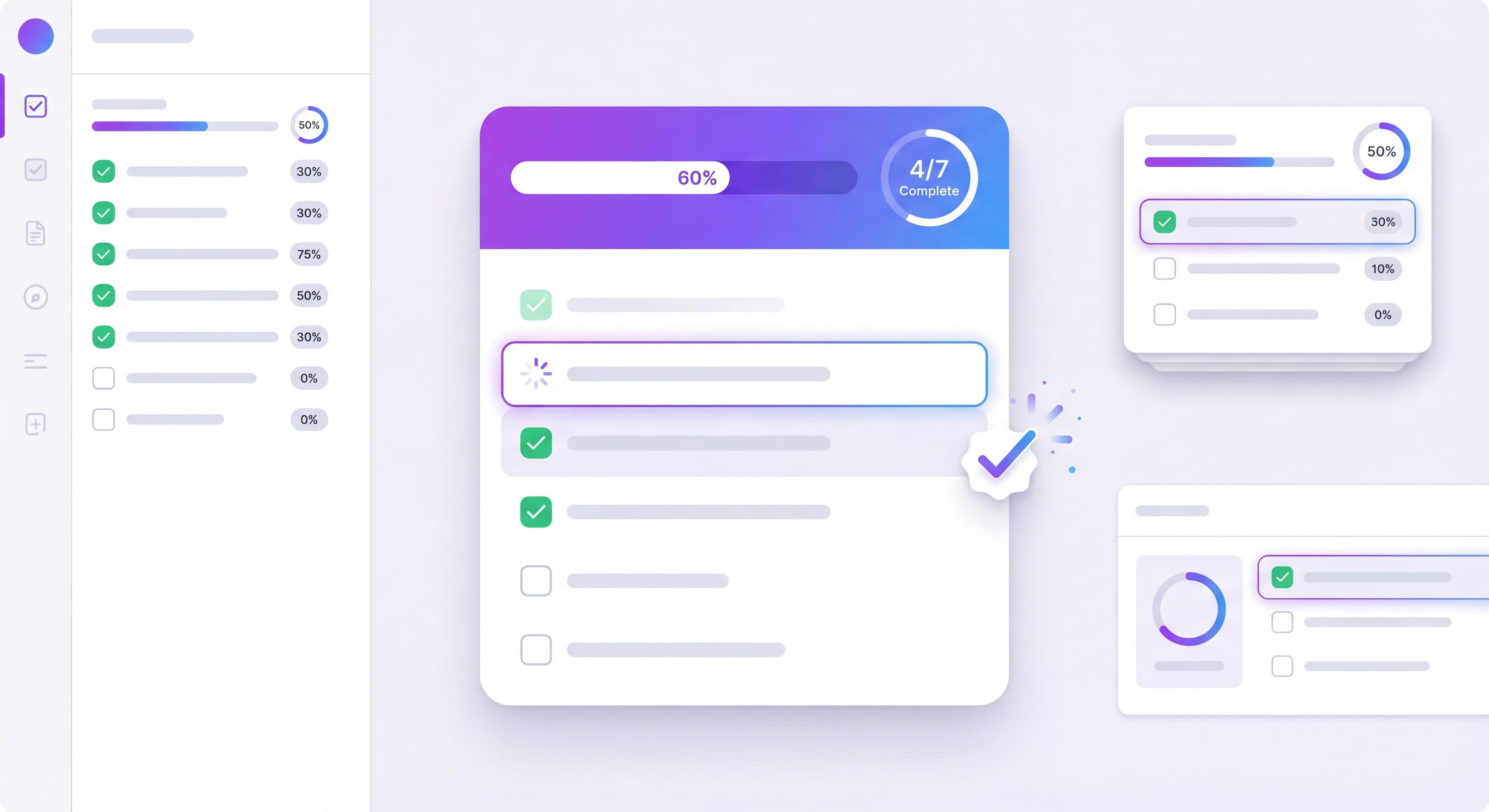
Anatomy of an Effective Checklist
Essential Components
Title: Clear, benefit-oriented ("Get Started" or "Set Up Your Workspace")
The checklist title sets expectations and frames the purpose of the tasks ahead. Benefit-oriented titles like "Get Started in 5 Minutes" or "Set Up Your Workspace" communicate value and time investment upfront. They help users understand what they're committing to before they begin. Generic titles like "Onboarding" or "Setup" fail to convey urgency, benefit, or time commitment, which reduces user motivation to engage.
Progress Indicator: Visual representation of completion (bar, fraction, percentage)
Progress visualization is probably the single most critical element of effective checklists. Procreator Design research on SaaS onboarding design emphasizes that clear completion indicators satisfy users' psychological need for achievement while giving them motivation to continue. Progress bars typically outperform simple numeric indicators (like "3 of 5") because they create a stronger sense of momentum through visual fill that grows with completion. The progress bar provides immediate, visceral feedback that users are making meaningful progress, which triggers the Progress Principle that drives continued engagement.
Items: 5-7 action-oriented tasks
Experts recommend limiting product onboarding checklists to 3-5 essential tasks maximum. Research shows completion rates drop dramatically beyond five items as users experience decision paralysis. Chameleon data confirms that checklists with 3-4 items achieve 75-85% completion, while 5-6 items achieve 60-70% completion. More than 7 items significantly reduces completion to 45-55% or lower. This decline happens because users get overwhelmed by the perceived effort and question whether completing all tasks is worth it.
Item States: Clear visual distinction between complete, in-progress, and incomplete
Visual clarity in item states prevents user confusion and reinforces progress. Incomplete items should use neutral colors with empty checkboxes at full opacity to indicate tasks awaiting completion. Completed items benefit from success colors (typically green), filled checkboxes, and a slightly faded appearance to signal they're finished and no longer need attention. Current or next items can be highlighted with brighter colors or animated attention indicators to guide users toward what to do next.
CTA: Primary action button that takes users to the next incomplete item
The primary call-to-action button serves as the entry point for users ready to make progress. Rather than requiring users to click individual items to begin, a prominent "Continue" or "Next Step" button that automatically advances to the next incomplete task reduces friction and maintains momentum. This single-click progression keeps users focused on completing tasks rather than navigating the checklist interface.
Optional Enhancements
Celebration: Animation or message when completing items or finishing
Time Estimate: "About 5 minutes" sets expectations
Skip Option: Let users dismiss without completing
Rewards: Gamification elements like badges or unlocks
The Template Structure
Here's a proven checklist structure that works for most SaaS products:
Checklist Items
Item 1: Quick Win (30 seconds)
The first item should be almost impossible to fail. It builds momentum and confidence.
- Example: "Complete your profile"
- Example: "Name your workspace"
- Example: "Choose your theme"
Item 2: Core Setup (1-2 minutes)
Essential configuration that enables value.
- Example: "Create your first project"
- Example: "Add your first contact"
- Example: "Connect your email"
Item 3: First Value Moment (2-3 minutes)
The action that delivers the core product benefit.
- Example: "Send your first message"
- Example: "Generate your first report"
- Example: "Create your first design"
Item 4: Integration/Enhancement (1-2 minutes)
Extend value with connections or customization.
- Example: "Connect to Slack"
- Example: "Import your data"
- Example: "Customize your dashboard"
Item 5: Team/Social Element (1-2 minutes)
Add the multiplayer dimension that increases stickiness.
- Example: "Invite your first teammate"
- Example: "Share with your team"
- Example: "Assign your first task"
Item 6: Advanced Feature (1-2 minutes)
Introduce a power feature that demonstrates depth.
- Example: "Set up automation"
- Example: "Create your first template"
- Example: "Configure notifications"
Item 7: Completion/Celebration
Acknowledge completion and transition to ongoing use.
- Example: "Explore more features"
- Example: "Visit the resource center"
- Example: "You're all set!"
Why This Order Works
- Easy start builds confidence
- Quick value demonstrates why they're here
- Enhancement shows depth
- Social element increases switching costs
- Advanced feature reveals growth potential
Writing Effective Checklist Items
Action-Oriented Copy
Every item should start with a verb and clearly describe the action:
Good:
- Create your first project
- Invite a team member
- Connect your calendar
Bad:
- Projects
- Team members
- Calendar integration
Benefit-Hinting Descriptions
Include a brief reason why each item matters:
"Create your first project — Organize your work in one place"
"Invite a team member — Collaborate in real-time"
"Connect your calendar — Never miss a deadline"
Specific Over Vague
Users should know exactly what to do:
Good: "Add 3 tasks to your project"
Bad: "Set up tasks"
Good: "Upload your logo"
Bad: "Customize your workspace"
Checklist Design Best Practices
Visual Progress
The progress indicator is crucial. Options include:
Progress Bar: Visual fill that grows with completion
Fraction: "3 of 7 complete"
Percentage: "42% done"
Dots/Steps: Individual indicators for each item
Progress bars typically perform best because they create the strongest sense of momentum.
Completion States
Clear visual distinction between states:
Incomplete: Neutral color, empty checkbox, full opacity
Complete: Success color (green), filled checkbox, slightly faded
Current/Next: Highlighted, possibly animated attention indicator
Placement Options
Persistent Widget: Always visible in corner or sidebar
Modal on Entry: Appears when users arrive, dismissible
Dashboard Component: Part of the main interface
Expandable Launcher: Collapsed state with expansion
Persistent placement generally outperforms modals for completion rates.
Mobile Considerations
On mobile:
- Ensure touch targets are large enough
- Consider collapsible design for screen real estate
- Test scroll behavior with checklist overlay
- Simplify to fewer items if necessary
Gamification Elements
Progress Rewards
Partial Completion:
- Encouraging message at 50%
- "Great progress!" notification
Full Completion:
- Celebration animation (confetti, etc.)
- Completion badge
- "Setup Complete" achievement
- Discount or extended trial (optional)
Streaks and Bonuses
For products with daily use, consider:
- Day 1, Day 3, Day 7 check-ins
- Bonus items for power users
- Time-based challenges
When to Avoid Gamification
Gamification can backfire when:
- Users are in a hurry
- The product is serious/professional
- Users are sophisticated/skeptical
- It feels manipulative or childish
Know your audience.
Training taking too long?
Create step-by-step guides that get users productive faster with Glitter AI.
Implementation Approaches
No-Code Tools
Most onboarding platforms support checklists:
Included:
- Appcues (Growth plan+)
- Userpilot
- UserGuiding
- Userflow
- Chameleon
How They Work:
- Define checklist items in dashboard
- Link items to events or page visits
- Tool tracks completion automatically
- No engineering required for basic checklists
Custom Implementation
For more control, build custom:
State Management:
- Store completion state in user profile
- Track individual item completion
- Persist across sessions
Event Tracking:
- Fire events when items complete
- Connect to analytics
- Enable segmentation based on completion
UI Components:
- Build reusable checklist component
- Animate progress updates
- Handle edge cases (refresh, multiple tabs)
Hybrid Approach
Use no-code tool for quick deployment, plan custom implementation for long-term:
- Launch with tool to validate checklist
- Optimize based on data
- Build custom when confident in structure
- Maintain flexibility for iteration
Measuring Checklist Success
Key Metrics
Checklist Start Rate: % of new users who see the checklist
- Target: 80%+ (if auto-shown)
Item Completion Rates: % completing each individual item
- Look for drop-off patterns
- Items below 50% need attention
Checklist Completion Rate: % who finish all items
- Benchmark: 40-60%
- Elite: 70%+
Time to Completion: How long to finish checklist
- Benchmark against your estimate
- Long times indicate confusion
Correlation with Activation: Do checklist completers activate at higher rates?
- This validates your checklist actually helps
A/B Test Ideas
Number of Items:
- Test 5 vs 7 vs 10 items
- More items = lower completion but more education
Item Order:
- Test different sequences
- Which order drives activation best?
Progress Display:
- Bar vs fraction vs percentage
- Which motivates better?
Rewards:
- With vs without completion celebration
- Does gamification help your audience?
Training taking too long?
Create step-by-step guides that get users productive faster with Glitter AI.
Real-World Examples
Notion's Checklist
Notion uses a minimal checklist focused on templates:
- Choose a template to start
- Create a page
- Add content
- Share with someone
It's short because Notion's flexibility requires exploration over prescription.
Slack's Checklist
Slack focuses on team dynamics:
- Create a channel
- Send a message
- Invite teammates
- Connect an app
The order drives to the core value (messaging) quickly, then expands to stickiness factors.
Asana's Checklist
Asana's longer checklist teaches project management:
- Create a project
- Add tasks
- Set due dates
- Assign teammates
- Mark tasks complete
- View in different views
- Use keyboard shortcuts
More educational because project management has a learning curve.
Common Mistakes to Avoid
Too Many Items
More than 7 items reduces completion rates significantly. If you need more education, use progressive disclosure or follow-up checklists.
Vague Items
"Set up your account" tells users nothing. Be specific: "Upload your profile photo and company logo."
Wrong Order
Starting with hard items kills momentum. Always begin with the quickest win.
No Progress Indicator
Without visible progress, users don't feel the momentum that drives completion.
Mandatory Completion
Forcing users to complete checklists before using the product creates resentment. Let users skip or dismiss.
Set-and-Forget
Checklists need optimization. Launch, measure, and iterate.
Checklist Template Quick Reference
Use this template structure for your checklist:
[Progress Bar: 0/6 complete]

☐ Quick Win (30s)
   Subtitle: Why this matters
   → Links to: [specific location]

☐ Core Setup (1-2min)
   Subtitle: Why this matters
   → Links to: [specific location]

☐ First Value (2-3min)
   Subtitle: Why this matters
   → Links to: [specific location]

☐ Integration (1-2min)
   Subtitle: Why this matters
   → Links to: [specific location]

☐ Team Element (1-2min)
   Subtitle: Why this matters
   → Links to: [specific location]

☐ Advanced Feature (1-2min)
   Subtitle: Why this matters
   → Links to: [specific location]

[Complete: Celebration screen with next steps]
Repeating the same steps?
Document your onboarding process once and share it with every new user with Glitter AI.
Getting Started
- List all actions new users should take
- Prioritize by impact on activation
- Select 5-7 highest-impact items
- Order from quickest win to more complex
- Write clear, action-oriented copy
- Design with progress indicators
- Implement with tracking
- Measure and iterate
A well-designed user onboarding checklist can transform your activation rates. Start simple, measure results, and refine based on what you learn.
Continue building your onboarding: First-Time User Experience Guide and Psychology of User Onboarding.
Frequently Asked Questions
How many items should a SaaS onboarding checklist have?
An effective onboarding checklist should have 5-7 items. Research shows checklists with 3-4 items achieve 75-85% completion, 5-6 items achieve 60-70% completion, while more than 7 items significantly reduces completion rates.
What is the best order for onboarding checklist items?
Start with a quick win item that takes 30 seconds to build momentum, then core setup (1-2 minutes), first value moment (2-3 minutes), integration or enhancement, team element for stickiness, and finally an advanced feature to show product depth.
Why do onboarding checklists increase activation rates?
Checklists leverage psychology including the Zeigarnik Effect (uncompleted tasks create mental tension), the Progress Principle (visible progress creates momentum), and cognitive offloading (reduces mental load). Research shows tasks with visible progress are 40% more likely to be completed.
What is a good completion rate for an onboarding checklist?
The benchmark completion rate for onboarding checklists is 40-60%, with elite performers achieving 70% or higher. Individual items below 50% completion need attention and optimization.
Should onboarding checklists be mandatory or optional?
Onboarding checklists should be optional with skip or dismiss options. Forcing users to complete checklists before using the product creates resentment. Let users explore freely while the checklist provides guidance and structure.