Empty States: Designing for Zero Data

When someone signs up for a new product, they often land on... nothing. No data. No projects. Just blank screens staring back at them. These empty states can either spark engagement or send users running.
It's kind of surprising how little attention empty state design gets, considering it's frequently the very first thing users see after signup. Bad empty states confuse people and drive early churn. Good ones help users take action.
This guide walks through how to turn those blank screens into moments that actually get users moving.
Users confused by blank screens?
Create step-by-step guides that show users exactly what to do when they first land in your product with Glitter AI.
What Are Empty States?
Empty states show up whenever there's nothing to display in a part of your product. Think of them as blank canvases that users see before they've created anything, added any data, or generated content.
Types of Empty States
First-Use Empty States:
User hasn't created any content yet.
- First time seeing a dashboard
- Empty project list
- Blank activity feed
User-Cleared Empty States:
User deleted all their content.
- All items archived or deleted
- Filters showing no results
- Completed and cleared items
No-Results Empty States:
Search or filter returned nothing.
- Search with no matches
- Filter criteria too narrow
- Category with no items
Error Empty States:
Content can't be loaded.
- Connection failed
- Permission denied
- Resource unavailable
Why Empty States Matter
First Impressions:
They're frequently what users see right after signing up.
Activation Opportunity:
A perfect moment to nudge someone toward their first action.
Conversion Impact:
Poorly designed empty states lead to higher early dropout rates.
Value Perception:
A blank screen can make your whole product feel incomplete.
The Problem with Blank Screens
What Happens Without Good Empty States
Confusion:
People have no idea what to do next.
Abandonment:
They leave and never come back.
Support Burden:
You get tickets asking "Is this thing broken?"
Negative Perception:
The product comes across as unfinished or buggy.
The User's Perspective
When someone hits a blank screen, questions start popping up:
- What's supposed to be here?
- What am I supposed to do now?
- Did something break?
- How do I even start?
Well-designed empty states answer these questions upfront. Bad ones just leave people confused.
Anatomy of a Good Empty State
Essential Components
Visual Element:
An illustration, icon, or graphic that gives users context about where they are.
Clear Heading:
Something that explains what this section is actually for.
Helpful Description:
A quick explanation of why it's empty and what users should do about it.
Primary Action:
An obvious CTA that helps users create their first piece of content.
Secondary Resources:
Links to help docs, examples, or more information for those who need it.
Optional Enhancements
Example Data:
Sample content that shows users what things will look like once they add something.
Quick Start Options:
Templates or presets that speed things up for people who want to jump in fast.
Progress Context:
Some indication of how this fits into the bigger onboarding picture.
Empty State Design Patterns
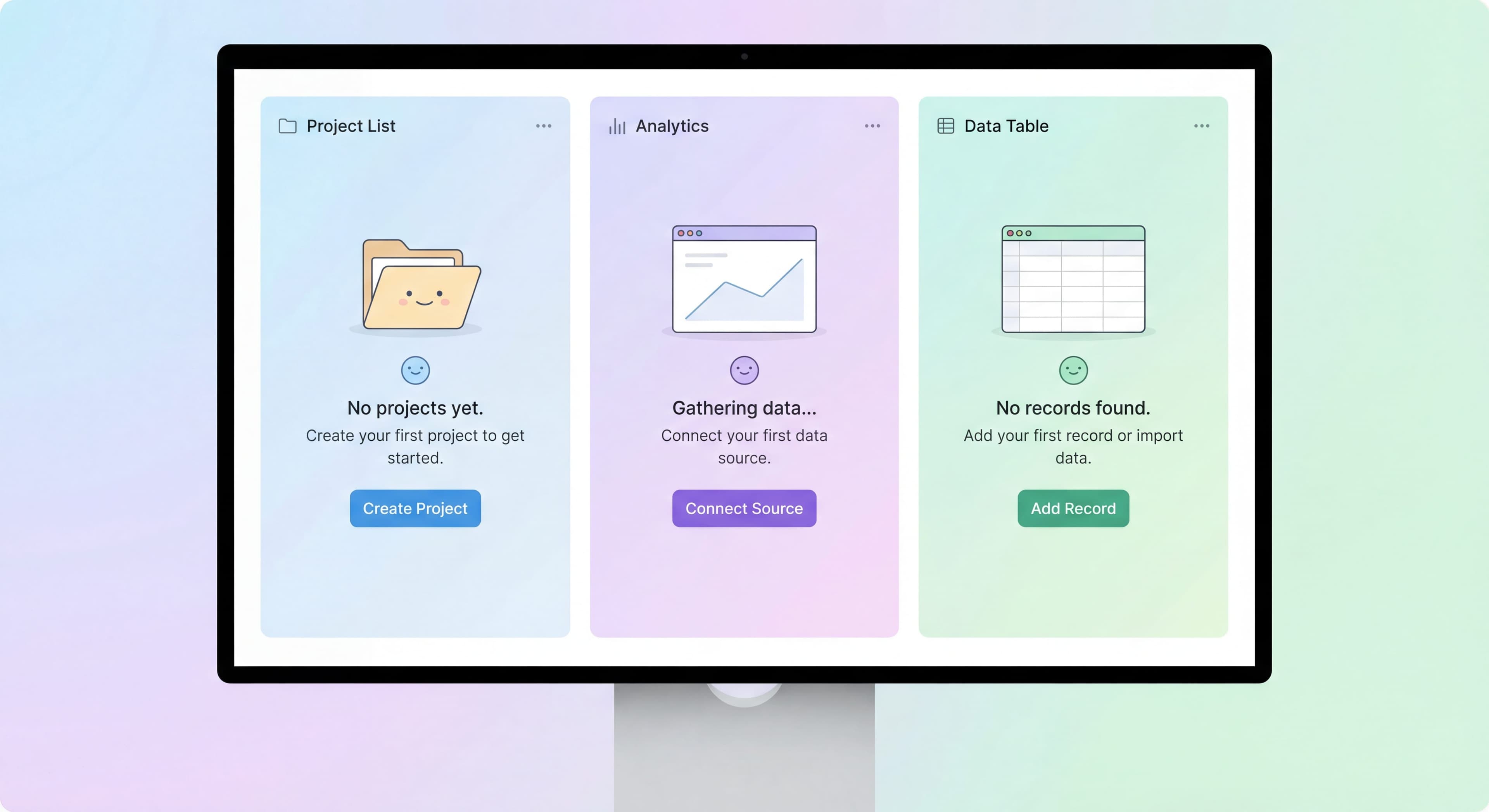
Pattern 1: Action-Focused
This pattern puts all the emphasis on one clear action that resolves the empty state.
Structure:
[Illustration]

"No projects yet"

Create your first project to start organizing
your work and collaborating with your team.

[Create Project Button]
When to Use:
- Simple, clear next action
- Core feature areas
- Most first-use empty states
Pattern 2: Educational
This one takes a moment to explain what the feature does and why users should care.
Structure:
[Illustration]

"Your analytics dashboard"

Once you start using [Product], you'll see
performance metrics, user activity, and
insights here.

Here's what you'll be able to track:
• Active users over time
• Feature adoption rates
• Engagement trends

[Connect Your Data]

Learn more about analytics →
When to Use:
- Complex features
- Areas requiring setup first
- When value needs explanation
Pattern 3: Template Gallery
Gives users pre-built starting points so they don't have to begin from scratch.
Structure:
[Illustration]

"Start with a template"

Choose a template to get started quickly,
or create a blank project from scratch.

[Template 1] [Template 2] [Template 3]

[Browse All Templates]    [Start From Scratch]
When to Use:
- Products with use case variety
- When templates genuinely help
- Complex creation processes
Pattern 4: Import-Focused
Helps users bring in data they already have from somewhere else.
Structure:
[Illustration]

"Import your existing work"

Bring your projects from other tools to
get started immediately.

[Import from Asana]
[Import from Trello]
[Upload CSV]

Or [Create from scratch]
When to Use:
- Users likely have existing data
- Switching from competitors
- Data-heavy products
Pattern 5: Celebration
Recognizes when users have accomplished something or finished a task.
Structure:
[Celebration illustration]

"All caught up!"

You've completed all your tasks for today.
Nice work!

[Add a new task] or [Take a break] 👋
When to Use:
- User-cleared empty states
- Completion moments
- Inbox-zero scenarios
Writing Empty State Copy
Headlines
Be Specific:
Bad: "Nothing here"
Good: "No projects yet"
Avoid Negative Framing:
Bad: "You have no data"
Good: "Your dashboard is ready"
Be Contextual:
Bad: "Empty"
Good: "Your team workspace is waiting"
Description Copy
Explain Why It's Empty:
"You haven't created any campaigns yet."
Show What Becomes Possible:
"Once you create campaigns, you'll see performance data here."
Guide the Next Step:
"Start by creating your first campaign to reach your audience."
CTA Copy
Action-Oriented Options:
- "Create Your First Project"
- "Add Your First Contact"
- "Import Your Data"
Benefit-Focused Options:
- "Get Started"
- "Start Organizing"
- "Begin Tracking"
Avoid Vague CTAs:
- "Click Here"
- "Submit"
- "Continue"
Tone Considerations
Friendly, Not Cutesy:
Keep it warm but professional. Don't try too hard to be clever.
Helpful, Not Pushy:
Guide users without making them feel pressured.
Brief, Not Sparse:
Give enough information without overwhelming people.
Visual Design for Empty States
Illustrations
Purpose:
- Add visual interest to an otherwise blank area
- Make things feel less "broken"
- Reinforce your brand personality
- Give users context about where they are
Guidelines:
- Keep them relevant to the feature
- Maintain consistent style across the product
- Don't make them too large or distracting
- Make sure they work at different screen sizes
Layout
Centered:
The most common approach. Content sits in the middle of the available space.
Inline:
Works for smaller components that might be empty, like lists or cards.
Full Page:
Best for main views and dashboards.
Spacing
Room to Breathe:
Empty states should feel calm and spacious, not cramped.
Visual Hierarchy:
Create clear priority flowing from illustration to headline to description to CTA.
Color
Brand Consistency:
Stick to your design system.
Accessibility:
Make sure there's enough contrast for text readability.
Emotional Tone:
Light, approachable colors tend to work well here.
Empty States by Context
Same questions over and over?
Create self-serve documentation that empowers users to help themselves with Glitter AI.
Dashboard Empty States
For many users, this is the very first thing they see after signing up.
Best Practices:
- Give users a preview of what the populated dashboard will look like
- Make it obvious what action will generate data
- Consider offering sample or demo data
- Link to setup steps if there's additional configuration needed
Example:
[Dashboard illustration with sample data preview]

"Your dashboard will come to life"

Complete your setup to start seeing:
- [x] Performance metrics
- [x] Team activity
- [x] Project progress

[Complete Setup →]

Or explore with sample data →
List Empty States
Things like empty project lists, contact lists, and similar views.
Best Practices:
- Make it obvious how to add the first item
- Offer template or import options where they make sense
- Keep the design simple
Example:
[Illustration]

"No projects yet"

Create your first project to start
organizing your work.

[Create Project]

Import from another tool →
Search Empty States
What happens when a search returns nothing.
Best Practices:
- Acknowledge what the user searched for
- Suggest alternatives or next steps
- Never leave users at a dead end
Example:
[Search illustration]

No results for "quarterly report"

Try:
• Check your spelling
• Use fewer keywords
• Search in a different category

[Browse all reports]    [Create new report]
Error Empty States
What to show when something breaks.
Best Practices:
- Explain what happened in plain language
- Give users an action they can take to fix it
- Include a way to get support if the problem persists
Example:
[Connection illustration]

"Couldn't load your data"

This usually means a connection issue.
Try refreshing the page.

[Refresh Page]

Still not working? Contact support →
Same questions over and over?
Create self-serve documentation that empowers users to help themselves with Glitter AI.
Empty States and Onboarding
Integration Points
Onboarding Checklist:
Empty states can reference where users are in their checklist progress.
Product Tours:
You can launch contextual tours directly from empty states.
Help Content:
Link to relevant documentation for users who want more detail.
First-Time vs Returning Users
First-Time Users:
Give them more education and guidance. They need context.
Returning Users (empty again):
Less explanation, faster path to action. They already know the basics.
Personalization
Based on User Type:
Show admins admin-relevant empty states. Show regular users something different.
Based on Progress:
Reference what they've already done and suggest logical next steps.
Measuring Empty State Effectiveness
Key Metrics
Conversion Rate:
What percentage of users take the primary action from your empty state?
Time on Empty State:
How long do users spend there before taking action or leaving?
Bounce Rate:
What percentage leave the product entirely from the empty state?
Help Seeking:
Are users filing support tickets or accessing help content from there?
Optimization
A/B Test:
Try different copy, CTAs, and visuals to see what performs better.
Heatmaps:
See where users are actually looking and clicking.
User Testing:
Watch real people encounter your empty states and note where they get stuck.
Common Empty State Mistakes
Mistake 1: Truly Empty
Problem: Just blank white space with zero guidance.
Result: Users get confused and leave.
Fix: Always provide some context and a clear action.
Mistake 2: Generic Content
Problem: Using the exact same empty state everywhere.
Result: You miss the chance to give contextual help.
Fix: Customize empty states for each feature area.
Mistake 3: No Clear Action
Problem: Explanation but no CTA.
Result: Users understand the situation but don't know what to do about it.
Fix: Include a primary action button.
Mistake 4: Too Much Information
Problem: A wall of text explaining everything.
Result: Cognitive overload. Nobody reads it.
Fix: Keep copy brief and scannable.
Mistake 5: Negative Framing
Problem: Copy like "You have nothing" or "No data found"
Result: Users feel like they've failed or the product is empty.
Fix: Frame things positively and forward-looking.
Mistake 6: Missing Help Options
Problem: Only offering one possible path.
Result: Users who need help get stuck.
Fix: Include secondary help resources for those who need them.
Empty State Checklist
Run through this for each empty state in your product:
- Visual element gives users context
- Headline is specific to this particular feature
- Description explains the purpose and guides action
- Primary CTA is clear and action-oriented
- Secondary options exist for users with different needs
- Copy is helpful but doesn't overwhelm
- Design matches your product's overall style
- Accessible (good contrast, screen reader compatible)
- Works well on mobile
- Set up for A/B testing
Tools and Implementation
Design Systems
Make sure your design system covers empty states:
- Component templates
- Copy guidelines
- Illustration library
- Interaction patterns
Development Considerations
- Handle empty states at the component level
- Make sure you distinguish between loading states and truly empty states
- Use skeleton screens before confirming something is empty
- Build in graceful fallbacks
Content Management
- Keep copy in a central place for consistency
- Make updates easy without requiring code changes
- Support localization if you have international users
Onboarding taking too long?
Create step-by-step guides that walk users through their first actions and reduce time-to-value with Glitter AI.
The Bottom Line
Empty states aren't edge cases. They're central to how people experience your product during onboarding. Every single user encounters them, and how you handle these moments determines whether they take that first meaningful action or leave feeling confused.
Key Principles:
- Never leave screens completely blank
- Provide clear, specific context
- Make the next action obvious
- Offer alternative paths for different user needs
- Frame things positively and helpfully
- Design for the experience, not just the data
The best empty states don't feel empty at all. They feel like invitations to get started.
Continue learning: First-Time User Experience and Onboarding Checklist Design.
Frequently Asked Questions
What should an empty state include in UX design?
A good empty state includes a visual element (illustration or icon), a clear heading explaining what the area is for, helpful description of why it's empty and what to do, a primary action CTA, and secondary resources like help links or examples.
Why do empty states matter for user onboarding?
Empty states are often the first thing users see after signup. Poor empty state design causes confusion, abandonment, and negative perception that the product is broken or incomplete. Well-designed empty states guide users to their first meaningful action.
What are the main types of empty state patterns?
Common patterns include action-focused (emphasizing the single action to create content), educational (explaining feature value), template gallery (offering pre-built starting points), import-focused (helping migrate existing data), and celebration (acknowledging completion).
How do I write effective empty state copy?
Use specific headlines like 'No projects yet' instead of generic 'Nothing here', avoid negative framing, explain why the area is empty and what's possible once populated, include action-oriented CTAs like 'Create Your First Project', and keep copy brief but helpful.
How do I measure empty state effectiveness?
Track conversion rate (percentage taking primary action), time on empty state before action or abandonment, bounce rate from empty states, and help-seeking behavior. Use A/B testing, heatmaps, and user testing to optimize design and copy.