User Onboarding Metrics: 12 KPIs Every Product Manager Should Track

You can't improve what you don't measure. Yet many product teams run onboarding programs with only a vague sense of whether they're working. "Seems like users are getting stuck" isn't actionable. Data is.
This guide covers the essential onboarding metrics for understanding effectiveness, plus how to set up tracking and interpretation frameworks that drive real improvement.
Onboarding process unclear?
Create step-by-step guides that get users to activation faster with Glitter AI.
Metric Categories
The Onboarding Metrics Framework
Understanding how different onboarding metrics relate to each other helps you build a measurement framework that enables both real-time optimization and long-term planning. Onboarding metrics fall into three categories, each serving distinct but interconnected purposes.
Leading indicators measure user behavior during onboarding itself, providing early signals that predict future outcomes. These metrics offer a quick feedback loop for real-time intervention. When you see a leading indicator trending negatively (like declining step completion rates or increasing time to first action) you can investigate and address problems immediately rather than waiting weeks to see their impact on retention. Leading indicators are inherently actionable because they measure behaviors you can directly influence through onboarding design changes. If you notice that users who complete a specific setup step within their first session activate at twice the rate of those who don't, you can optimize onboarding to encourage that early completion.
Lagging indicators measure outcomes after users complete (or abandon) onboarding, confirming whether your improvements actually drive business results. These focus on revenue and retention, the ultimate measures of onboarding success. While lagging indicators have slower feedback loops, they provide the validation necessary to justify continued investment in onboarding optimization. An increase in trial conversion rate or 30-day retention directly demonstrates business impact in ways that process metrics alone cannot. The relationship matters: you optimize leading indicators to improve lagging indicators, then validate that the relationship holds by measuring both over time.
Process metrics evaluate the onboarding experience itself, measuring how users interact with the specific flows, content, and guidance you've created. Flow completion rates reveal whether users find your onboarding valuable enough to finish. Step timing shows where users slow down or get stuck, indicating friction points that need work. Content engagement metrics show which help resources, tours, and educational materials actually get used versus ignored. These metrics help you refine the tactical execution of your onboarding strategy, ensuring the experiences you've designed actually work as intended. Together, these three categories create a complete picture: leading indicators predict success, lagging indicators confirm it, and process metrics explain how to achieve it.
The 12 Essential Metrics
1. Activation Rate
Activation rate measures the percentage of users who reach a defined "activated" state within a specific timeframe, typically 7-14 days from signup. This is probably the single most predictive onboarding metric for long-term retention and revenue. Activated users have experienced your product's core value and demonstrated engagement behaviors that correlate strongly with becoming paying, retained customers. The power of activation rate lies in its ability to predict future outcomes: users who activate have dramatically higher lifetime value than those who don't, making it a leading indicator of overall business health.
Calculating activation rate requires first defining what "activated" means for your specific product. This definition should be based on behavioral analysis that identifies which early actions correlate most strongly with retention. For Facebook, activation was "7 friends in 10 days." For Slack, it's "2,000 messages sent by the team." For Dropbox, it involves saving files to multiple devices. Your activation criteria should represent behaviors that indicate users have truly experienced and understood your product's core value. Once defined, the formula is straightforward: divide users who complete all activation criteria within your timeframe by total signups, then multiply by 100 to get a percentage.
Industry benchmarks give you context for evaluating performance. The average SaaS activation rate sits at just 37.5%, meaning nearly two-thirds of signups never reach an activated state. That's a sobering reminder of how much value most products leave on the table. Good activation rates fall between 40-50%, while excellent products achieve 50% or higher. These benchmarks vary significantly by industry, product complexity, and target market though. Enterprise software serving technical users might have different benchmarks than consumer apps with self-serve onboarding. The most important comparison is against your own historical performance: are you improving activation rate over time?
Tracking activation effectively requires user onboarding analytics infrastructure that captures the specific events and properties defining your activation criteria. Most product teams use platforms like Amplitude, Mixpanel, or Heap to track user behaviors and calculate activation rates automatically. You'll instrument your product to fire events when users complete activation-related actions, then create cohort reports showing what percentage of each signup cohort reaches activation within your defined timeframe. Regular monitoring lets you identify trends, spot problems early, and measure onboarding success.
2. Time to Value (TTV)
Time to Value measures how long it takes from signup to when users first experience meaningful value from your product, their "aha moment." This metric directly correlates with activation and retention: the faster users reach their first value moment, the more likely they are to stick around and eventually pay. Every minute between signup and value realization represents risk of abandonment. Users who don't quickly experience value start questioning whether they should invest more time learning your product, making them vulnerable to distractions, competing priorities, or alternative solutions.
The formula calculates the median time difference between signup timestamp and first value moment timestamp. Using median rather than mean prevents outliers from skewing your metric. A few users who take weeks to return shouldn't obscure the fact that most users either experience value quickly or abandon entirely. First, instrument your product to capture when value moments occur. This might be creating their first design, sending their first message, completing their first analysis, or whatever action represents your core value delivery. Then, for each user, calculate the time between signup and that first occurrence, and determine the median across all users who reached it.
Benchmark expectations vary dramatically based on product complexity and user context. Simple, consumer-focused products should aim for Time to Value under 5 minutes. Users expect immediate gratification and will abandon quickly if they don't get it. Standard SaaS products serving business users can reasonably expect TTV under 30 minutes, recognizing that professionals will invest more time but still expect relatively fast value delivery. Complex B2B software with significant setup requirements might target TTV under 24 hours, accounting for integration steps, data import, and configuration. Regardless of your product category, the directional goal stays constant: reduce Time to Value as much as possible without sacrificing the quality of that first value experience.
Tracking TTV requires clear instrumentation of both signup events and value moment events, along with analytics capability to calculate time differences and generate median statistics. Modern product analytics platforms make this relatively straightforward through funnel analysis and time-to-convert reporting. The insight comes not just from knowing your current TTV but from monitoring how it changes in response to onboarding improvements. When you simplify setup, add contextual guidance, or streamline initial workflows, TTV should decrease. If it doesn't, you've likely optimized the wrong parts of the experience or introduced new friction elsewhere.
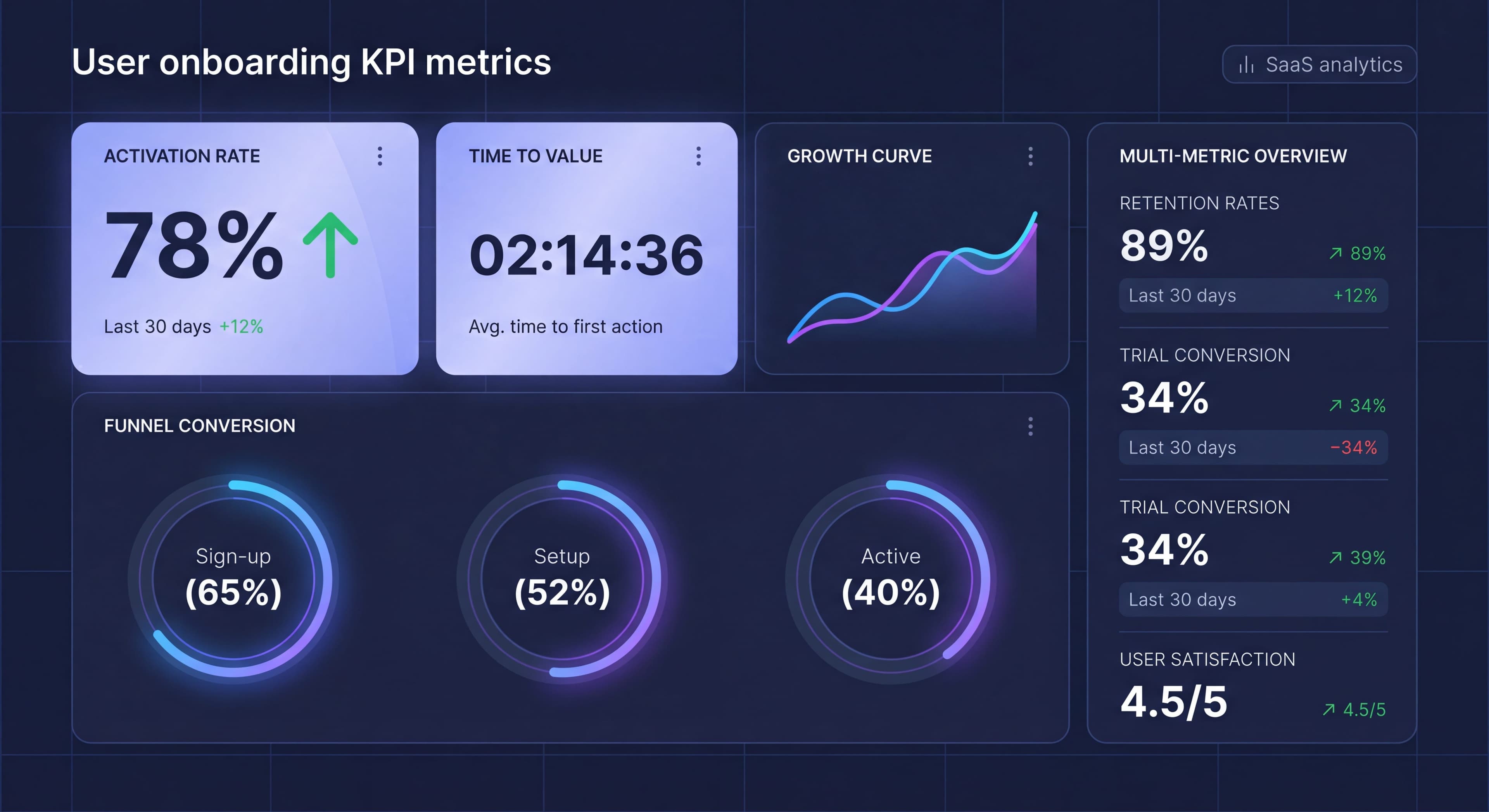
3. Signup-to-Activation Funnel
Definition:
Step-by-step conversion through onboarding stages.
Formula:
Per-step: (Completed Step N / Completed Step N-1) × 100
Why It Matters:
Identifies where users drop off.
Example:
Signup: 1000 users (100%)
Profile: 850 users (85%)
First Action: 600 users (71%)
Second Action: 450 users (75%)
Activated: 350 users (78%)
Overall: 35%
How to Track:
Define funnel stages, track completion of each, calculate drop-off percentages.
4. Onboarding Completion Rate
Definition:
Percentage of users who complete defined onboarding flow.
Formula:
(Users Completing Onboarding / Users Starting Onboarding) × 100
Why It Matters:
Shows whether onboarding content is engaging and completable.
Benchmark:
- Product tours: 70%+ completion
- Checklists: 80%+ completion (for completed steps)
- Email sequences: 60%+ open rates
How to Track:
Track start and completion events for each onboarding element.
5. Feature Adoption Rate
Definition:
Percentage of users who use specific features during onboarding.
Formula:
(Users Using Feature X / Total Users) × 100
Why It Matters:
Shows which features drive activation and which are being missed.
Example:
Core Feature A: 80% adoption
Feature B: 45% adoption
Feature C: 15% adoption
How to Track:
Track feature usage events, calculate percentage of user base.
6. Time to Complete Onboarding
Definition:
How long onboarding takes from start to finish.
Formula:
Median(Last Onboarding Step - First Onboarding Step)
Why It Matters:
Too long = friction. Too short = might not be thorough.
Benchmark:
- First session: Under 10 minutes
- Full onboarding: Under 30 minutes across sessions
How to Track:
Timestamp first and last onboarding interactions.
7. Engagement During Trial
Definition:
Activity level during trial or first period.
Metrics Include:
- Sessions per user
- Actions per session
- Time in product
- Features explored
Why It Matters:
Predicts conversion and indicates engagement quality.
How to Track:
Session analytics, event tracking, time measurements.
8. Retention Rate (Day 1/7/30)
Definition:
Percentage of users who return after specific time periods.
Formula:
(Users Active on Day N / Total Users from Cohort) × 100
Why It Matters:
Shows if onboarding creates lasting habits.
Benchmark:
- Day 1: 50%+
- Day 7: 30%+
- Day 30: 15%+
How to Track:
Cohort analysis tracking return visits.
9. Trial Conversion Rate
Definition:
Percentage of trial users who become paying customers.
Formula:
(Converted Trial Users / Total Trial Users) × 100
Why It Matters:
Ultimate measure of onboarding-to-revenue success.
Benchmark:
- Opt-in trials: 15-25%
- Opt-out trials: 40-60%
How to Track:
Track trial start and conversion events.
10. Support Ticket Rate
Definition:
Support tickets per user during onboarding period.
Formula:
Onboarding Period Tickets / Total Onboarding Users
Why It Matters:
High rates indicate confusion or friction.
Benchmark:
Should decrease as onboarding improves.
How to Track:
Tag support tickets by user tenure, calculate rate.
11. NPS/CSAT During Onboarding
Definition:
User sentiment scores during or immediately after onboarding.
Formula:
NPS: % Promoters - % Detractors
CSAT: (Satisfied Responses / Total Responses) × 100
Why It Matters:
Qualitative measure of experience quality.
Benchmark:
- NPS: Above 30 is good, above 50 is excellent
- CSAT: Above 80% is good
How to Track:
In-app or email surveys at specific touchpoints.
12. Time to First Action
Definition:
Duration from signup to first meaningful product action.
Formula:
Median(First Action Timestamp - Signup Timestamp)
Why It Matters:
Early action predicts activation.
Benchmark:
- Should be under 2 minutes for simple products
- Under 10 minutes for complex products
How to Track:
Track first key action event after signup.
Setting Up Tracking
Event Taxonomy
Define consistent events for:
Onboarding Events:
onboarding_startedonboarding_step_completed(with step_name)onboarding_completedonboarding_skipped
Value Events:
first_value_achievedactivation_threshold_metfeature_first_used(with feature_name)
Engagement Events:
session_startedfeature_used(with feature_name)key_action_completed
Tracking Implementation
Analytics Platforms:
- Amplitude
- Mixpanel
- Heap
- Pendo
Event Structure:
analytics.track('onboarding_step_completed', {
  step_name: 'profile_setup',
  step_number: 2,
  total_steps: 5,
  time_on_step_seconds: 45
});
Data Integration
Connect onboarding platform with analytics:
Segment Integration:
Most DAPs integrate with Segment for unified tracking.
Direct Integration:
Many offer direct Amplitude/Mixpanel connections.
Custom:
API events for complete control.
Building Dashboards
Essential Dashboard Views
Overview Dashboard:
- Activation rate trend
- Conversion funnel
- Key metrics summary
- Alert indicators
Funnel Dashboard:
- Step-by-step conversion
- Drop-off visualization
- Segment comparison
- Time analysis
Cohort Dashboard:
- Retention curves
- Cohort comparison
- Trend analysis
- Segment breakdown
Content Performance:
- Tour completion rates
- Checklist engagement
- Email metrics
- Help content usage
Dashboard Template
Section 1: Health Metrics
Activation Rate: 42% (↑ 3% from last week)
TTV: 8 minutes (↓ 2 min from last week)
Trial Conversion: 24%
Support Ticket Rate: 0.3 per user
Section 2: Funnel
Signup → Profile → First Action → Activation
100% → 85% → 60% → 42%
Section 3: Engagement
Day 1 Retention: 55%
Day 7 Retention: 32%
Sessions/User (Week 1): 3.2
Section 4: Content Performance
Product Tour Completion: 72%
Checklist Completion: 68%
Email Open Rate: 34%
Training taking too long?
Create step-by-step guides that get users productive faster with Glitter AI.
Segment Analysis
Why Segment
Aggregate onboarding metrics create dangerous blind spots by hiding critical differences between user groups that require fundamentally different onboarding approaches. When you only look at overall numbers, you miss that your product might be working great for some users while failing completely for others. Consider this common scenario: your overall activation rate sits at 40%, which seems acceptable. But segmentation reveals that marketing users activate at 55% while developer users activate at only 25%. Without this segmentation, you'd celebrate your 40% rate and miss the fact that you're losing half your developer signups due to onboarding that doesn't address their specific needs.
This insight completely changes your optimization strategy. Instead of generic improvements that might marginally benefit everyone, you can focus specifically on developer onboarding, building technical documentation, adding API examples, creating integration guides, and adjusting your product tour to highlight features developers actually care about. The potential impact is huge: improving developer activation from 25% to 40% would increase your overall activation rate to nearly 50%, a transformation that generic optimization rarely achieves. Segmentation transforms vague hunches about user differences into precise, actionable insights backed by data.
Key Segments to Track
User type segmentation divides users based on their role, use case, or technical proficiency. Admins need onboarding focused on configuration, permissions, and team management. End users need guidance on daily workflows and feature discovery. Viewers or read-only users require entirely different onboarding than editors. Use case segmentation recognizes that users solving different problems need different paths to value. Someone using your project management tool for personal productivity needs different guidance than someone coordinating a distributed team. Technical level matters a lot: developers expect technical documentation and API access immediately, while non-technical users need more visual guidance and step-by-step workflows.
Source-based segmentation tracks how different acquisition channels perform through onboarding. Users from organic search often have specific problems in mind and may activate faster. Paid campaign traffic might be less qualified and require more education. Referral users arrive with context from whoever recommended your product, potentially speeding their onboarding. Campaign-specific tracking reveals which marketing messages attract users who actually succeed with your product versus which attract signups that never activate. This feedback loop helps marketing teams optimize not just for volume but for quality.
Account-based segmentation becomes important for B2B products where company characteristics predict onboarding needs. Startup users (1-10 people) need fast time-to-value and simple setup. They'll tolerate less complexity because they need quick wins. Enterprise users (1000+ people) expect solid security, compliance features, and sophisticated admin capabilities. They'll invest more time in setup if it delivers enterprise-grade functionality. Industry segmentation reveals vertical-specific needs: healthcare companies care deeply about HIPAA compliance, while financial services companies prioritize security certifications and audit trails.
Behavioral segmentation groups users by how they interact with your product, revealing patterns that predict success or failure. Fast activators who reach value in their first session represent your ideal users. Study what makes them successful and try to replicate those conditions for others. Slow activators need different support, maybe nudges to return or simplified workflows that reduce complexity. Help seekers who frequently use documentation or support need good self-service resources. Independent users who rarely seek help might benefit from proactive guidance at key decision points. Feature explorers who click around broadly need different onboarding than focused users who pursue specific workflows immediately.
Segment-Specific Metrics
Tracking onboarding KPIs separately for each meaningful segment creates a multi-dimensional view of performance. Activation rate by segment reveals which user types succeed with current onboarding and which struggle. Time to Value differences highlight segments that reach value quickly versus those who need more help or encounter more friction. Drop-off points often vary dramatically by segment. Marketers might abandon during technical setup while developers might leave when encountering limited customization options. Feature adoption patterns show which capabilities resonate with which segments, informing how you prioritize feature education. Conversion rates from trial to paid often differ significantly across segments, revealing which user types find enough value to justify payment and which need additional cultivation before they're ready to buy.
Cohort Analysis
Time-Based Cohorts
Group users by signup period.
Purpose:
- See if onboarding improves over time
- Control for external factors
- Track feature impact
Example:
Jan Cohort: 35% activation
Feb Cohort: 38% activation (new tour added)
Mar Cohort: 42% activation (checklist added)
Behavior-Based Cohorts
Group users by early behavior.
Purpose:
- Understand behavior patterns
- Predict outcomes
- Identify intervention opportunities
Example:
Users completing profile Day 1: 55% activation
Users completing profile Day 3+: 28% activation
Training taking too long?
Create step-by-step guides that get users productive faster with Glitter AI.
Benchmarking
Internal Benchmarks
Compare against your own history:
- Week over week
- Month over month
- Before/after changes
Industry Benchmarks
General SaaS benchmarks:
| Metric | Average | Good | Excellent |
|---|---|---|---|
| Activation Rate | 37.5% | 40-50% | 50%+ |
| Trial Conversion | 15-25% | 25-35% | 35%+ |
| Day 7 Retention | 20-30% | 30-40% | 40%+ |
| TTV | Varies | <30 min | <10 min |
Benchmark Cautions
- Industry varies significantly
- Your context matters
- Internal improvement > hitting benchmarks
- Benchmarks are guides, not goals
Using Metrics to Improve
The Improvement Cycle
- Measure: Establish baseline
- Analyze: Identify biggest opportunities
- Hypothesize: What would improve metric?
- Test: A/B test the change
- Measure: Did it work?
- Iterate: Continue or try something else
Prioritizing Improvements
High Impact Areas:
- Largest drop-off points
- Biggest segment gaps
- Furthest from benchmark
Quick Wins:
- Easy to implement
- Clear hypothesis
- Previous data suggests impact
Example Analysis
Observation:
Profile completion is 85%, but First Action is only 60%.
Analysis:
- 25% drop between steps
- Users completing profile but not taking action
- Need to bridge profile → first action
Hypothesis:
Contextual prompt after profile pointing to first action will increase conversion.
Test:
A/B test: Control vs. post-profile prompt.
Result:
Profile → First Action: 60% → 72%
Common Measurement Mistakes
Mistake 1: Wrong Activation Definition
Problem: Activation criteria don't predict retention.
Symptom: Improving activation doesn't improve retention.
Fix: Validate correlation between activation and retention.
Mistake 2: Vanity Metrics
Problem: Tracking metrics that don't matter.
Symptom: Dashboard looks good, business doesn't improve.
Fix: Focus on metrics tied to business outcomes.
Mistake 3: Not Segmenting
Problem: Only looking at aggregate numbers.
Symptom: Missing important differences between user types.
Fix: Segment all key metrics.
Mistake 4: No Baseline
Problem: Making changes without baseline measurement.
Symptom: Can't tell if changes helped.
Fix: Always establish baseline before testing.
Mistake 5: Small Sample Sizes
Problem: Drawing conclusions from insufficient data.
Symptom: Metrics swing wildly, "wins" don't replicate.
Fix: Ensure statistical significance before concluding.
Team asking same questions?
Create step-by-step SOPs once and let your team access them anytime with Glitter AI.
The Bottom Line
Onboarding metrics transform guesswork into science. With the right measurement framework, you can identify problems precisely, prioritize fixes effectively, and validate improvements rigorously.
Key Principles:
- Focus on metrics that predict outcomes
- Segment to understand different user needs
- Use cohorts to track improvement over time
- Establish baselines before testing
- Let data guide decisions, not opinions
The best onboarding teams aren't the ones with the fanciest tools. They're the ones with clear onboarding KPIs, rigorous measurement, and disciplined improvement processes.
Keep learning: Activation Rate Deep Dive and A/B Testing Onboarding.
Frequently Asked Questions
What are the most important onboarding metrics to track?
The essential onboarding metrics are activation rate (percentage reaching activated state), Time to Value (duration from signup to first value moment), signup-to-activation funnel conversion, onboarding completion rate, feature adoption rate, and day 1/7/30 retention rates.
What is a good activation rate for SaaS products?
The average SaaS activation rate is 37.5%. A good activation rate is 40-50%, and excellent products achieve 50% or higher. Activation rate is the single most predictive metric for retention and revenue.
How do you measure Time to Value in onboarding?
Time to Value (TTV) is measured as the median duration from signup to first meaningful value moment. For simple products, aim for under 5 minutes. Standard SaaS should target under 30 minutes, while complex B2B products should aim for under 24 hours.
What onboarding KPIs should product managers track?
Product managers should track activation rate, Time to Value, funnel conversion at each step, onboarding completion rate, feature adoption rates, trial conversion rate (15-25% for opt-in trials), support ticket rate during onboarding, and NPS/CSAT scores.
How do you use cohort analysis to improve onboarding?
Cohort analysis groups users by signup period or early behavior to track onboarding improvements over time. Compare activation rates across cohorts after adding new features, identify which early behaviors predict success, and control for external factors affecting user quality.