Benchmarking Your Onboarding: Industry Standards for 2025

"Is 35% activation good?" Without benchmarks, that question has no answer. Benchmarks give you context for your metrics. They help you understand whether you're ahead, behind, or competitive with similar companies.
This guide compiles 2025 onboarding benchmarks for key metrics across SaaS categories, along with how to use them effectively.
Why Benchmarks Matter
The Value of Context
Raw metrics tell you:
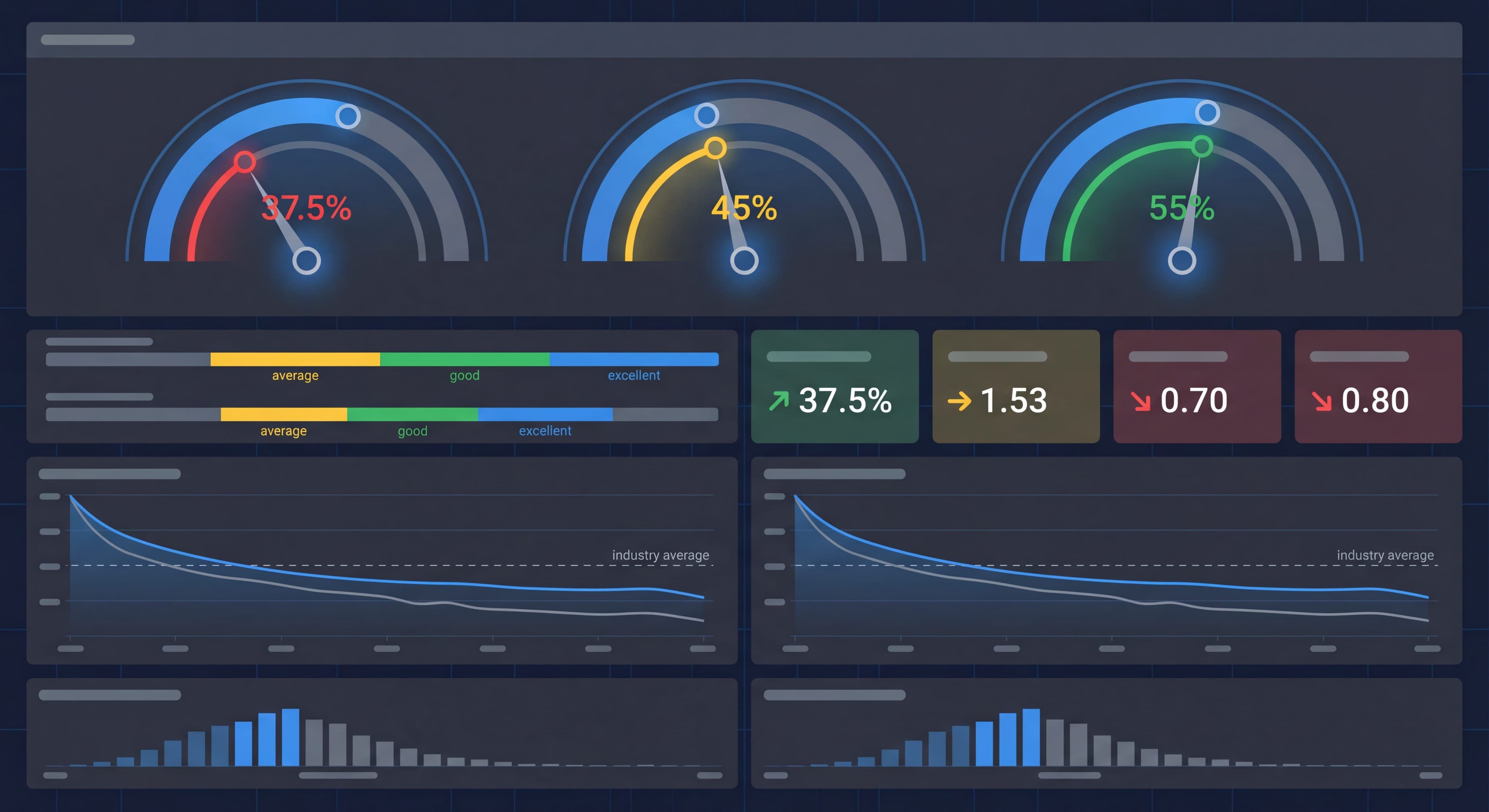
Your activation rate is 35%.
Benchmarked metrics tell you:
Your activation rate is 35%, which is slightly below average (37.5%) for your category, indicating improvement opportunity.
Knowing where you stand relative to industry standards turns raw numbers into actionable intelligence. Without context, a 35% activation rate could be either a significant achievement or a critical problem. You simply don't know. According to Userpilot's SaaS product metrics benchmark report for 2025, the average activation rate across SaaS businesses is 37.5%. That gives you the reference point needed to interpret your performance. This context enables better decision-making about where to focus improvement efforts and whether your current performance warrants concern or celebration. Benchmarks also help with internal conversations. Stakeholders may not understand whether specific metrics represent success or failure. When you can say "we're in the top quartile for our industry" or "we're below average and need to improve," you ground discussions in objective reality rather than subjective interpretation. MadX Digital research on SaaS conversion rates emphasizes that benchmarks help identify specific areas where your product underperforms industry standards. That lets you direct limited resources toward high-impact improvements rather than scattered optimization.
Benchmark Limitations
Context Varies:
Your specific situation may differ significantly.
Average Isn't Always Target:
Top performers beat averages significantly.
Timing Matters:
Benchmarks change over time.
Methodology Differs:
How metrics are calculated varies.
Your History Matters Most:
Internal trends often more valuable than external comparisons.
While benchmarks provide valuable context, they come with significant limitations that can mislead teams who apply them without thinking critically. Your specific business context, including target market, product complexity, pricing model, and go-to-market strategy, creates unique conditions that may make industry averages irrelevant or even counterproductive as targets. Callin's B2B SaaS marketing benchmarks research highlights that product-specific factors can create 20-30 percentage point variations from industry averages while still representing healthy performance. Targeting industry averages often sets the bar too low. Averages include both struggling and thriving companies. Top performers consistently beat average benchmarks by 50-100% or more. Benchmarks also suffer from timing lags. Published data often reflects conditions from 6-12 months prior, potentially missing recent market shifts or emerging best practices. Methodology variations create additional problems since different research firms define metrics differently, making cross-study comparisons tricky. LeanLabs research on B2B SaaS conversion rate benchmarks emphasizes that your own historical trend data often provides more actionable insights than external benchmarks. Improving from 30% to 35% activation represents clear progress regardless of how it compares to industry standards.
Activation Rate Benchmarks
Overall SaaS Average
Industry Average: 37.5%
This represents the percentage of users who reach a defined "activated" state.
By Company Stage
| Stage | Average | Good | Excellent |
|---|---|---|---|
| Early Stage | 25-35% | 35-45% | 45%+ |
| Growth Stage | 35-45% | 45-55% | 55%+ |
| Mature | 45-55% | 55-65% | 65%+ |
By Product Type
| Product Type | Average | Good | Excellent |
|---|---|---|---|
| Simple Tools | 45-55% | 55-65% | 65%+ |
| Productivity | 35-45% | 45-55% | 55%+ |
| Complex B2B | 25-35% | 35-45% | 45%+ |
| Enterprise | 40-55%* | 55-65% | 65%+ |
*Enterprise often higher due to high-touch onboarding
By Pricing Model
| Model | Average |
|---|---|
| Freemium | 30-40% |
| Free Trial (opt-in) | 35-45% |
| Free Trial (opt-out) | 45-60% |
| Direct Paid | 55-70% |
Trial Conversion Benchmarks
Overall Average
Industry Average: 25% (for opt-in free trials)
Trial-to-paid conversion is one of the most critical metrics for product-led growth companies. It directly impacts revenue and customer acquisition costs. According to Userpilot research on SaaS average conversion rates, free trial conversions typically range between 10% and 20%. Conversion rates above 20% indicate that your product meets user expectations and your onboarding and sales strategies work well. The 25% average for opt-in trials (those not requiring credit card information upfront) reflects performance across diverse SaaS categories, company stages, and trial lengths. Understanding these benchmarks helps product teams set realistic conversion targets and spot when performance issues need immediate attention. MadX Digital research reveals that trial conversion varies significantly based on trial structure, with average conversion rates spanning 8-15% across the B2B SaaS industry. Top performers achieve rates of 20-25% through optimized nurture sequences, targeted onboarding, and strategic sales interventions. The variation between average and excellent performance shows the massive impact that onboarding quality, product-market fit, and user support have on conversion outcomes.
By Trial Type
| Trial Type | Average | Good | Excellent |
|---|---|---|---|
| Opt-In (no CC) | 15-25% | 25-35% | 35%+ |
| Opt-Out (CC required) | 40-50% | 50-60% | 60%+ |
| Reverse Trial | 35-45% | 45-55% | 55%+ |
| Freemium → Paid | 3-5% | 5-8% | 8%+ |
The trial structure you choose fundamentally shapes conversion expectations and user quality. Totango research reveals something counterintuitive: free trials requiring credit card information upfront see conversion rates 30-50% lower in percentage terms but attract higher-quality prospects. The result is similar absolute numbers of paid customers despite lower conversion volume. Opt-in trials without credit card requirements lower barriers to entry and attract more trial users, but yield lower conversion rates since many users sign up without serious purchase intent. Opt-out trials with credit card requirements create friction that filters out casual browsers while converting 40-50% of those who complete signup. That reflects higher initial commitment and reduced activation friction. Freemium models face the steepest conversion challenges with typical rates between 1-10% according to OpenView benchmarks. Many freemium users never intend to pay and find sufficient value in free tier functionality. That said, freemium's lower conversion rates are offset by unlimited user acquisition potential and the ability to demonstrate value over extended periods before requesting payment.
By Product Category
| Category | Opt-In Trial | Notes |
|---|---|---|
| Project Management | 20-30% | Higher with team adoption |
| Email Marketing | 15-25% | Dependent on list building |
| CRM | 20-30% | Higher with integration |
| Analytics | 15-25% | Requires data value |
| Collaboration | 25-35% | Network effects help |
| Developer Tools | 15-20% | Often starts with free tier |
Conversion by Trial Length
| Length | Average Conversion | Notes |
|---|---|---|
| 7 days | 20-30% | Higher urgency |
| 14 days | 22-28% | Most common |
| 30 days | 18-25% | More evaluation, less urgency |
| 60+ days | 15-22% | Enterprise evaluation |
Retention Benchmarks
Day 1 Retention
What It Means: Users who return day after first use.
| Category | Average | Good | Excellent |
|---|---|---|---|
| B2B SaaS | 40-50% | 50-60% | 60%+ |
| B2C SaaS | 35-45% | 45-55% | 55%+ |
| Mobile Apps | 20-30% | 30-40% | 40%+ |
Day 7 Retention
What It Means: Users who return within first week.
| Category | Average | Good | Excellent |
|---|---|---|---|
| B2B SaaS | 25-35% | 35-45% | 45%+ |
| B2C SaaS | 20-30% | 30-40% | 40%+ |
| Mobile Apps | 10-15% | 15-25% | 25%+ |
Day 30 Retention
What It Means: Users active 30 days after signup.
| Category | Average | Good | Excellent |
|---|---|---|---|
| B2B SaaS | 15-25% | 25-35% | 35%+ |
| B2C SaaS | 10-20% | 20-30% | 30%+ |
| Mobile Apps | 5-10% | 10-15% | 15%+ |
Long-Term Retention (Annual)
Net Revenue Retention (NRR):
| Performance | Rate |
|---|---|
| Poor | <90% |
| Average | 90-100% |
| Good | 100-110% |
| Excellent | 110-130% |
| Best-in-Class | 130%+ |
Time to Value Benchmarks
By Product Complexity
| Complexity | Target TTFV | Target TTV |
|---|---|---|
| Simple | Under 2 min | Under 10 min |
| Moderate | Under 10 min | Under 30 min |
| Complex | Under 30 min | Under 2 hours |
| Enterprise | Under 1 day | Under 1 week |
Industry Averages
| Product Type | Typical TTFV |
|---|---|
| Note-taking | 1-2 minutes |
| Task Management | 5-10 minutes |
| Email Marketing | 15-30 minutes |
| CRM | 30-60 minutes |
| Analytics | 1-4 hours |
| Enterprise SaaS | Days-weeks |
Onboarding Flow Benchmarks
Product Tour Completion
| Tour Length | Average Completion |
|---|---|
| 3 steps | 70-80% |
| 5 steps | 55-65% |
| 7 steps | 40-50% |
| 10+ steps | 20-30% |
Key Insight: Each additional step reduces completion by ~8-12%.
Checklist Completion
| Checklist Length | Average Completion |
|---|---|
| 3-4 items | 75-85% |
| 5-6 items | 60-70% |
| 7-8 items | 45-55% |
| 10+ items | 30-40% |
Email Sequence Performance
| Metric | Average | Good | Excellent |
|---|---|---|---|
| Open Rate | 20-30% | 30-40% | 40%+ |
| Click Rate | 2-4% | 4-6% | 6%+ |
| Sequence Completion | 40-50% | 50-60% | 60%+ |
Engagement Benchmarks
Sessions Per User (First Week)
| Product Type | Average | High |
|---|---|---|
| Daily Use Tools | 5-7 | 10+ |
| Weekly Use Tools | 2-3 | 5+ |
| Occasional Use | 1-2 | 3+ |
Feature Adoption
| Feature Type | Average Adoption |
|---|---|
| Core features | 60-80% |
| Secondary features | 30-50% |
| Advanced features | 10-25% |
| Power features | 5-10% |
Onboarding Element Engagement
| Element | Average Engagement |
|---|---|
| Welcome screen | 90%+ |
| Product tour | 60-70% |
| Checklist | 70-80% |
| Tooltips | 50-70% |
| Resource center | 20-30% |
| Help articles | 10-20% |
Support and Satisfaction Benchmarks
Support Ticket Rates (During Onboarding)
| Performance | Tickets per 100 Users |
|---|---|
| Excellent | <5 |
| Good | 5-10 |
| Average | 10-20 |
| Poor | 20+ |
NPS During/After Onboarding
| Performance | NPS Score |
|---|---|
| Excellent | 50+ |
| Good | 30-50 |
| Average | 10-30 |
| Needs Work | <10 |
Customer Effort Score (CES)
For Onboarding:
| Rating | Score (1-7) |
|---|---|
| Excellent | 6.0+ |
| Good | 5.0-6.0 |
| Average | 4.0-5.0 |
| Poor | <4.0 |
Using Benchmarks Effectively
Benchmark Comparison Process
Step 1: Select Relevant Benchmarks
Choose benchmarks that match your:
- Product type
- Target market
- Business model
- Company stage
Step 2: Calculate Your Metrics
Ensure consistent methodology:
- Same time windows
- Same definitions
- Same calculations
Step 3: Identify Gaps
Where are you vs. benchmark?
- Significantly above
- At or near
- Significantly below
Step 4: Prioritize
Focus on:
- Biggest gaps
- Highest impact metrics
- Most actionable areas
Step 5: Set Goals
Realistic targets based on:
- Current position
- Resource availability
- Competitive position
Don't Over-Index on Benchmarks
Your Context Matters:
- Unique product characteristics
- Specific user base
- Market conditions
- Business model
Internal Trends Matter More:
- Are you improving?
- What's working?
- What correlates with success?
Top Performers Break Benchmarks:
- Benchmarks are averages
- Best companies far exceed them
- Don't limit ambition
Benchmark Sources
Where Benchmarks Come From
Industry Reports:
- OpenView Partners
- Bessemer Venture Partners
- SaaS Capital
- ProfitWell/Paddle
Analytics Platforms:
- Mixpanel benchmarks
- Amplitude benchmarks
- Heap reports
Research Companies:
- Gartner
- Forrester
Data Quality Considerations
Sample Bias:
Reporting companies may not be representative.
Methodology Variation:
Different companies calculate differently.
Self-Reporting:
Companies may present favorable data.
Time Lag:
Published benchmarks may be dated.
2025 Trends
What's Changing
Rising Expectations:
User expectations increasing, benchmarks rising.
AI Impact:
AI-assisted onboarding showing better completion rates.
PLG Maturity:
Product-led companies setting higher activation standards.
Personalization:
Segmented experiences outperforming generic approaches.
Emerging Benchmarks
Time to First Value (TTFV):
Becoming standard metric for onboarding speed.
Product Qualified Accounts (PQAs):
Team-level activation metrics gaining importance.
Self-Serve Rate:
Percentage completing onboarding without human help.
Benchmark Action Framework
If Below Benchmark
Analyze:
- Why is there a gap?
- What's causing poor performance?
- Where specifically is the problem?
Prioritize:
- High-impact opportunities
- Quick wins
- Resource-appropriate fixes
Act:
- Implement improvements
- Test changes
- Measure impact
If At Benchmark
Don't Assume Done:
- Benchmark is average
- Room to excel
- Continuous improvement mindset
Focus On:
- Moving to "good" or "excellent"
- Specific weak areas
- Competitive advantage
If Above Benchmark
Validate:
- Is measurement consistent?
- Sustainable advantage?
- Room for further improvement?
Leverage:
- What's working? Do more.
- Share learnings internally
- Consider raising targets
The Bottom Line
Onboarding benchmarks provide valuable context, but they're guides, not goals. Use them to understand where you stand, identify opportunities, and set realistic targets. But always prioritize your own data and what works for your specific situation.
Key Principles:
- Choose relevant benchmarks for your context
- Measure consistently for valid comparison
- Prioritize gaps with the biggest business impact
- Internal improvement matters more than beating averages
- Top performers significantly exceed benchmarks
The goal isn't to hit benchmarks. It's to continuously improve your onboarding to serve users better and grow more efficiently.
Continue learning: Onboarding Metrics KPIs and Activation Rate Deep Dive.
Frequently Asked Questions
What is a good activation rate for SaaS products in 2025?
The average SaaS activation rate is 37.5%. Good activation rates range from 45-55% for mature companies, while excellent rates exceed 55%. Rates vary by product complexity, with simple tools achieving 45-55% and complex B2B products achieving 25-35%.
What is the benchmark for free trial conversion rates?
For opt-in free trials without credit card required, the average conversion rate is 15-25%, good is 25-35%, and excellent is 35% or higher. Opt-out trials with credit card required convert at 40-50% on average.
What is a good Day 7 retention rate for B2B SaaS?
For B2B SaaS products, average Day 7 retention is 25-35%, good retention is 35-45%, and excellent retention is 45% or higher. B2C SaaS typically sees slightly lower rates at 20-30% average.
How long should a product tour be to maximize completion?
Product tours with 3 steps achieve 70-80% completion rates, while 5-step tours see 55-65% completion. Each additional step reduces completion by approximately 8-12%, so keeping tours short and focused maximizes user engagement.
What is Net Revenue Retention and what is a good benchmark?
Net Revenue Retention (NRR) measures revenue retained from existing customers including expansion. Average NRR is 90-100%, good is 100-110%, excellent is 110-130%, and best-in-class companies achieve 130% or higher.