Mobile App Onboarding: Best Practices for 2026

Mobile app onboarding faces unique challenges: smaller screens, touch-based interaction, permission requirements, and users with notoriously short attention spans. With 75-90% of mobile users lost within the first month, getting your app onboarding right is critical for success.
This guide covers mobile-specific best practices for 2026.
Mobile users abandoning?
Create step-by-step guides that help users succeed on any device with clear, scannable instructions with Glitter AI.
Mobile-Specific Challenges
Screen Real Estate
Mobile screens are small. Everything that works on desktop needs to be condensed, restructured, or spread across more screens.
Implications:
- Single-column layouts only
- One action per screen
- Progressive disclosure is essential
- Visual hierarchy matters more
Attention Spans
Mobile users are often multitasking, distracted, or using apps in brief sessions.
Implications:
- Shorter flows
- Clear progress indication
- Save progress for return sessions
- Quick wins are essential
Touch Interaction
Tap targets need to be large enough. Swiping introduces gesture-based navigation possibilities.
Implications:
- Minimum 44x44px touch targets
- Swipe-based onboarding flows
- Avoid hover states (don't exist on mobile)
- Consider gesture tutorials
Platform Differences
iOS and Android have different conventions, user expectations, and technical capabilities.
Implications:
- Platform-appropriate UI patterns
- Different permission flows
- Platform-specific features
- Testing on both platforms
Permission Requests
Permission requests are some of the most critical moments in mobile app onboarding. They're gatekeepers that either enable full functionality or create permanent barriers to engagement. Unlike web apps where functionality is generally available by default, mobile apps must explicitly request access to cameras, location, notifications, and contacts. When users deny these permissions, especially on iOS where the system prompt appears only once, reversing that decision requires navigating through system settings. Fewer than 5% of users bother. This makes timing, context, and presentation of permission requests absolutely critical.
The stakes are high because permission requests shape first impressions of your app's trustworthiness. According to research from Appcues, asking for permissions too early, before users understand the app's value, leads to rejections that could have been acceptances with better timing. Users who feel ambushed by permission requests right after installation perceive the app as invasive, damaging the relationship before it starts. Permission requests presented when users are trying to access related functionality feel helpful and logical, resulting in much higher opt-in rates.
Types of Permissions
Understanding the hierarchy of permissions helps you prioritize timing. Critical permissions are those your app literally cannot function without. A photo editing app needs camera access. A navigation app requires location. These should still be requested contextually rather than at first launch, but they're non-negotiable for delivering core value. Time the request for when users are about to use that core feature, not when they're still deciding if your app is worth keeping.
Important but deferrable permissions enable significant functionality but aren't required for initial value. Push notifications are the classic example. They dramatically enhance retention, but users can experience core value without them. Contacts and calendar access unlock powerful features while remaining optional for basic use. The strategy here is patience: demonstrate value first, then request permission when users are ready to go deeper. According to Localytics research, sending the opt-in message between the fourth and sixth session yields much higher acceptance rates than requesting on first launch.
Optional permissions are nice-to-have. Motion data for step counting, health data integration, background refresh. Request these only after users have become regular, engaged users who would appreciate the incremental value. Asking too early signals poor judgment about user priorities and triggers privacy concerns. Present these as opt-in opportunities within settings or feature discovery flows.
Permission Timing Strategies
Pre-permission priming transforms permission requests from binary system prompts into educational moments. Before showing the native iOS or Android permission dialog, present your own custom screen explaining why you need the permission and what value users get by granting it. This creates a safety net. If users decline your pre-permission screen, you haven't burned your one chance at the actual system permission. According to UserOnboard, adding a soft prompt can significantly improve iOS subscriber rates by preparing users for Apple's native prompt.
The difference between bad and good implementation is stark. Bad: system dialog immediately at launch, no context, high-stakes decision with minimal information. Good: a three-step flow. First, a custom screen explaining "To send you real-time alerts when teammates comment, we need notification permission." Second, users tap "Enable Notifications" if they agree. Third, only then does the system dialog appear. This gives users agency to decline without permanently blocking the permission, provides context the system dialog doesn't support, and ensures users who see the system prompt are already predisposed to accept.
Contextual asking is perhaps the most powerful strategy: requesting access at the precise moment users try to use features that require that permission. The request feels like enablement rather than demand. Babbel demonstrates this well. They don't ask for microphone access during the initial lesson. Users experience value first. Only when they reach speaking practice does Babbel request mic access, and at that moment it makes perfect sense because users are actively trying to practice pronunciation.
Gradual permissions follow a progressive disclosure pattern. Apps start with minimal permissions and request more as users demonstrate engagement. Personal training app Zova explains how push notifications unlock daily health and fitness videos, but only after users complete their first workout. This respects the user journey. New users are evaluating if your app is worth their time. Engaged users are looking to deepen their experience. Match permission requests to engagement level.
Permission Request Best Practices
Explain the Value:
"Notifications let you know when teammates comment on your work"
NOT: "Please enable notifications"
Offer Control:
"You can customize notification types in Settings anytime"
Accept Denial Gracefully:
Provide alternative paths when permissions are denied
Use System Patterns:
Follow iOS/Android guidelines for permission flows
Permission Priming Screens
Create custom screens before system prompts:
Elements:
- Icon representing the permission
- Clear headline (what we're asking)
- Brief explanation (why you benefit)
- Primary CTA (continue to system prompt)
- Secondary option (maybe later/skip)
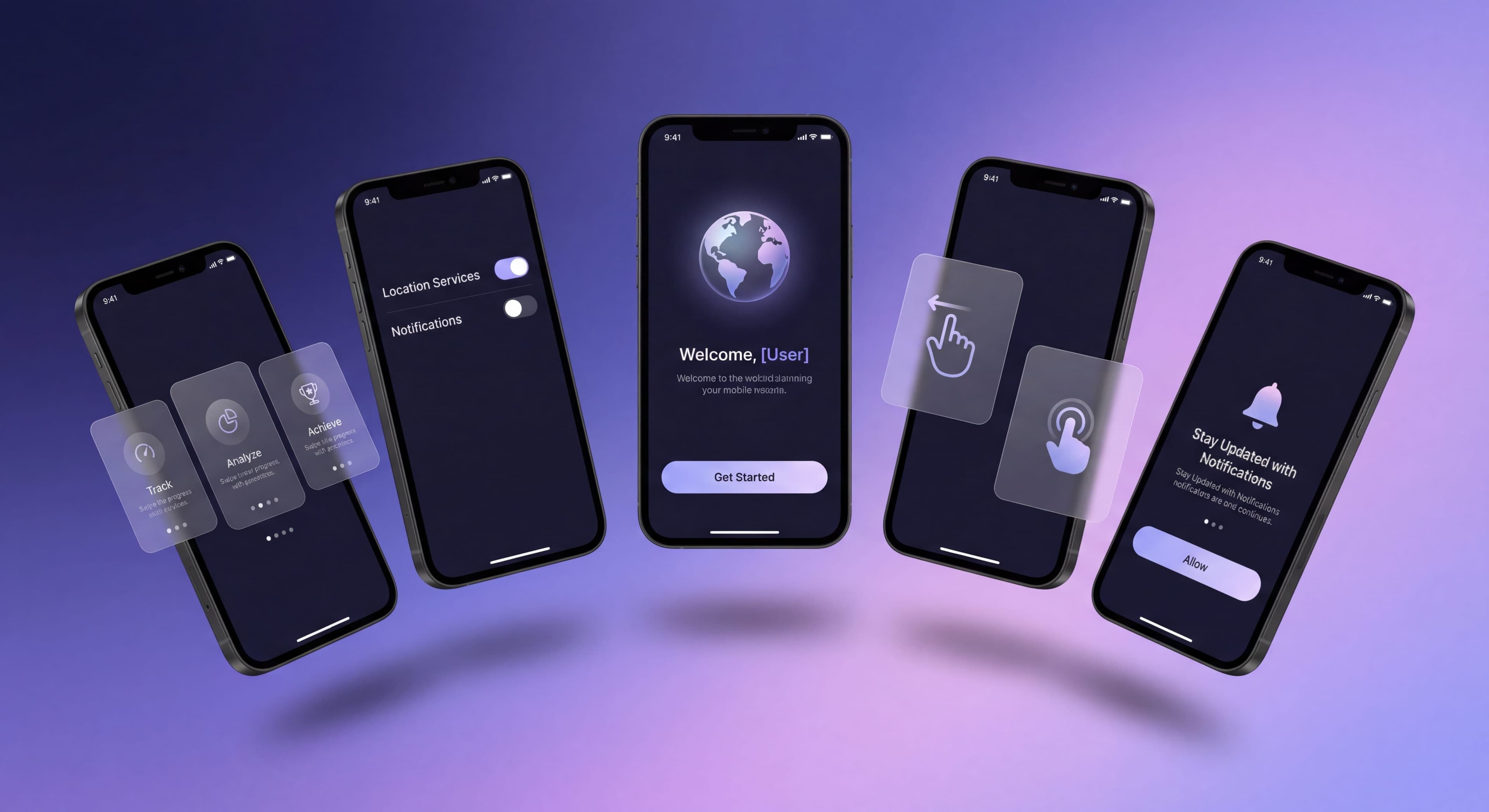
Progressive Mobile Onboarding
First Launch Flow
Keep it minimal:
Ideal First Launch:
- Splash/brand moment (1-2 seconds)
- Value proposition (single screen)
- Account creation/login
- One critical permission (if essential)
- Core action
- Value delivery
Total time target: Under 60 seconds to first value
Deferred Onboarding
Don't try to teach everything at first launch. Spread education across sessions:
Session 1: Core loop only
Session 2: Secondary feature introduction
Session 3: Advanced capabilities
Later: Power user features
Trigger-Based Education
Teach features when users approach them:
Examples:
- User opens menu → Highlight new feature
- User completes task → Introduce related capability
- User returns after absence → Show what's new
Gesture Training
Mobile apps often use gestures that aren't discoverable. Onboarding can teach them.
Common Gestures to Teach
- Swipe to delete
- Pull to refresh
- Long-press for options
- Pinch to zoom
- Swipe between screens
Gesture Tutorial Patterns
Animated Demonstration:
Show a finger animation performing the gesture
Ghost Touch:
Transparent hand performing gesture on actual content
Try It Now:
"Swipe this card to archive" with practice content
Dismiss and Remember:
Teach once, don't repeat
Best Practices
- Teach gestures in context, not in abstract tutorials
- Use actual app content for practice
- Provide alternative methods (buttons) for accessibility
- Don't assume gesture knowledge
Push Notification Strategy
Push notification opt-in is critical for retention. Handle it carefully.
When to Ask
Don't: Ask at first launch before value is demonstrated
Do: Ask after users have experienced value
Good Timing:
- After completing first core action
- When users enable a feature that benefits from notifications
- After achieving first success
How to Ask
Pre-Permission Screen:
"Stay updated when your team comments on your work"
"Get notified about time-sensitive updates"
"Never miss important messages"
Show Value First:
"You'll get notified about [something they just did] and similar updates"
Notification Types
Offer granular control where possible:
- Activity notifications (comments, likes)
- Message notifications
- Marketing notifications (optional)
- Digest vs. real-time options
Denied Permission Recovery
If users deny notifications:
- Respect the decision initially
- Offer in-app alternatives (message center)
- After demonstrated value, offer to enable in Settings
- Explain what they're missing
Cross-Platform Consistency
Training taking too long?
Create step-by-step guides that get users productive faster with Glitter AI.
Same Account, Different Devices
Users expect continuity between:
- Mobile app and web app
- iOS and Android versions
- Tablet and phone experiences
Consistency Areas:
- Progress synced across devices
- Preferences transferred
- Data always available
- Similar navigation patterns
Platform-Appropriate Design
iOS Conventions:
- Tab bar navigation
- Swipe-from-edge gestures
- Native iOS UI components
- Apple sign-in option
Android Conventions:
- Bottom navigation or hamburger menu
- Back button behavior
- Material Design patterns
- Google sign-in option
Onboarding Parity
Ensure onboarding quality is equal across platforms:
- Same information communicated
- Similar effort required
- Equivalent feature access
- Consistent branding
Mobile Onboarding UI Patterns
Carousel/Swipe Onboarding
Structure:
3-5 screens user swipes through
Best For:
Value proposition communication, high-level overview
Pitfalls:
- Users skip without reading
- No engagement with content
- Forgettable
Best Practices:
- Keep under 5 screens
- Make skip obvious
- Use compelling visuals
- One message per screen
Coach Marks/Tooltips
Structure:
Overlays pointing to specific UI elements
Best For:
Teaching specific features in context
Pitfalls:
- Can obscure content
- Easy to dismiss accidentally
- Don't work well for multiple features
Best Practices:
- One tooltip at a time
- Clear dismiss action
- Don't cover what you're teaching
Interactive Tutorials
Structure:
Users perform actions with guidance
Best For:
Teaching complex or non-obvious features
Pitfalls:
- Can feel forced
- Requires sandbox or demo content
- Longer than other methods
Best Practices:
- Allow skip option
- Use real or realistic content
- Celebrate completion
Training taking too long?
Create step-by-step guides that get users productive faster with Glitter AI.
Testing Mobile Onboarding
Device Testing
Test on multiple devices:
- Different screen sizes
- Different OS versions
- Low-end and high-end devices
- Both iOS and Android
Session Recording
Watch real users go through onboarding:
- Where do they hesitate?
- What do they skip?
- Where do they drop off?
- What gestures confuse them?
A/B Testing
Test variations of:
- Number of onboarding screens
- Permission request timing
- Feature introduction order
- Tutorial styles
Metrics to Track
Completion Rate: % who finish onboarding
Time to Complete: How long onboarding takes
Permission Opt-in Rate: % who grant each permission
Day 1/7/30 Retention: Impact on return usage
Mobile Onboarding Checklist
Before Launch
- Onboarding works offline
- Progress saves if app closes
- Touch targets are 44px minimum
- Works on smallest supported screen
- Works on largest supported screen
- Permission priming screens prepared
- Both platforms tested
Flow Design
- Under 5 screens for carousel
- Single focus per screen
- Skip option available
- Progress indicator present
- Value demonstrated before asking
Content
- One message per screen
- Headlines under 5 words
- Body text under 20 words
- Images/illustrations support message
- Action buttons are verb-driven
Technical
- Analytics tracking implemented
- A/B test capability
- Deep link handling
- State persistence
- Error state handling
Mobile Onboarding Examples
Best Practices in Action
Duolingo:
- Immediately starts lesson (value first)
- Account creation after completing first lesson
- Notification ask tied to streak feature
Headspace:
- Minimal onboarding
- First session (value) before account
- Premium features gated, not explained
TikTok:
- Shows content immediately (no onboarding)
- Account only needed for social actions
- Teaches algorithm through use
App onboarding too complex?
Create step-by-step guides that break down mobile flows into bite-sized steps users can follow with Glitter AI.
Building Great Mobile Onboarding
- Minimize before value: Get users to core value as fast as possible
- Respect constraints: Design for small screens and short sessions
- Ask at right times: Permissions after value, not before
- Teach through use: Context beats lengthy tutorials
- Test thoroughly: Multiple devices, real users, actual metrics
Mobile app onboarding requires balancing user expectations against user patience. Every moment counts. Make them count toward getting users to value.
Continue learning: Feature Adoption Strategies and Aha Moment Optimization.
Frequently Asked Questions
What are the biggest challenges of mobile app onboarding?
Mobile onboarding faces unique challenges including limited screen real estate requiring single-column layouts and one action per screen, short user attention spans requiring brief flows, touch interaction needing 44x44px minimum tap targets, and platform differences between iOS and Android requiring platform-appropriate UI patterns.
When is the best time to request app permissions during onboarding?
Request permissions after demonstrating value, not at first launch. Use contextual asking when users try to use related features (ask for camera when they tap Take Photo). Always use pre-permission priming screens that explain the value before showing system dialogs, and accept denial gracefully by providing alternative paths.
How do I improve push notification opt-in rates during mobile onboarding?
Ask for notification permission after users experience value, not at first launch. Good timing includes after completing the first core action or when enabling a feature that benefits from notifications. Use pre-permission screens explaining the value (Stay updated when teammates comment), and offer granular control over notification types.
How long should mobile app onboarding take?
Target under 60 seconds to first value. An ideal first launch includes a splash moment (1-2 seconds), single-screen value proposition, account creation, one critical permission if essential, core action, and value delivery. Use deferred onboarding to spread education across multiple sessions rather than teaching everything at first launch.
What mobile onboarding UI patterns work best?
Carousel/swipe onboarding works for value proposition communication but users often skip without reading. Coach marks and tooltips teach specific features in context but can obscure content. Interactive tutorials are best for complex features but can feel forced. Keep carousels under 5 screens, show one tooltip at a time, and always provide skip options.